Gyeonggi Content Agency
Description
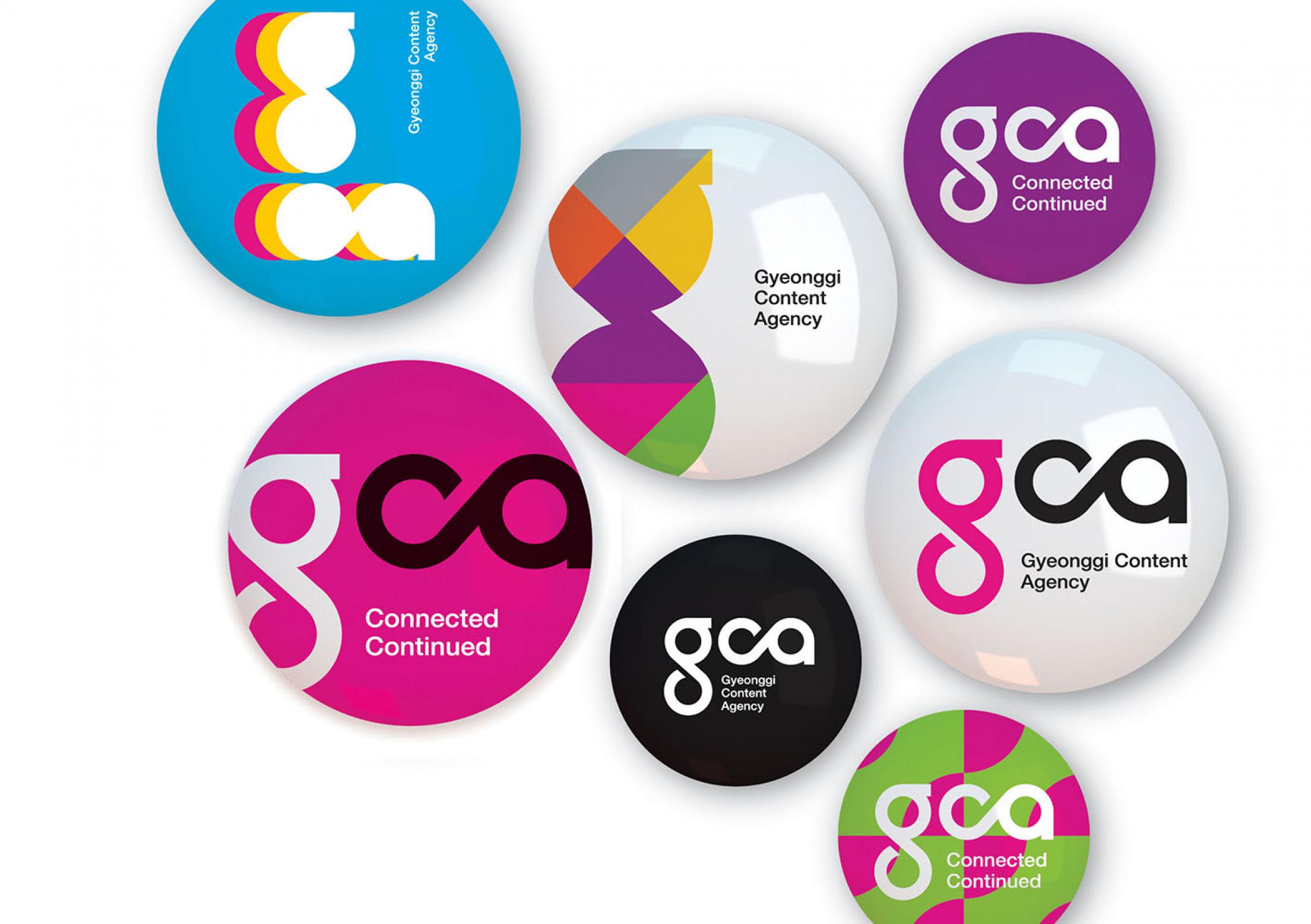
The Gyeonggi Content Agency is the organisation to support the cultural contents industry such as games, animations, movies and so on. The connected alphabets mean the fusion and connection of the contents, and the Möbius shapes represent the infinite creativity and possibility. The same shapes of the g and ca show how the contents can be changed by looking from a different point of view.
Statement of the jury
The logo expresses the brand promise of connection and convergence, both in terms of typography and also graphics, in a fantastic way. The addition of colour and graphic patterns in the look reinforces the vivid character, references the diversity and flexibility of the services and increases the general memorability of the brand.
Winner
Excellent Communications Design
Corporate Identity