DeBiobuttek

Description
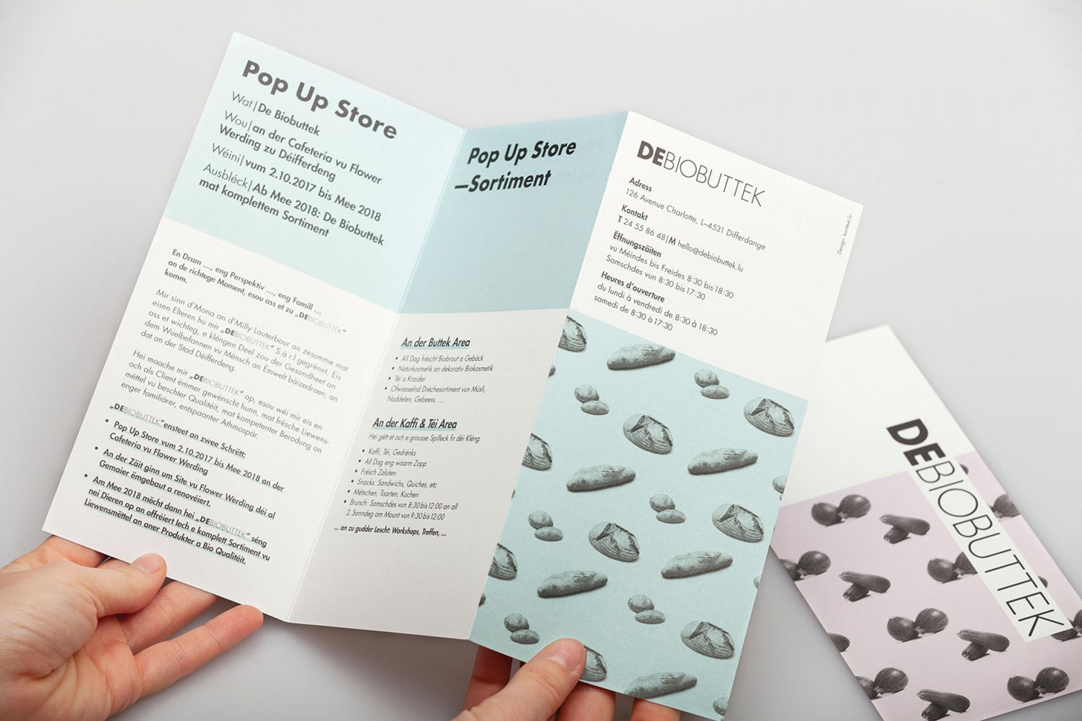
Futura Round is based on Futura and has rounded edges, which represents the connectedness with nature in an urban environment. The abundance of nature and the available products is mirrored in the colour scheme. The softer pastel tones represent the mindful and calm aspects of DeBiobuttek. The logotype reinforces the shop’s name. It’s not just a Biobuttek, it’s DeBiobuttek (De = the/Biobuttek = organic supermarket). By lining up the products we have a pattern which emphasises the product itself.
Statement of the jury
The rounding off of the Futura font with duplex-coloured, grid-like patterns that are constructed from food gives the brand image a particular aesthetic. The surface-structured design looks appealingly clear and open. An interesting design that you do not see every day in this field, which makes it stand out even more.