Austrian Airlines Rebranding – The same but better.

Description
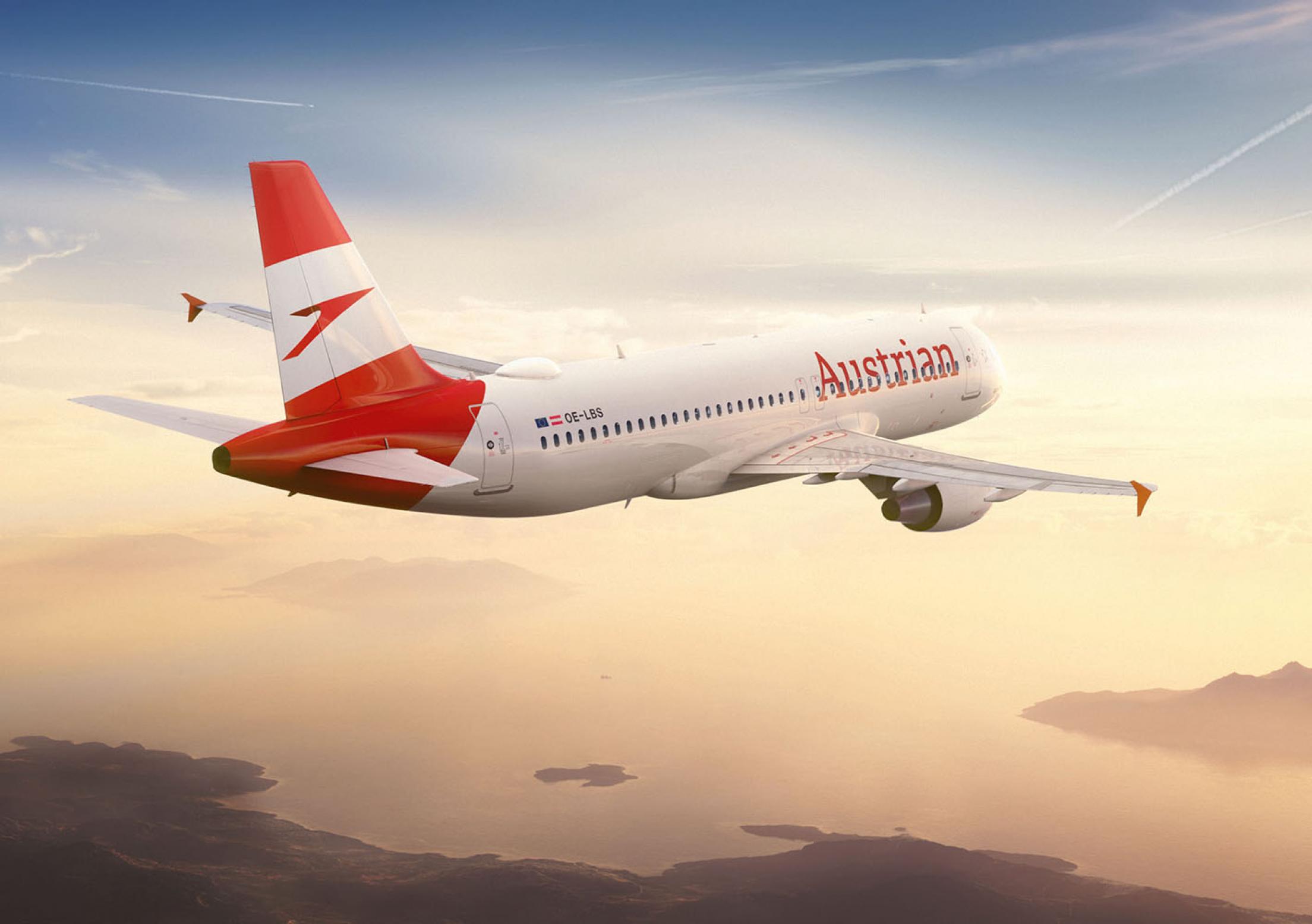
The objective: To infuse the brand of Austria’s national carrier with charm, elegance and life across the complete digital, analogue and personal customer journey to create a single and relevant brand experience. Typography, logo, visuals and tonality were optimised for the digital world – from the livery design of the planes, the airport signage or the board magazine to social media, digital boarding passes, motion design, stand design or its own 450 icon font.
Statement of the jury
Dynamic relaunch for more elegance and liveliness through digital optimisation of typography, logo and its own pictogram lettering and implementation on all levels: from the livery design of the aircraft, control system, boarding passes, board magazine and social media to the trade stand. A new and outstanding brand experience.