Colavita Cycling Kits

Description
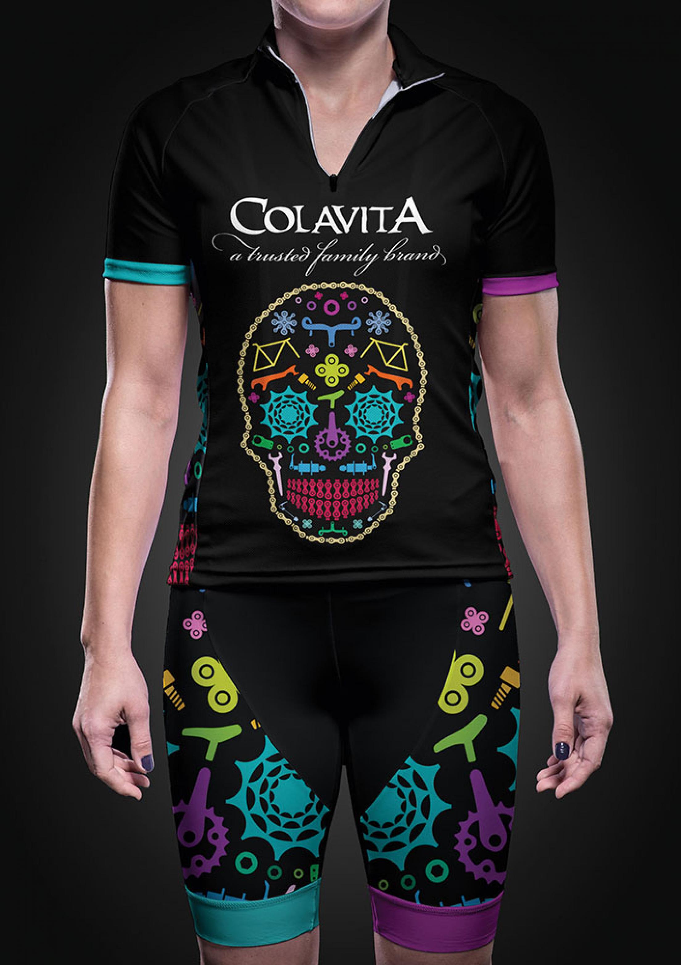
Bright colours were used for motorist awareness. Neon lime, pink, blue, purple and teal were used to stand out against a black background and contrast with the Las Vegas desert landscape. Bike parts were illustrated and arranged to depict a Day of the Dead motif, with a skull as the primary artwork and identifier of this popular holiday. As this is a women’s cycling team (the sponsor company is Colavita), I incorporated the idea of bike parts as if they were different shapes of pasta.
Statement of the jury
The colourful brand design made out of various bicycle parts, creates a positive mood, attracts a great deal of attention and gives the image an unmistakable identity. The skull variant is an original eye- catcher that has a unique effect and is an extremely strong visual. The idea of taking inspiration from the characteristic Mexican skulls ubiquitous on the Day of the Dead is simply brilliant and was very well executed.