Typo Kampagne / Redesign Anzeigen
Description
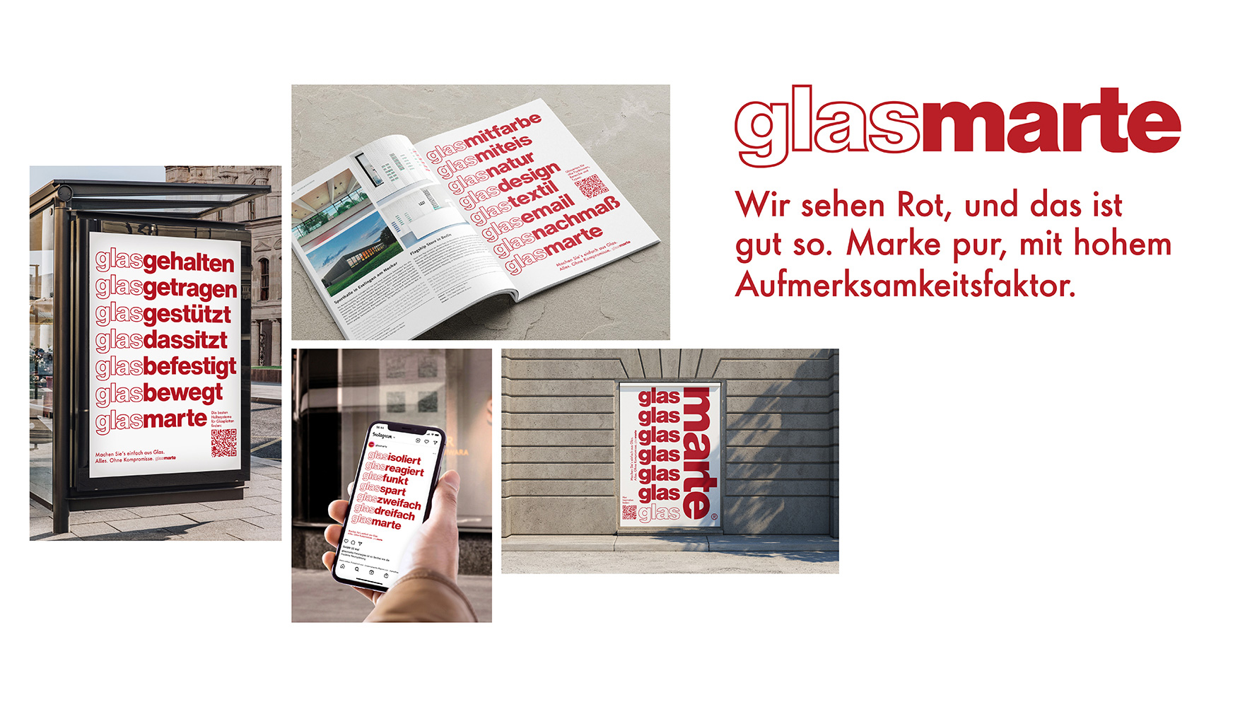
Do you have to show what is hardly visible anyway? Not as long as you dare to use strong words. This bold, purist typo campaign by the glass experts breaks out of the colorful advertising canon of trade magazines, trade fairs, billboards and social media. The second glance recognizes the play with the brand in the glass poems - and a lyrical wink in each text. With a beat poetic undertone, the company thus places its competencies - and a clear message: We are glass. Glass Marte.
Statement of the jury
The typography campaign by Glas Marte fires short messages, always beginning with the word »glass«, one after the other as if from a revolver. It’s eye-catching, loud and memorable.
Winner
Excellent Communications Design
Integrated Campaigns and Advertising
Company/Client
Design
atelier 522