Stichting Lezen en Schrijven (Reading and Writing Foundation)
Gold
Excellent Communications Design
Brand Identity
Details
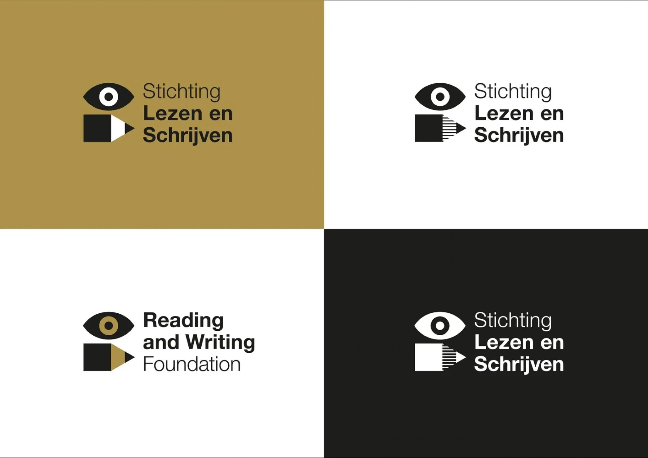
»Lezen en Schrijven« reduces literacy difficulties in Holland, so their brand identity must be accessible and coherent. Illustrations with simple shapes and colors make texts accessible for a less literate audience, images and text always strengthen each other. In the logo, an eye and pencil visualize the foundation’s name. The color palette underlines the human aspect and ensures diversity with light to dark pink shades. The result is accessible itself, but also a showcase for accessibility.