STIHL Brand Design
Special Mention
Excellent Communications Design
Brand Identity
Details
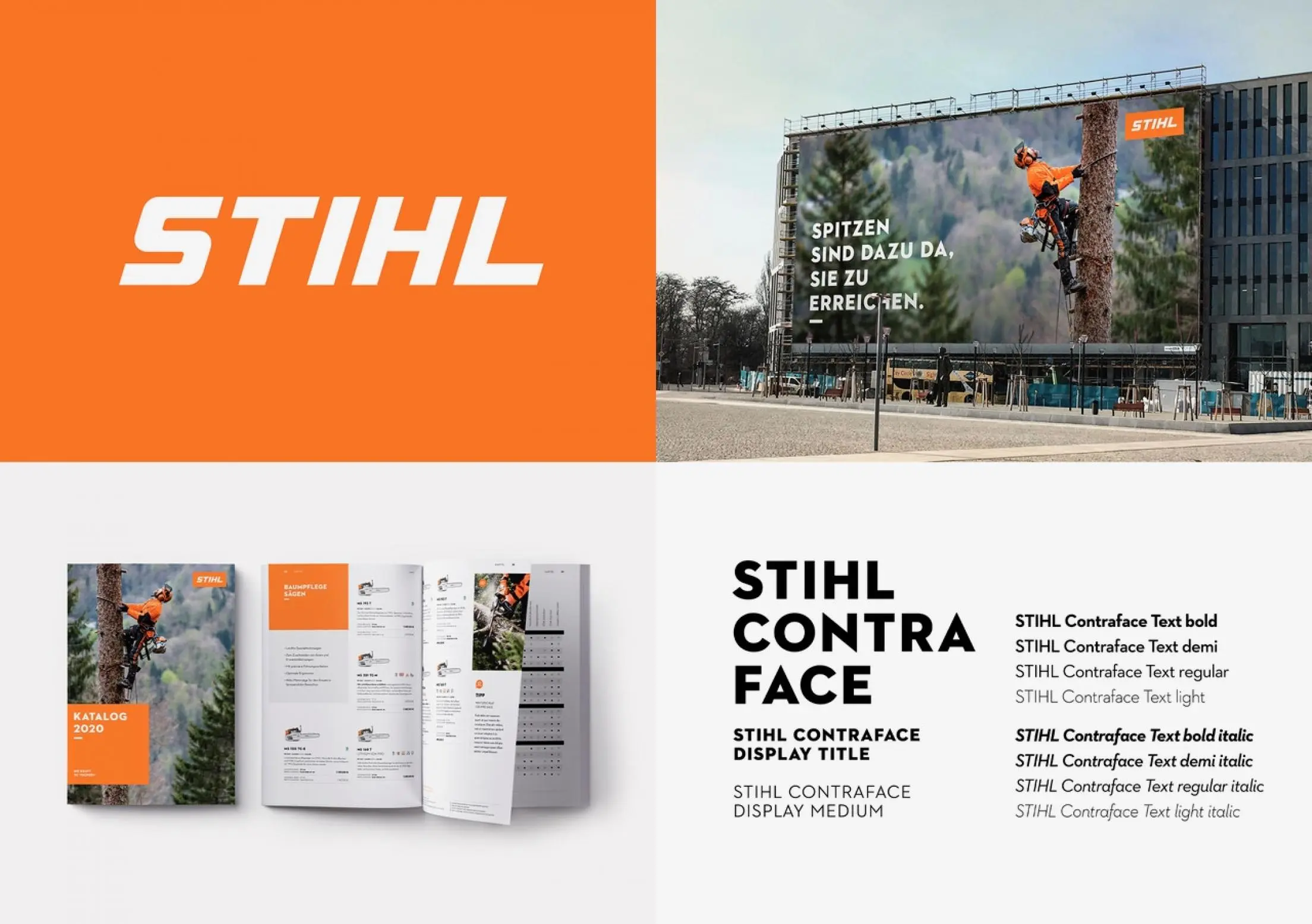
Less engine power, a greater feeling of nature. The new »STIHL brand design« aims to express this change. The Logo has been aligned, the Stihl orange, which originated in working with nature, becomes the primary brand color. The new Corporate Font CONTRAFACE reflects the company's self-image as an Engeneering Company. The leitmotif – Naturgefühl – is particularly evident in the brand’s visual presentation. The Corporate Language ist characterized by linguistic imagery from nature and work.