Brandigans
Winner
Excellent Communications Design
Corporate Identity

Details
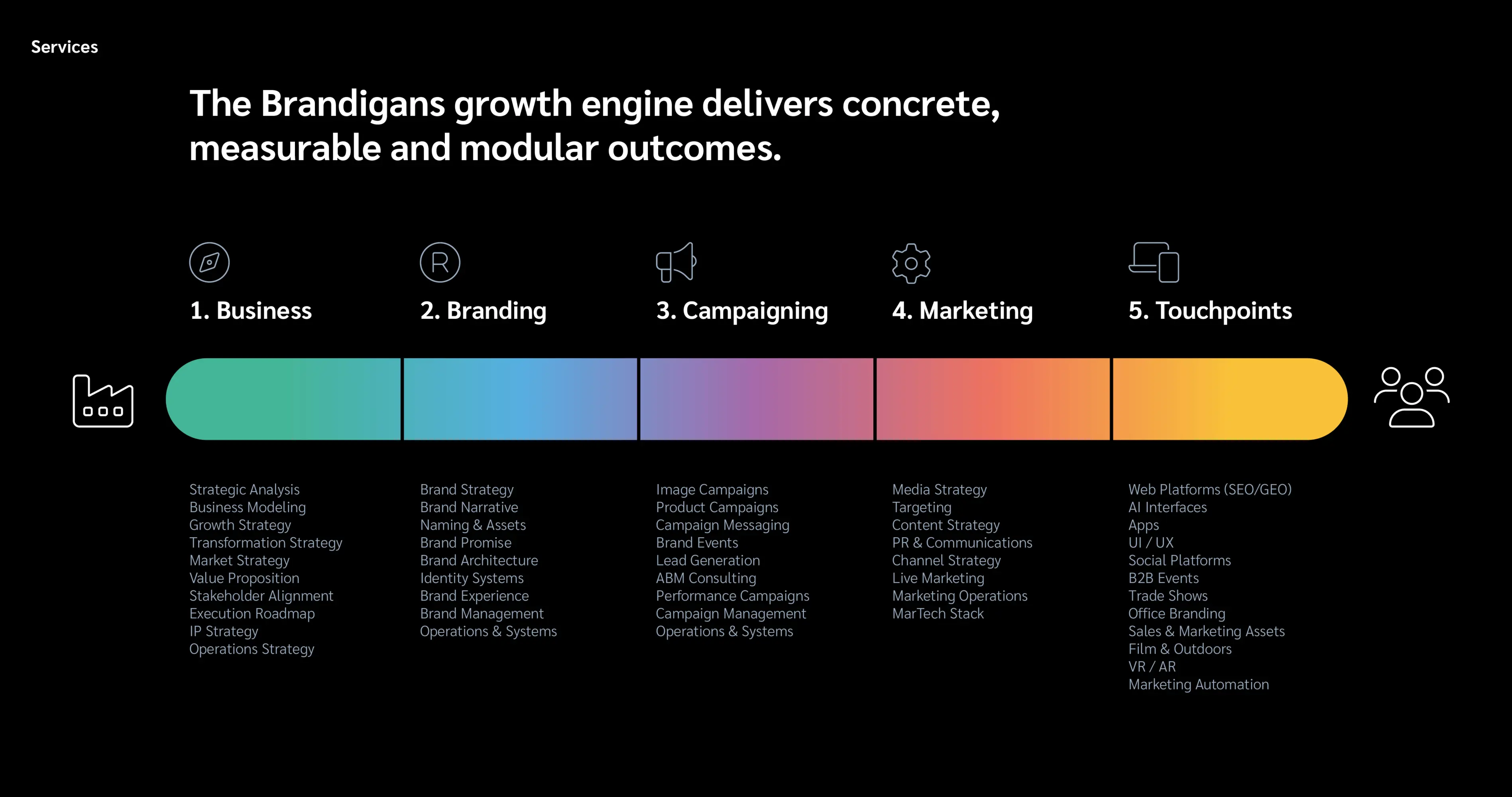
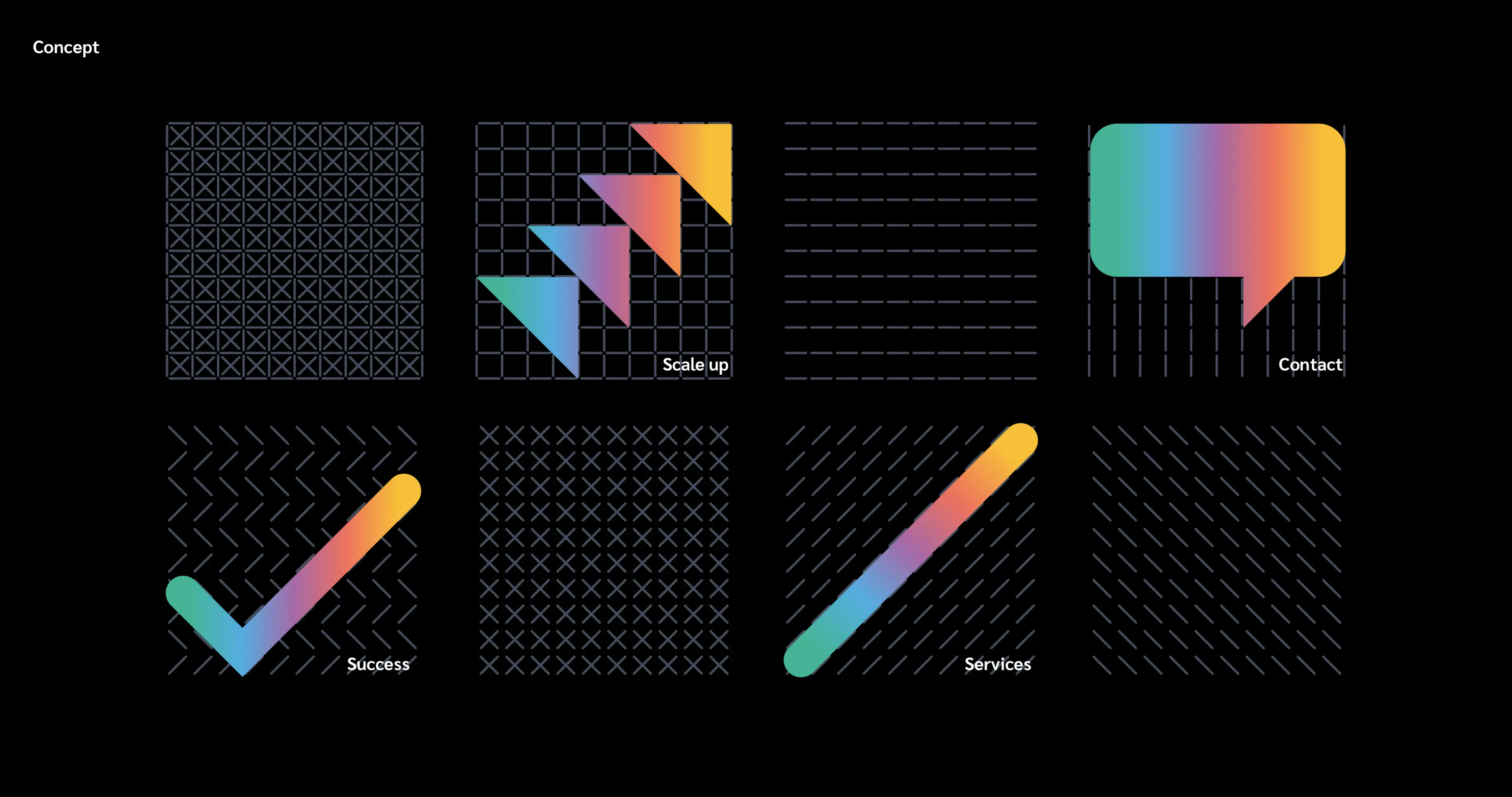
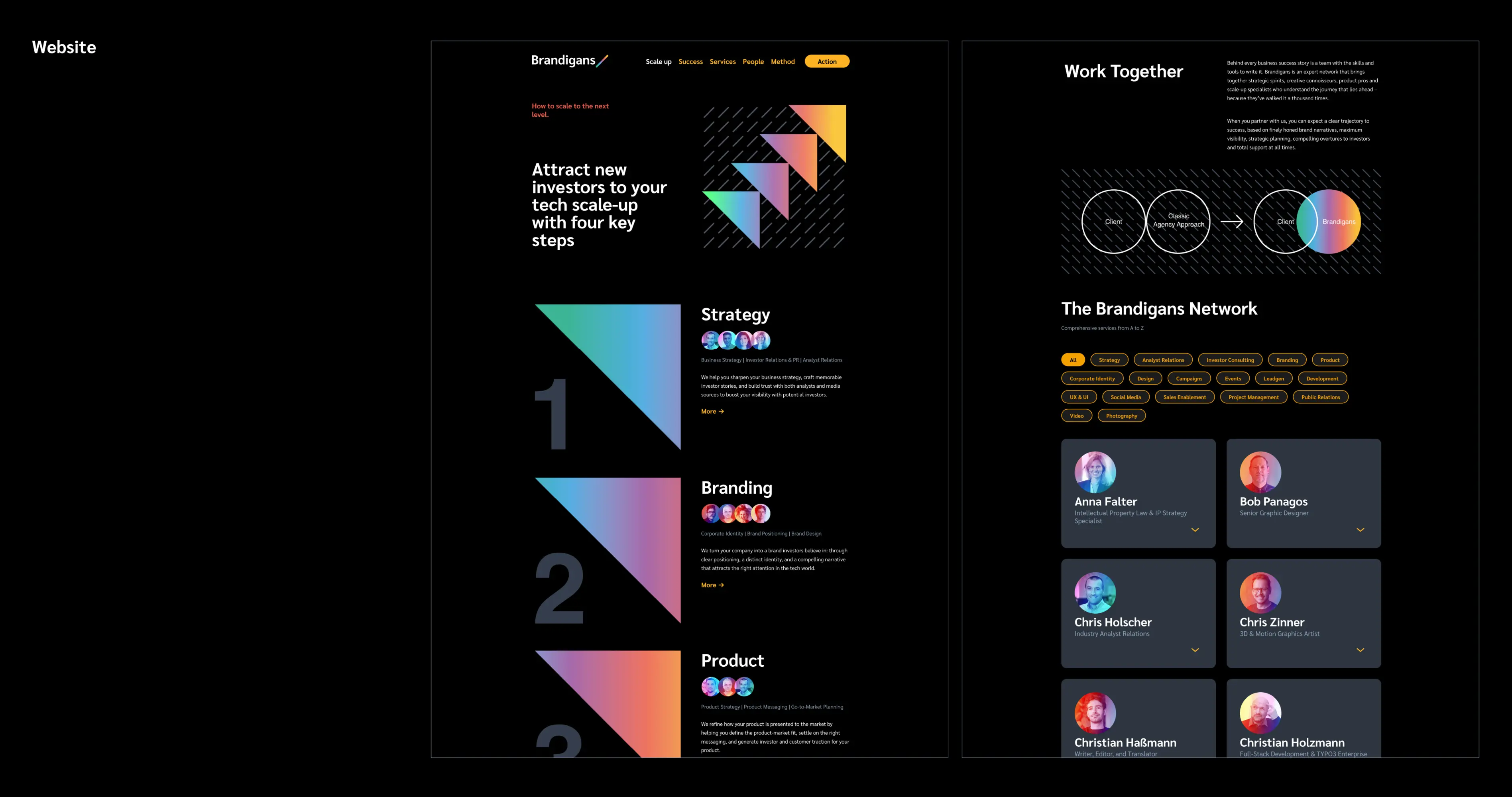
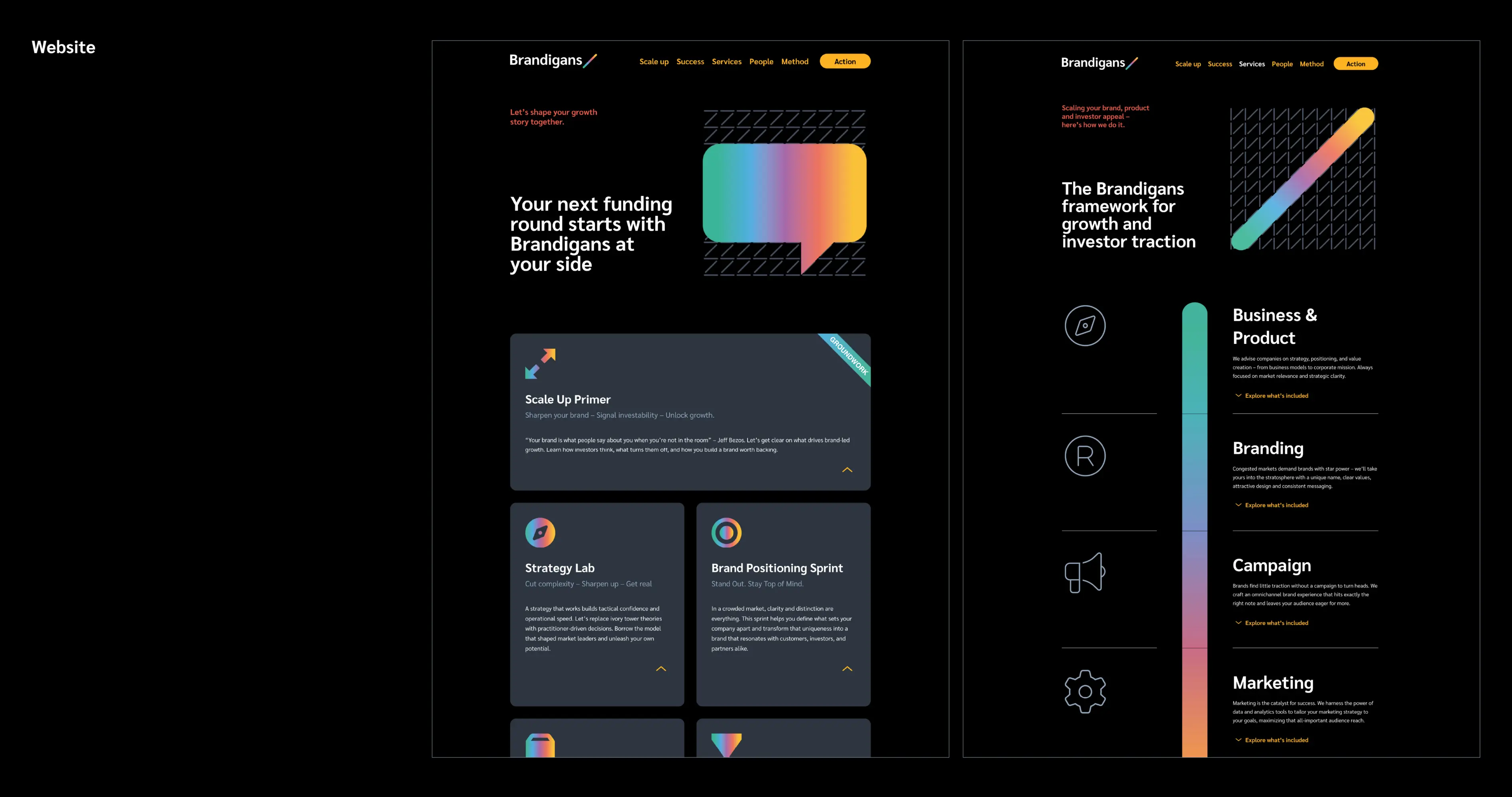
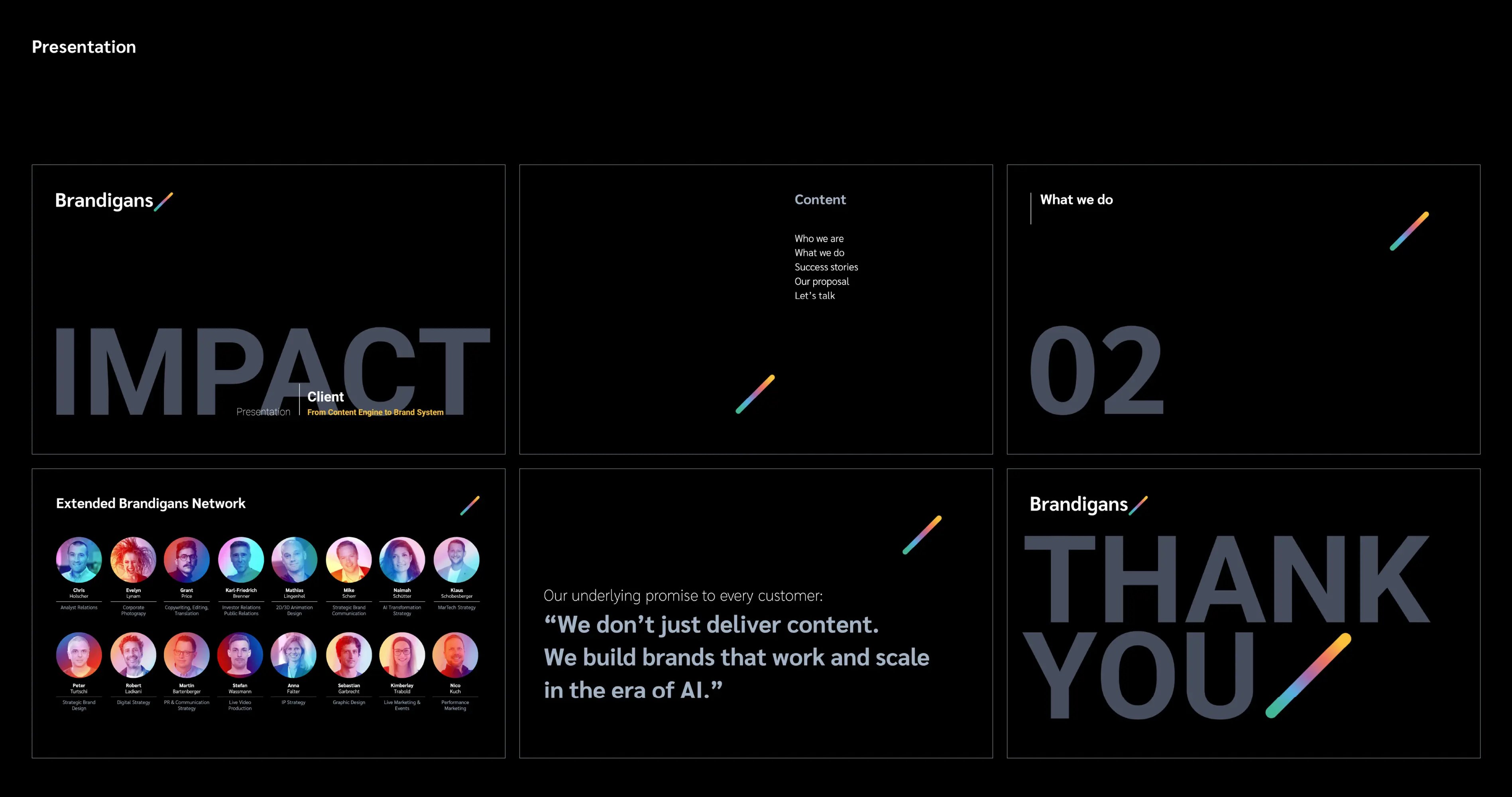
Brand system for an international scale-up network. Brandigans is an international expert network specialising in positioning and scaling scale-ups. The corporate design translates the complexity of its services into a clear, flexible visual system. At its heart is a diagonal colour gradient – a symbol of the flow of interconnected services, from strategy to digital touchpoints. Movement, scalability and transformation shape the system: grids reflect the methodical approach, dark mode delivers contrast and a high-end aesthetic. Consistent across web, presentations and interfaces.