Gyeonggi Province Identity Design Development
Special Mention
Excellent Communications Design
Corporate Identity
Details
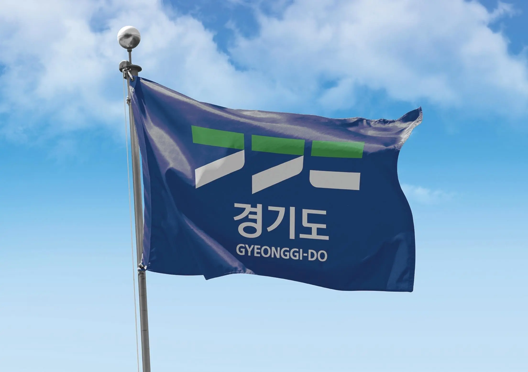
Gyeonggi-do is the province surrounding Korea’s capital, Seoul. It is the largest provincial government of Korea with 31 cities and counties. Its logo is a clear, bold expression derived from the first consonant characters of each syllable from its name. The green upper portion of the logo portrays the dynamic image of the province moving forward on a straight path while the blue lower half represents uprightness and flexibility through the harmony between straight and curvy lines.