Sartorius Brand Relaunch
Special Mention
Excellent Communications Design
Corporate Identity
Details
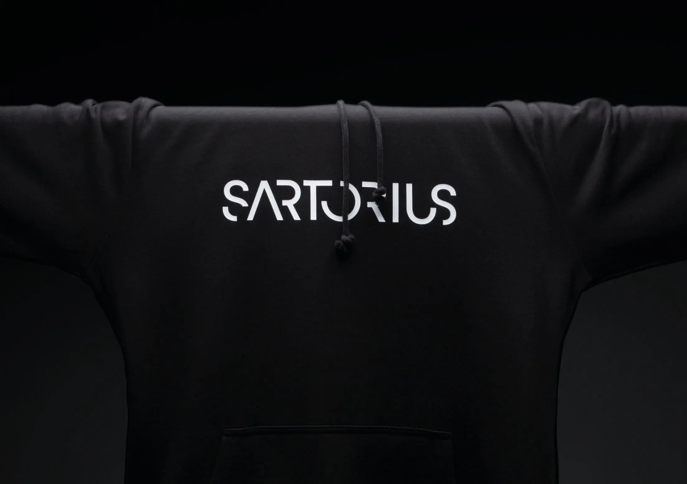
The 2020 relaunch of the »Sartorius« corporate brand is all about its repositioning and the new brand promise “Simplifying Progress”. At all touchpoints, the focused, creative and ambitious character becomes obvious. The engaging potential of the design lies within its simplicity: the bold logo omits unnecessary lines, icons or pictures. The color palette consists of just three colors: all one hundred percent pure. The result is a distinct, eye-catching appearance – a unique and pioneering brand.