Nachhaltigkeitsbericht Simon H. Steiner, Hopfen, GmbH
Special Mention
Excellent Communications Design
Editorial
Details
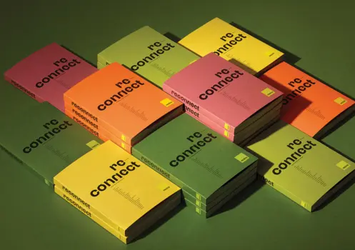
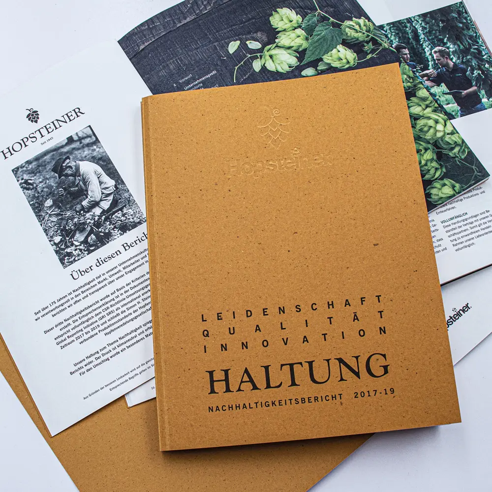
The publication underlines the innovative as well as grounded approach towards sustainability by the principal: a modern typography and an authentic imagery which are in line with the rural home of hop. Warm colours such as hop-like green and golden yellow make perceptible how natural the main product, hop, is. Numbers, data and facts liven up thanks to the design. The cover is minted and printed on „beer paper“ by manufacturer GMUND which is an eye-catching and tactile highlight in itself.