Packaging Redesign Youcook
Winner
Excellent Communications Design
Packaging
Credits
Company / Customer
Details
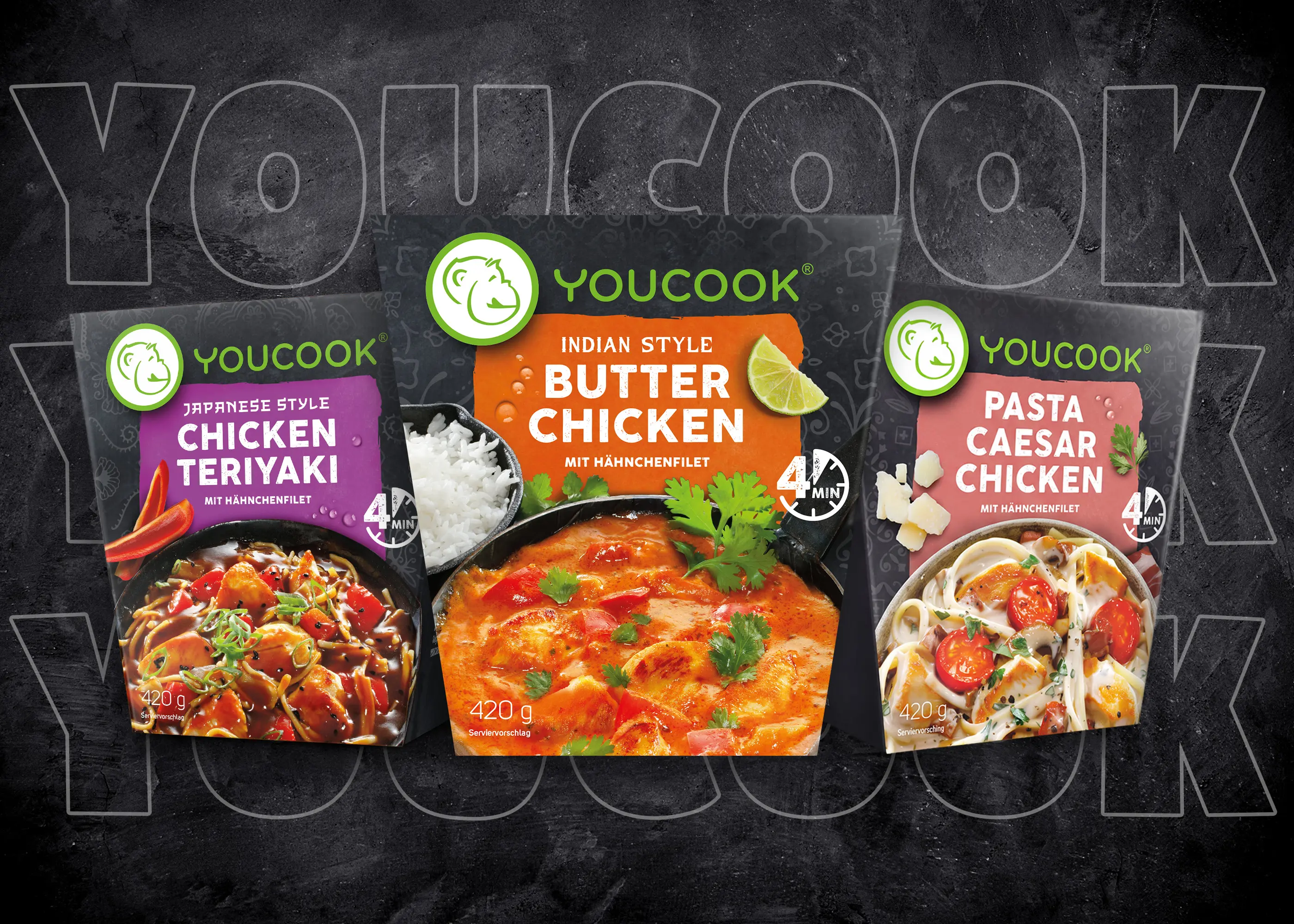
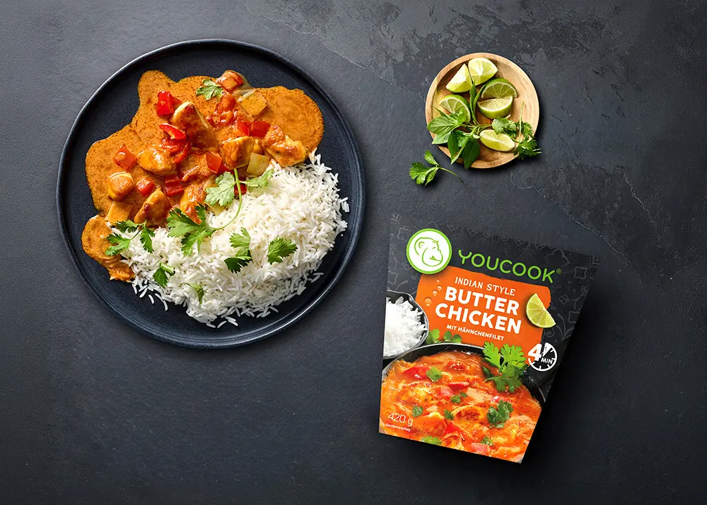
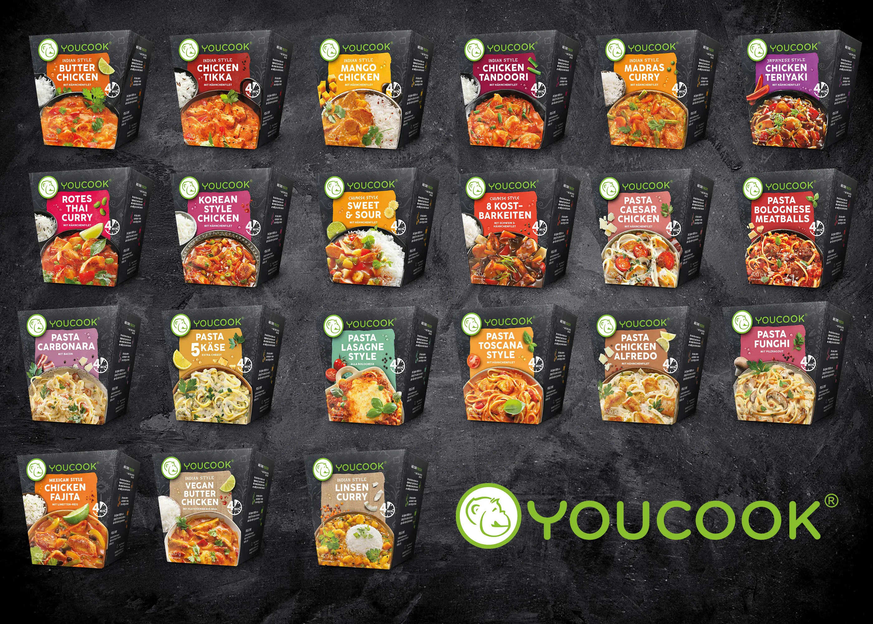
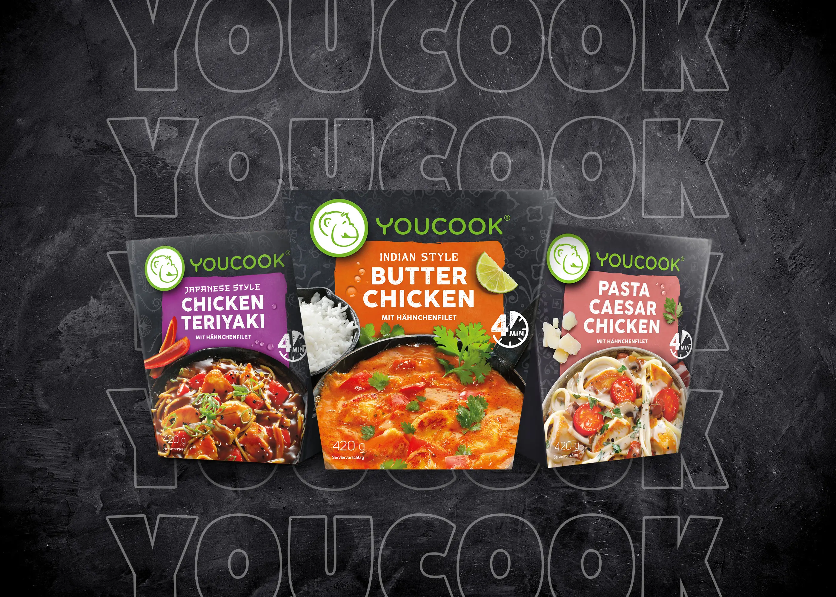
The redesign of the packaging transforms YOUCOOK into a more professional and recognisable brand. The name is now centred and clearly separated from the icon, standing out in green against the vibrant background. Each product has a unique colour background and clear typography for improved readability. Subtle patterns differentiate between cuisines, supported by a consistent colour scheme. The result is improved shelf navigation and a stronger, more premium brand presence.