Sartorius Brand Relaunch
Special Mention
Excellent Communications Design
Signage and Wayfinding
Details
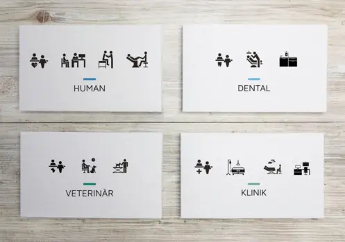
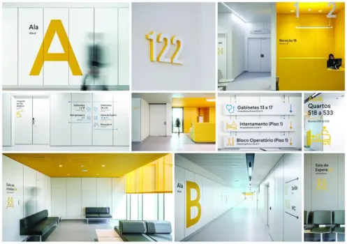
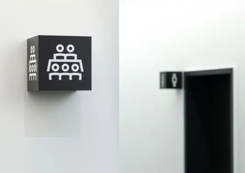
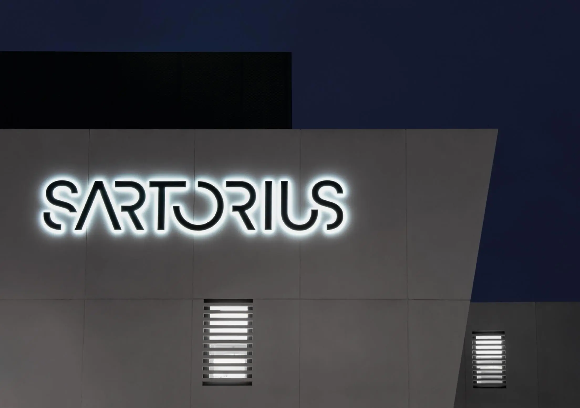
The »Sartorius« logo and signage were designed to reflect the brand promise “Simplifying Progress”. Thanks to its clear, graphic design, the logo differentiates the brand distinctly from our competitors. The basis for the logo was our corporate font TT Norms Pro, a timeless and geometric sans serif. The simplifying approach is also mirrored in our signage. The strong signal effect of the pure yellow, our bold logo, the simple iconography and clean-cut font make the brand recognizable and unique.