Miele Elements
Winner
Excellent Communications Design
Typography
Details
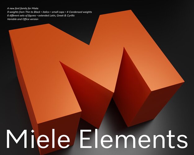
Miele Elements is the new typeface for the manufacturer Miele. It comes with 9 weights, 2 widths, has a variable and an office version and is designed for all future tasks. Distinctive italics, small caps, and six figure sets are included, as well as Latin, Greek, Cyrillic for broad language coverage. The typeface is inspired by the Miele logo, showing diamond-shaped dots, an M that echoes the shape of the logo, and straight-cut terminals. It has subtly rounded corners that reflect the sharp yet tactile design of Miele appliances. The font is now used in combination with the Miele icon set, which has been mutually developed over the years.
The Jury‘s Statement
This typeface impresses with its versatility and adaptability, meeting the demands of a globally operating company. Its elegant form and subtly rounded corners reflect the precision the brand symbolizes. »Miele Elements« seamlessly combines functionality and aesthetics, thereby supporting the visual identity within the corporate context.