EpilepsieNL
Special Mention
Excellent Communications Design
Web
Details
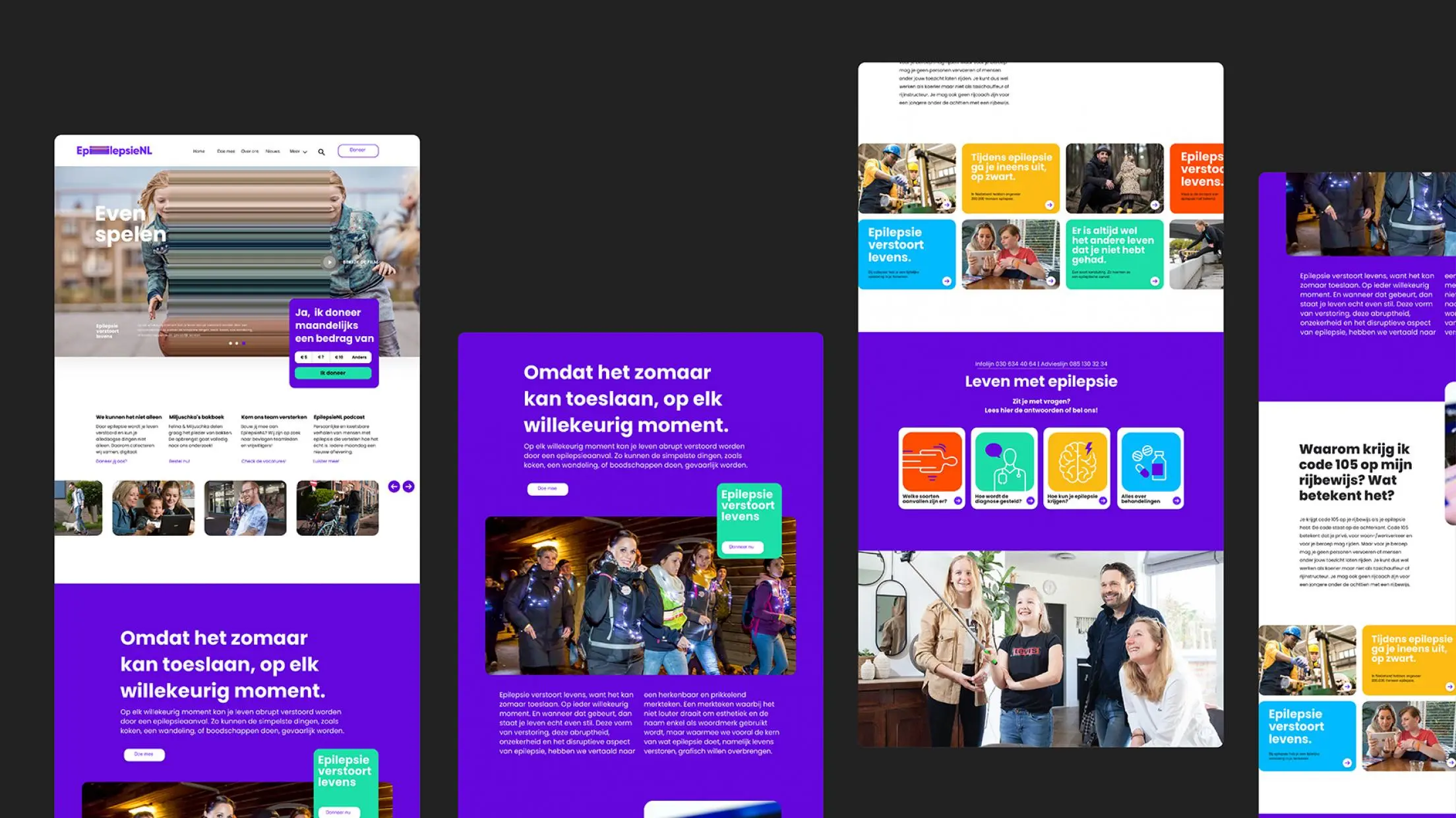
We created a new branding and website for EpilepsieNL. The basis is a stretch effect that disrupts the logo and images. It visualizes the disruption that epilepsy attacks enact. The use of this effect on the website makes the impact of epilepsy palpable for everyone. The primary color of the style is a lavender purple, which is the color of International Epilepsy Day, because of lavender’s positive effect on people with epilepsy. Each element contributes to the message: epilepsy disrupts lives.