Weingut Diehl

Description
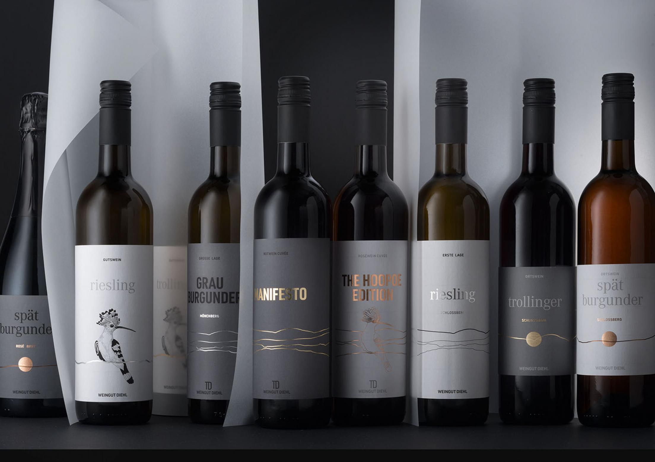
Reason for the new CD: Weingut Diehl is now managed in the third generation by Thomas Diehl. And it reflects his attitude: close to home, cosmopolitan and committed to the environment and society. The signet: the hoopoe, a migratory bird, a beneficial animal in the vineyard, which is now reclaiming its space and is thus a bearer of hope. The wine labels, with focus on the content, show the horizon line seen from the respective vineyard. Placed side by side, an infinite play of lines emerges.
Statement of the jury
Making the individual layers distinguishable through the distinctive line of the horizon is ingenious and it is fantastically executed. With their minimalistic design – complemented with accents of gold, silver and copper – the labels not only look very elegant and high quality, but also give the brand a unique identity. This is made even more unmistakable through the graphic representation of the useful migratory bird. A great appearance that intelligently combines land, environment and quality in a highly creative way.