Alber – Formenbasierte Brand Identity
Winner
Excellent Communications Design
Brand Identity

Details
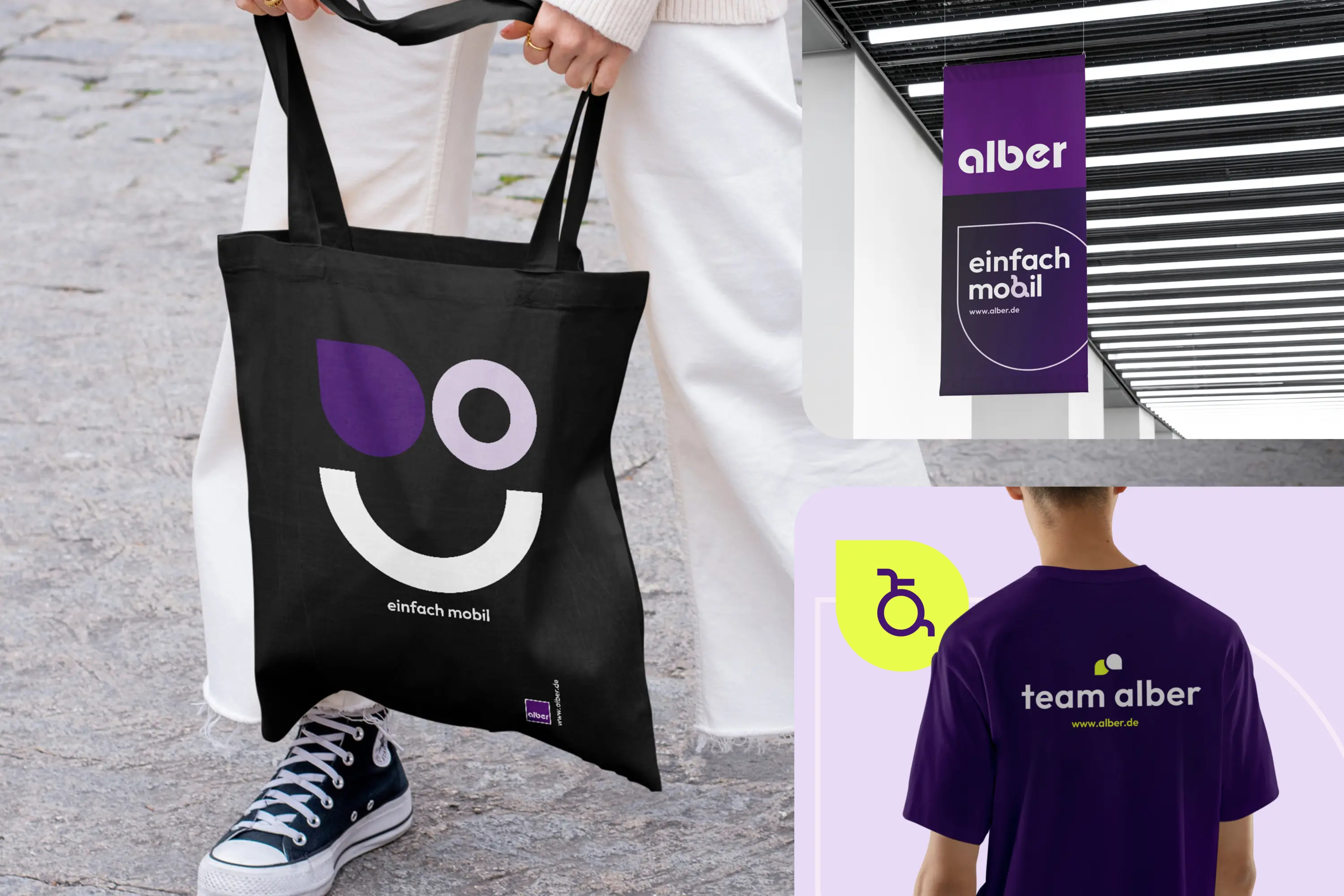
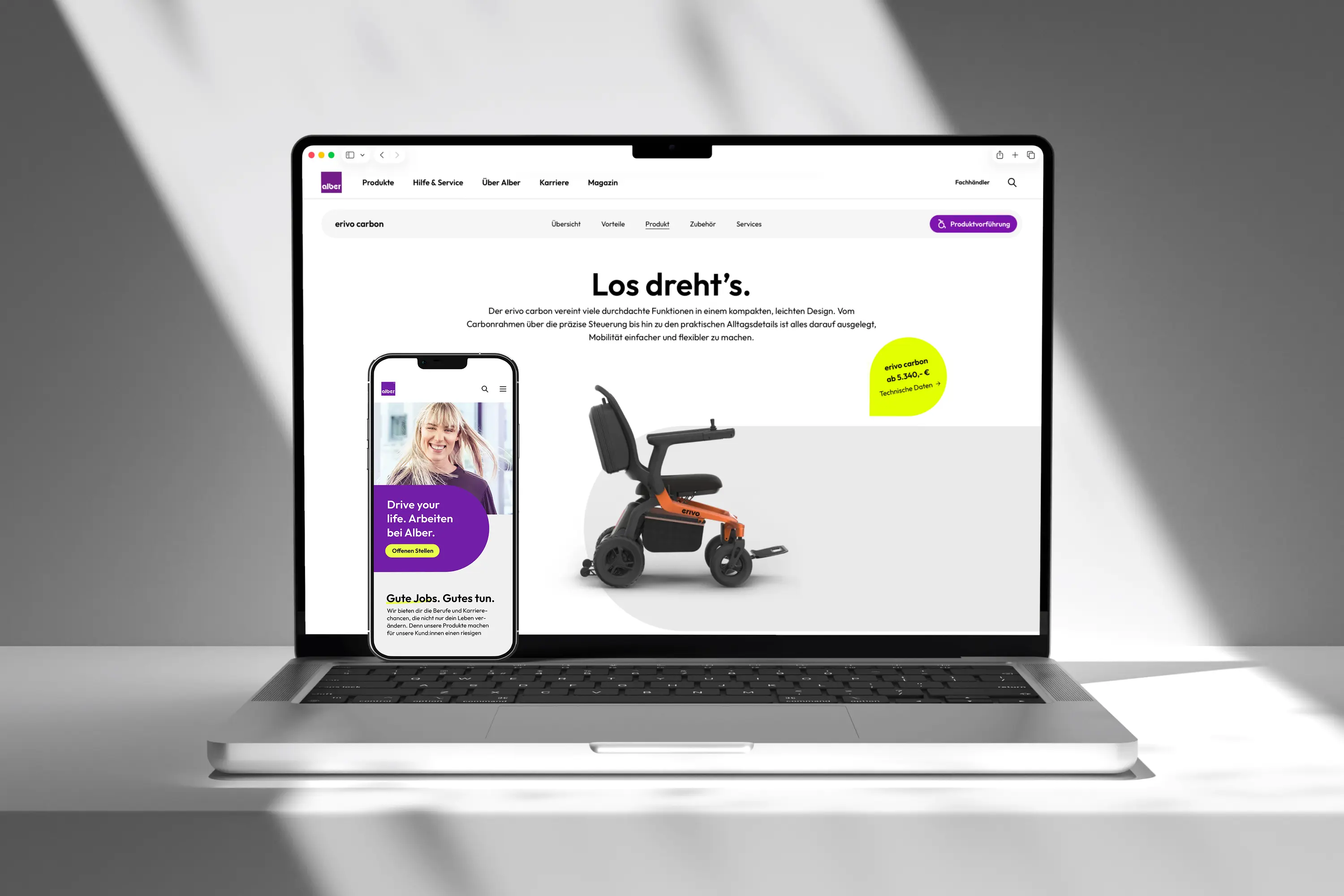
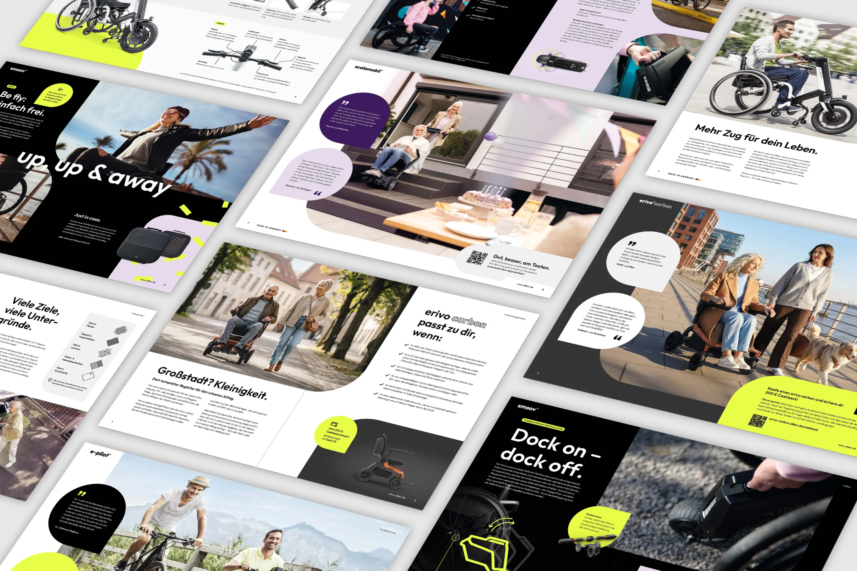
Alber’s new brand identity translates mobility, movement and the joy of living into a distinctive visual identity. It is built around three fundamental shapes derived from the logo and the idea of movement: the square, the “Alber-a” logo element, and the circle. Combined with the brand values of tech pioneering, trust, and enthusiasm, these elements form a flexible design system with a distinctive visual language. Individual motion patterns, colors, and tonalities give each product its own identity, while grids, typography, and a consistent use of shapes unite Alber as a strong and recognizable brand across all media.