Eurowings Brand Design
Winner
Excellent Communications Design
Brand Identity
Credits
Company / Customer
Details
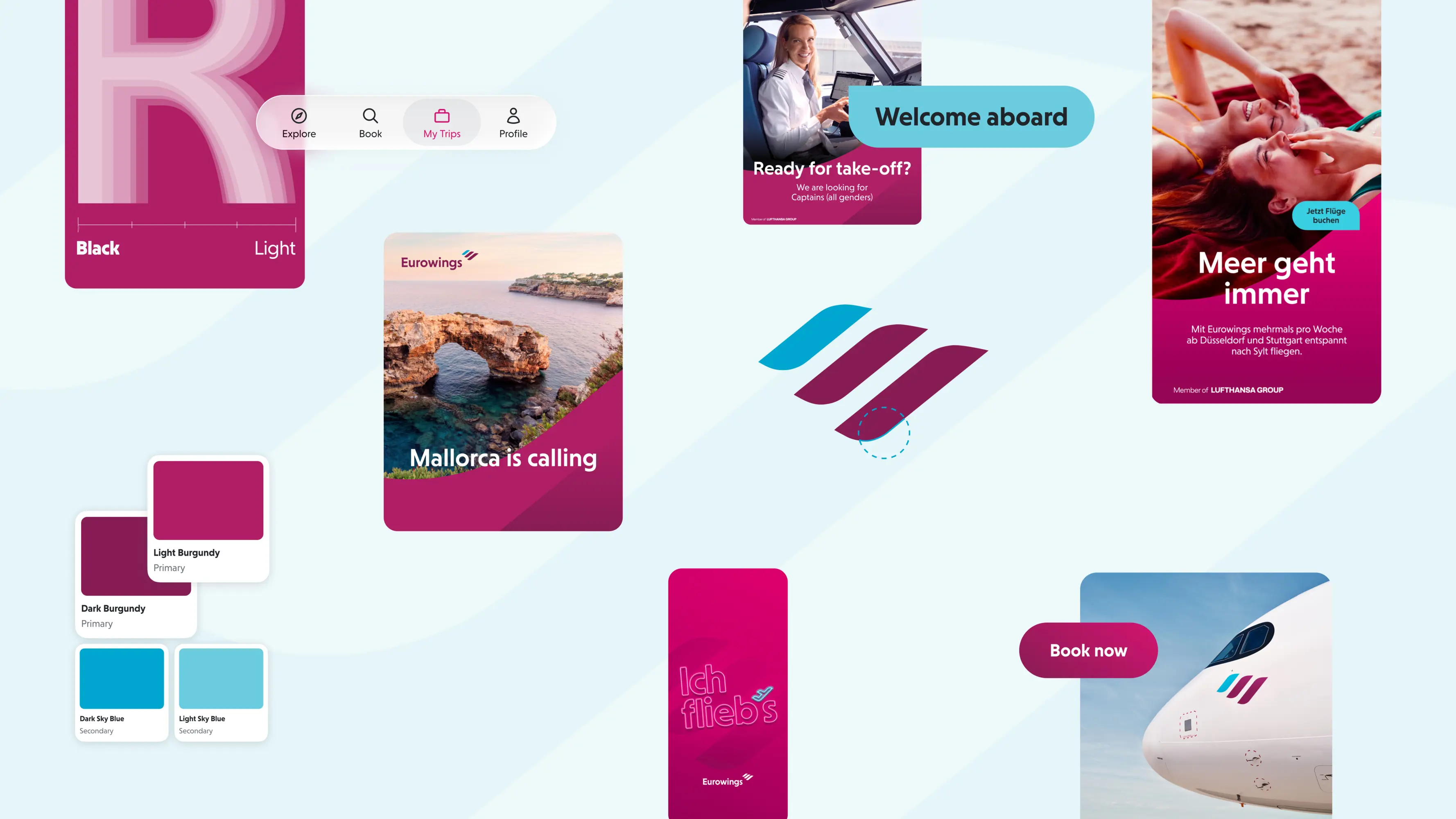
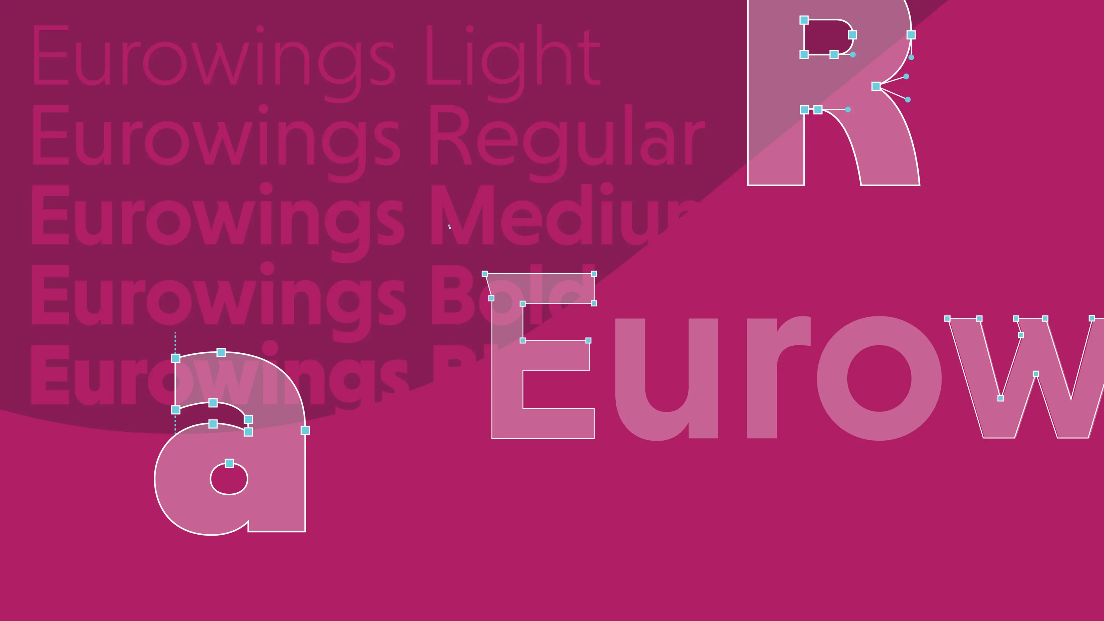
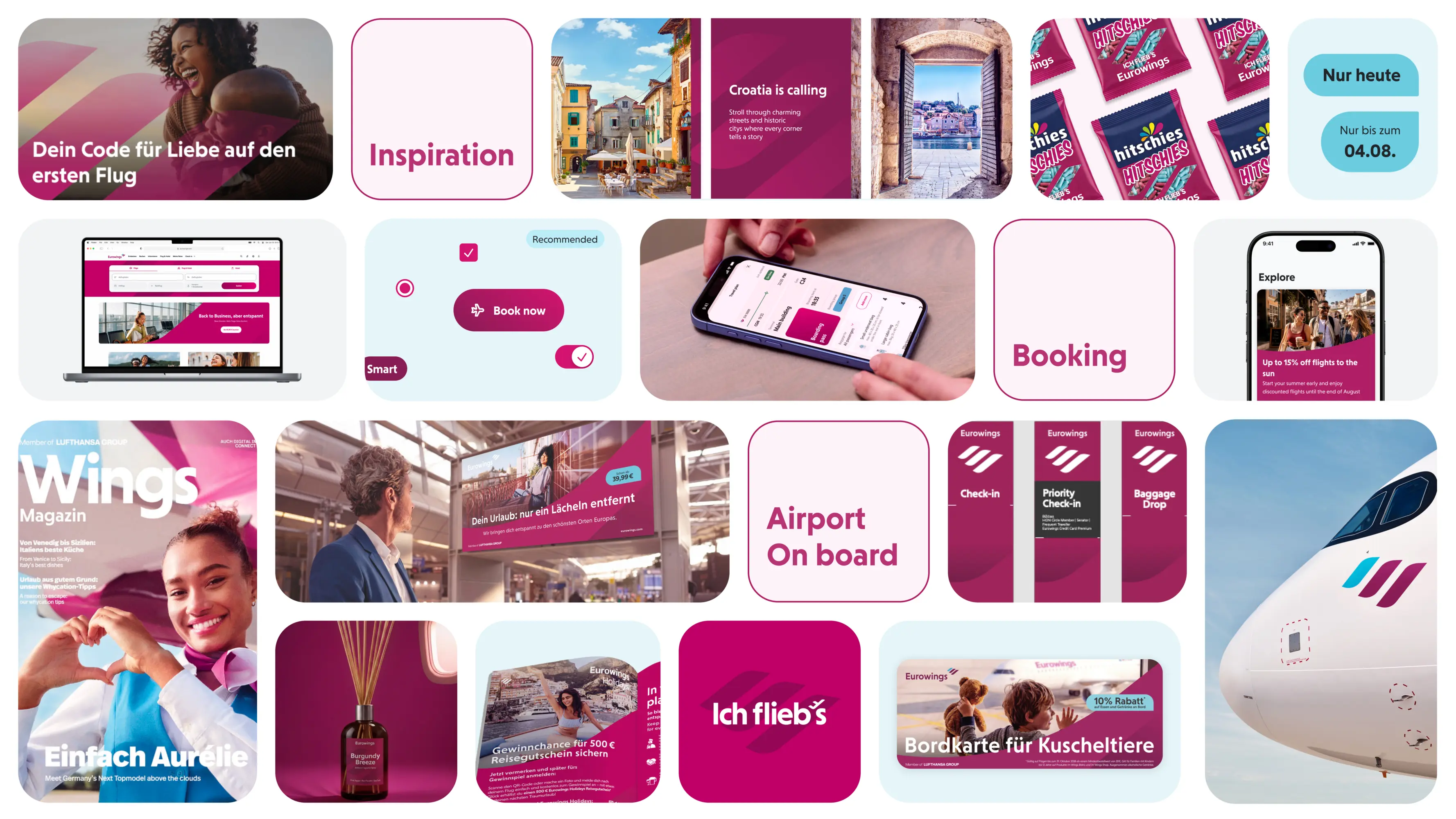
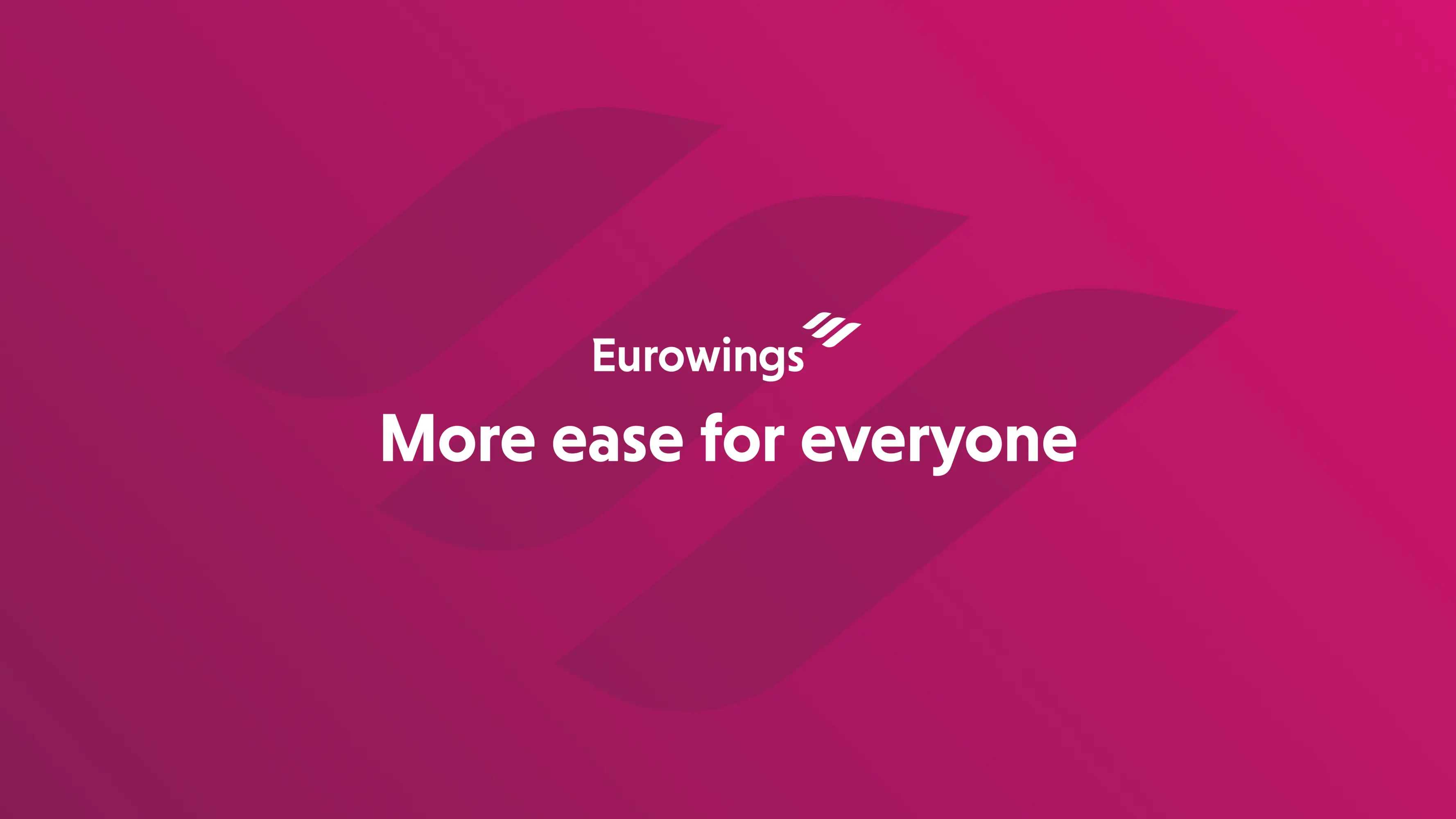
Eurowings stands for ‘More ease for everyone’. The new brand design translates this promise into a visual principle: making ease tangible through design. The iconic Power Wings become the defining design element. Sweeping forms, transparencies, gradients and dynamic scaling create movement, depth and openness. Dynamic typography combines character with clarity, while accessibility is embedded in the system from the outset. The result is a design for everyone – consistent across the entire customer journey, from digital applications into the aircraft itself.