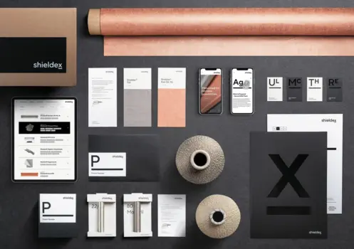
Kisling AG
Special Mention
Excellent Communications Design
Brand Identity
Details
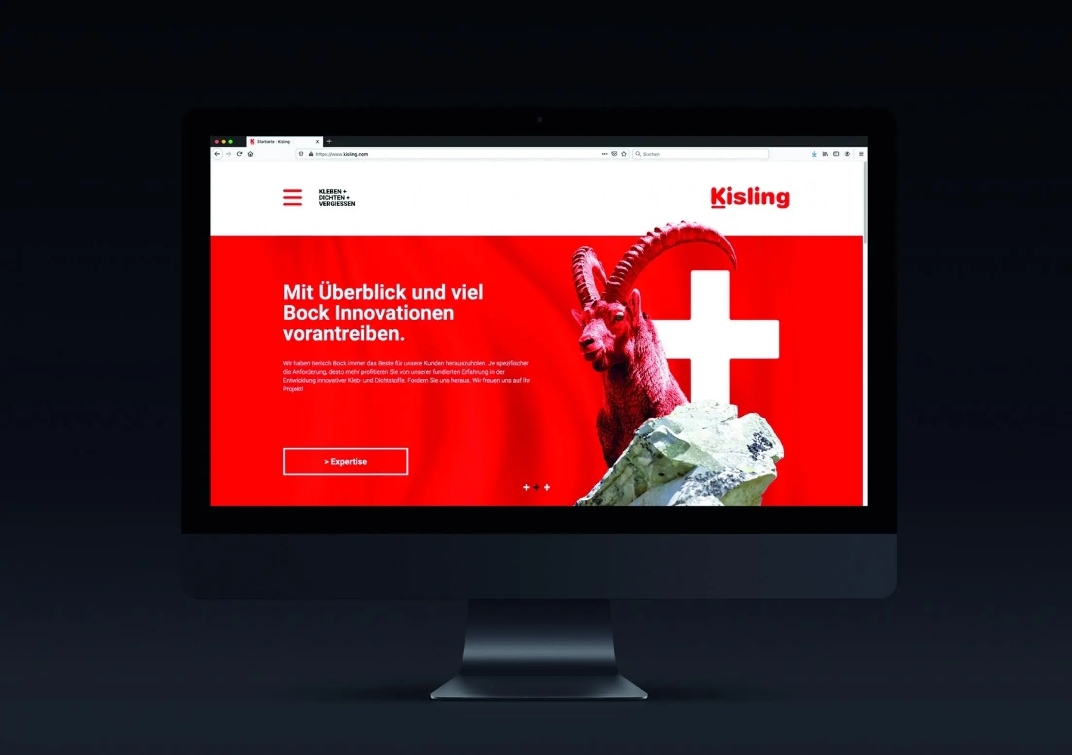
The corporate design for Kisling was fundamentally renewed. The focus is on the color red. On the one hand, this emphasizes the affiliation and proximity to the internationally renowned Würth Group, but also the Swiss origin with all its advantages such as experience and quality. In addition, the red ibex is a strong key visual that builds a bridge to the product world. After all, Kisling adhesives provide a firm hold even in difficult terrain.