Oktoberfest München
Special Mention
Excellent Communications Design
Brand Identity
Details
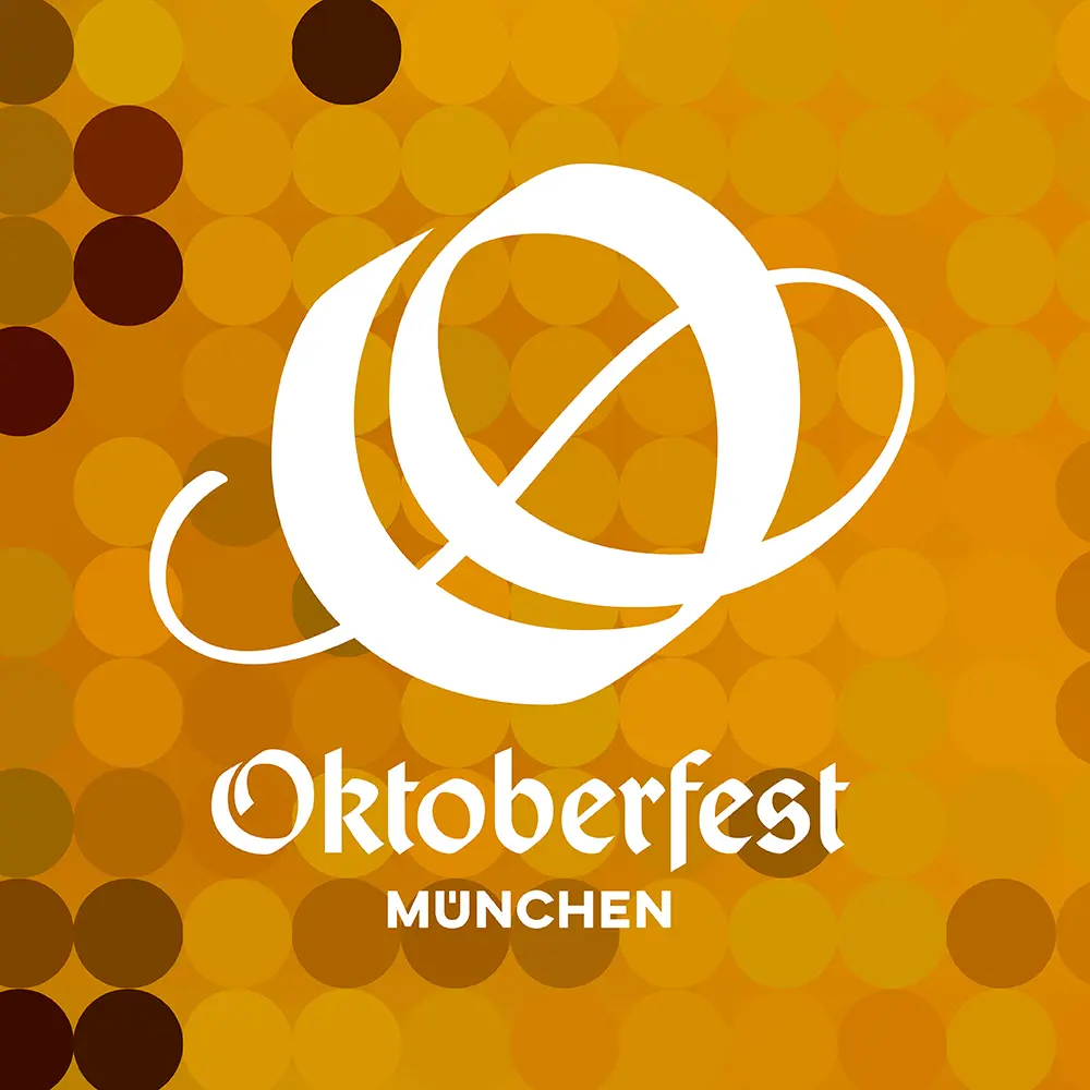
For the first time, a uniform visual identity is being developed for the Oktoberfest: an “O” initial is transformed into an iconic symbol, which is based off a Gothic script font. This font has been custom-made for the Oktoberfest to be modern and accessible, in particular also for international readers. Embedded in a modular design system that does justice to the high emotionality character of the event by graphically capturing the colorful nature of the festival.