Qingziyou
Special Mention
Excellent Communications Design
Brand Identity
Details
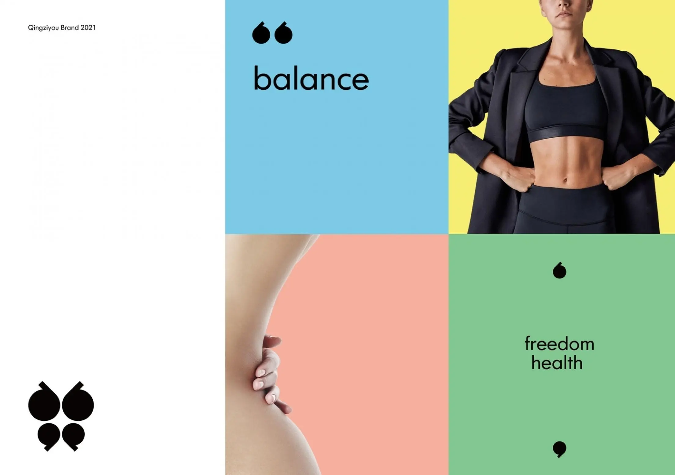
»Qingziyou« takes health as its core concept. Through its minimalist design language, the butterfly with its wings spreading out and flying freely, symbolizes beauty and freedom. Our creativity as a whole is in a state of axial symmetry, representing the core value of light freedom: balance. Balance is a healthy and unburdened way of shaping, an energetic mental state, and a relaxed and free lifestyle. The negative shape (logo center) is like a cross star, bursting with dazzling light.