apio pflege
Special Mention
Excellent Communications Design
Corporate Identity
Details
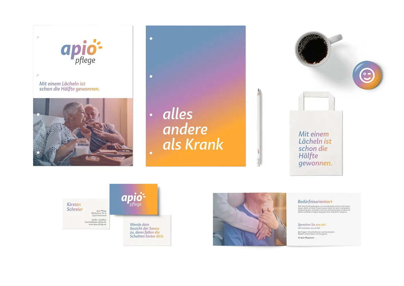
The branding of apio-care is colorful, unconventional and cheerful. That doesn't suit older sick people at all - does it? In principle, apio-pflege would like to use a different approach to communication. Instead of focusing on the illness and problems, the focus should be on health. Instead of emphasizing the negative, the focus should be forward. Positive "vibes" characterize the visuals to make this approach clear.
Colors, typography and images convey a bright image. Colorful healthy communication! Just everything else than sick. Because the direction is essential.
Colors, typography and images convey a bright image. Colorful healthy communication! Just everything else than sick. Because the direction is essential.