Namyangju City Brand Identity
Winner
Excellent Communications Design
Corporate Identity
Details
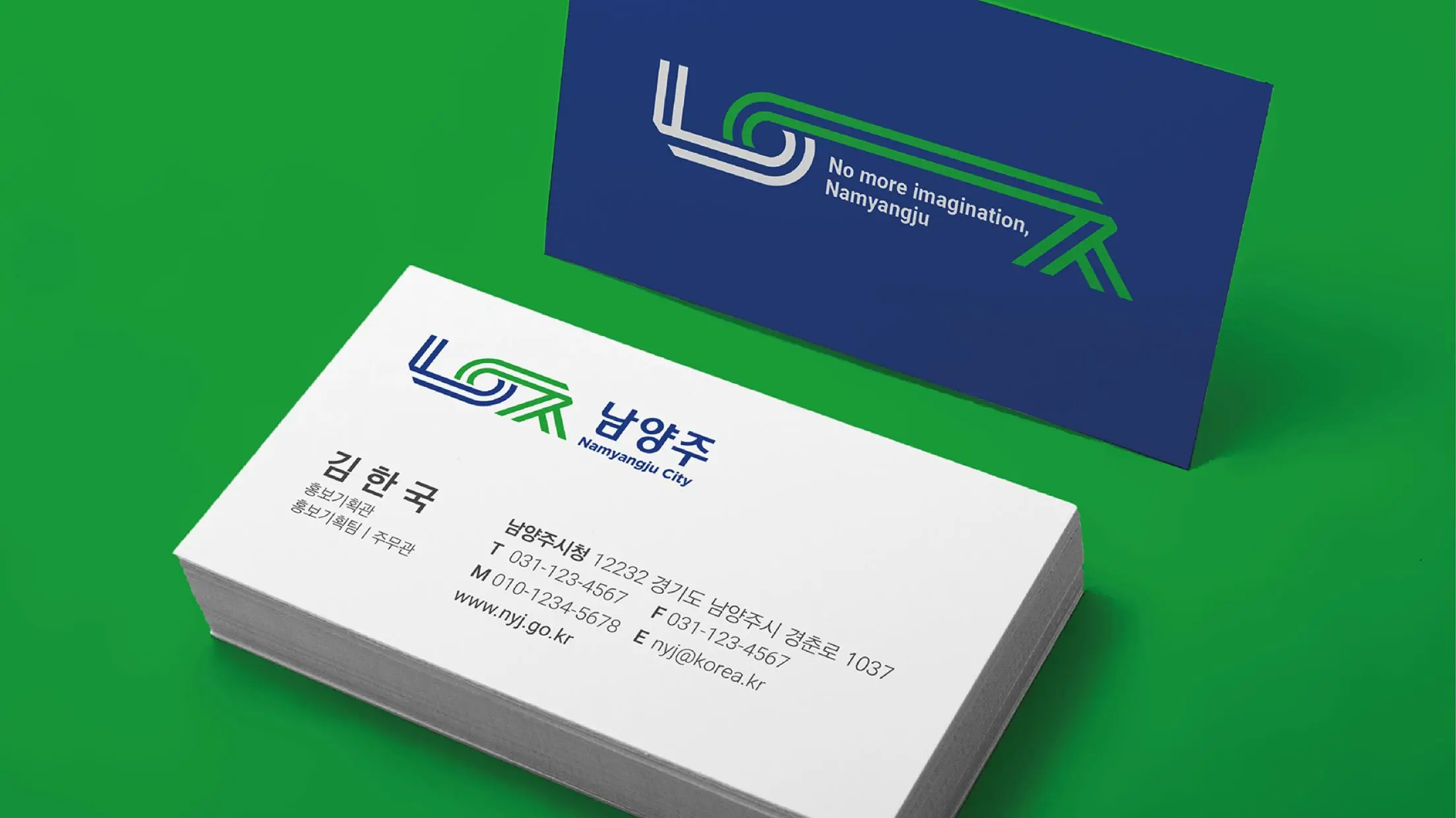
Namyangju is a city in Gyeonggi-do, South Korea, and is characterized by the harmony between nature and urban infrastructure. The CI design is based on the initial consonants of Namyangju’s Hangeul, with the concept of ‘openness and connection’. Through images connected by a single line, it means ‘connection’ between nature and technology, today and tomorrow, and people and cities. Green symbolizes clean nature and blue symbolizes an open future.
The Jury‘s Statement
The corporate design for the South Korean city of Namyangju graphically manifests the harmonious connection between city and nature. A wonderfully light and lively design that conveys a positive mood.