Rebranding EASY SOFTWARE AG
Winner
Excellent Communications Design
Corporate Identity
Details
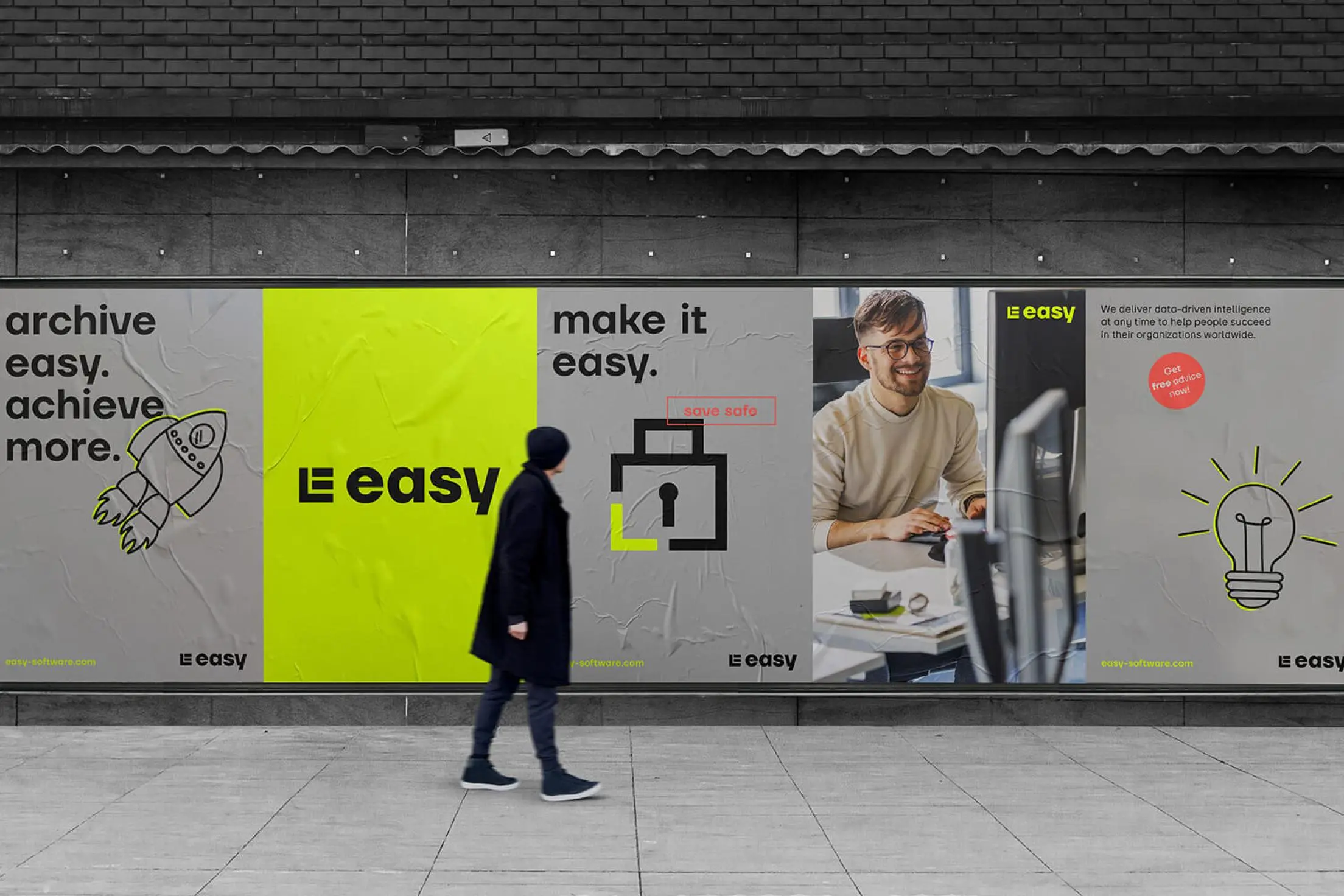
As a leading ECM software manufacturer, easy has stood for digital archiving since 1990. 31M developed a completely revised corporate design based on the vision "We are the pulsating data heart for the most successful companies". The neon colour easy Pulse Glow determines the activating colour world and the stylized E represents a data cube, which develops into an independent image world in 3D visuals. The corporate type "easy head" underlines the digital impression.
The Jury‘s Statement
EASY SOFTWARE convinces with a modern and clearly designed appearance, which has a high degree of attention and recognisability due to the neon-coloured key colour. The appearance is complemented by a high-quality image world, which supports the emotional appeal in a sympathetic way.