Cross Culture N° 6
Winner
Excellent Communications Design
Editorial
Details
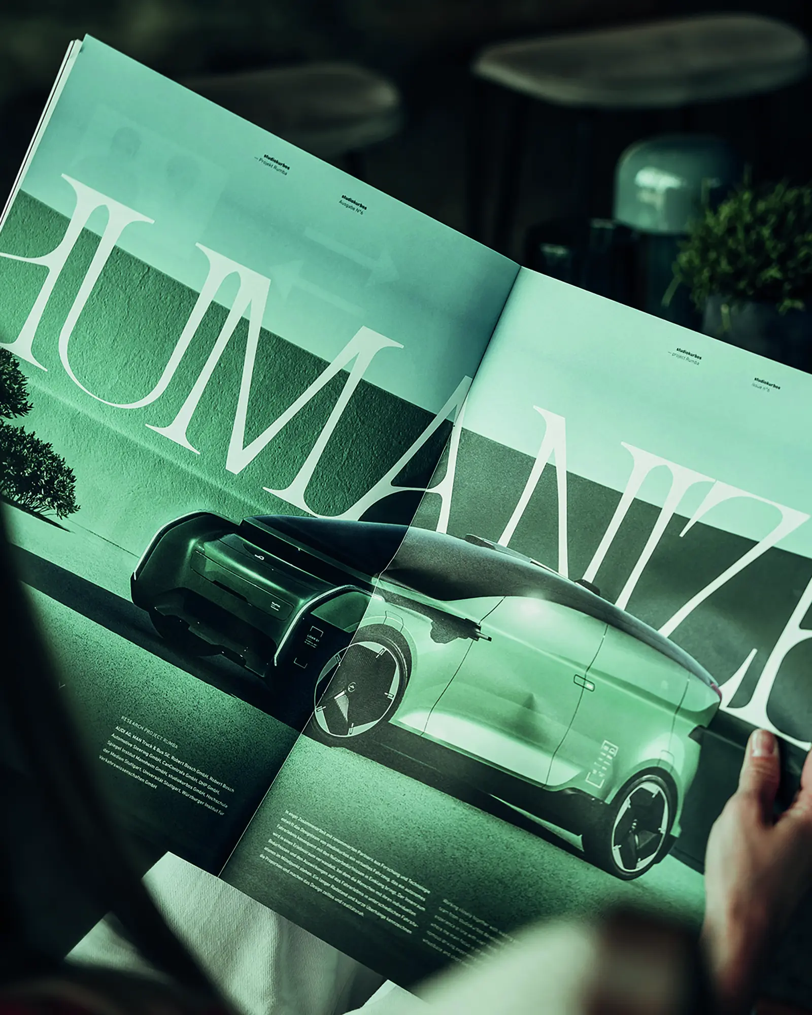
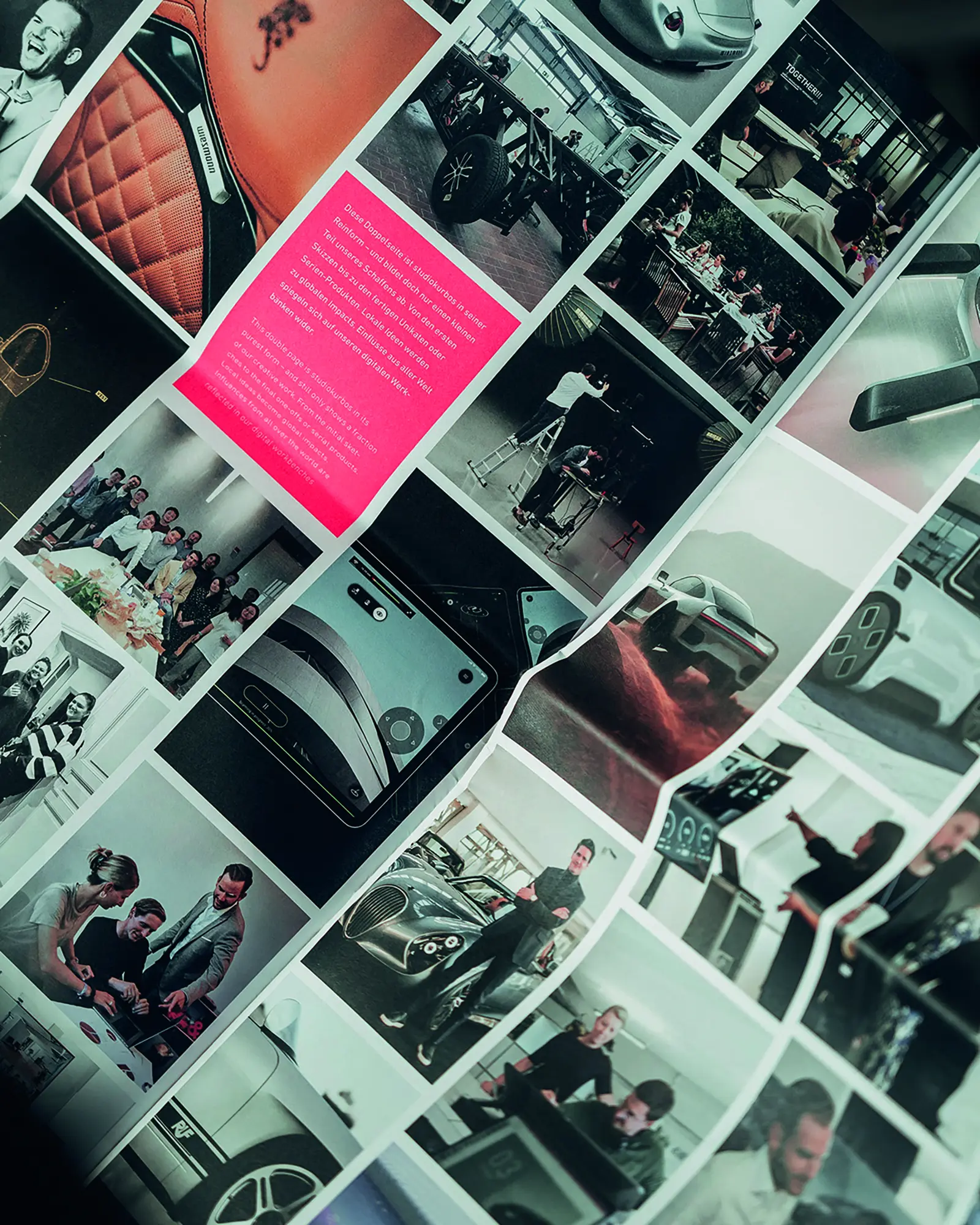
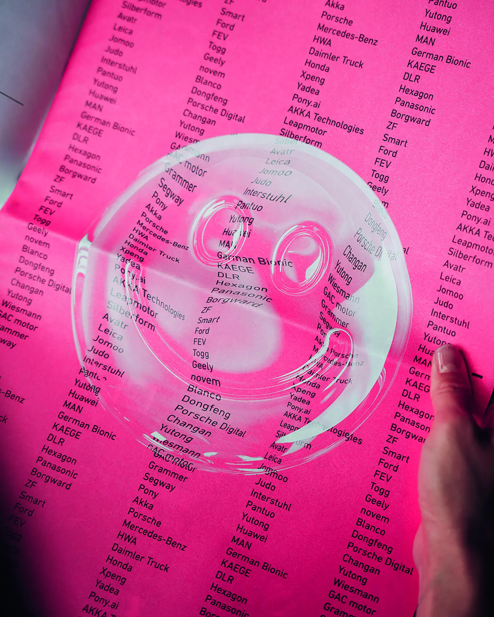
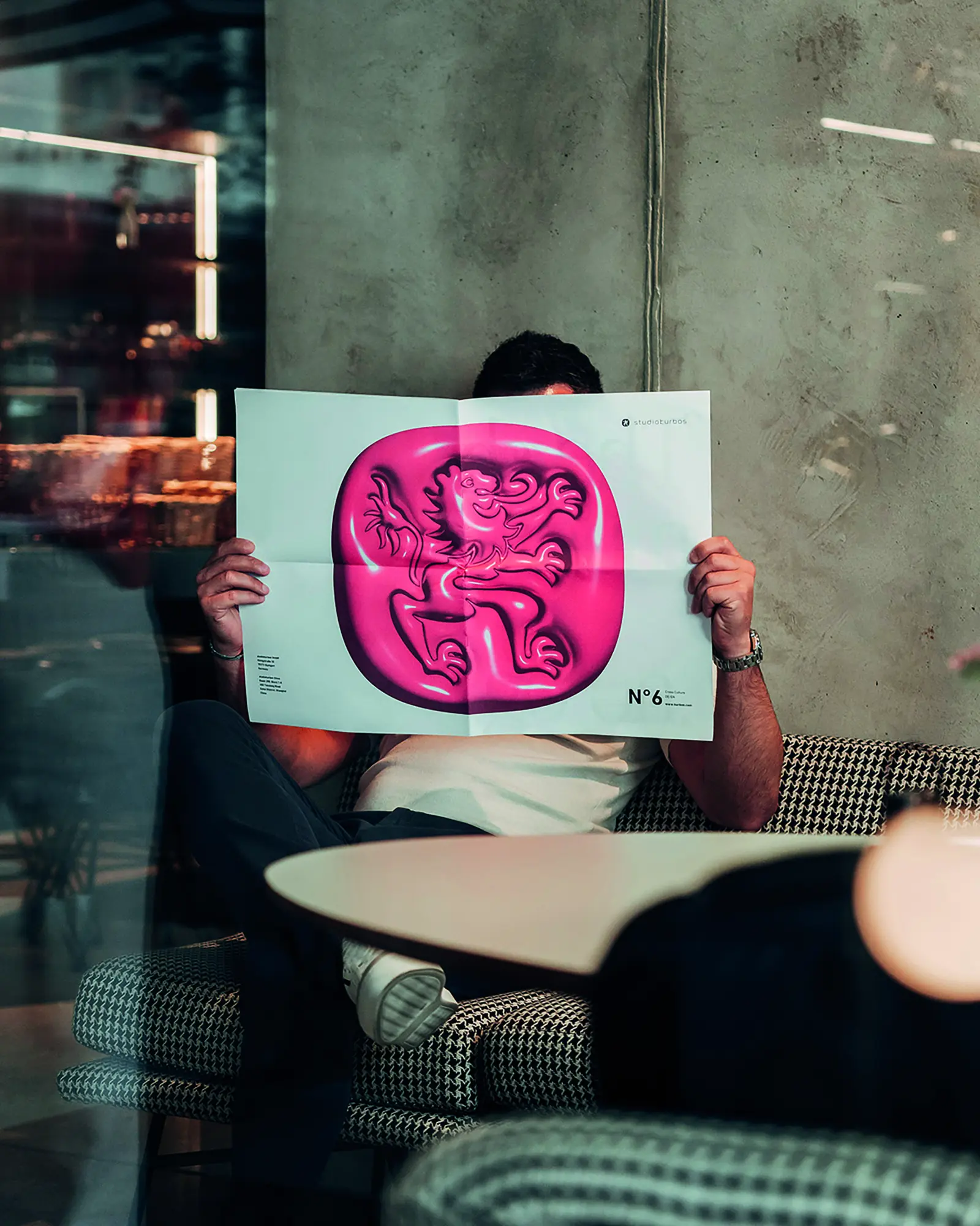
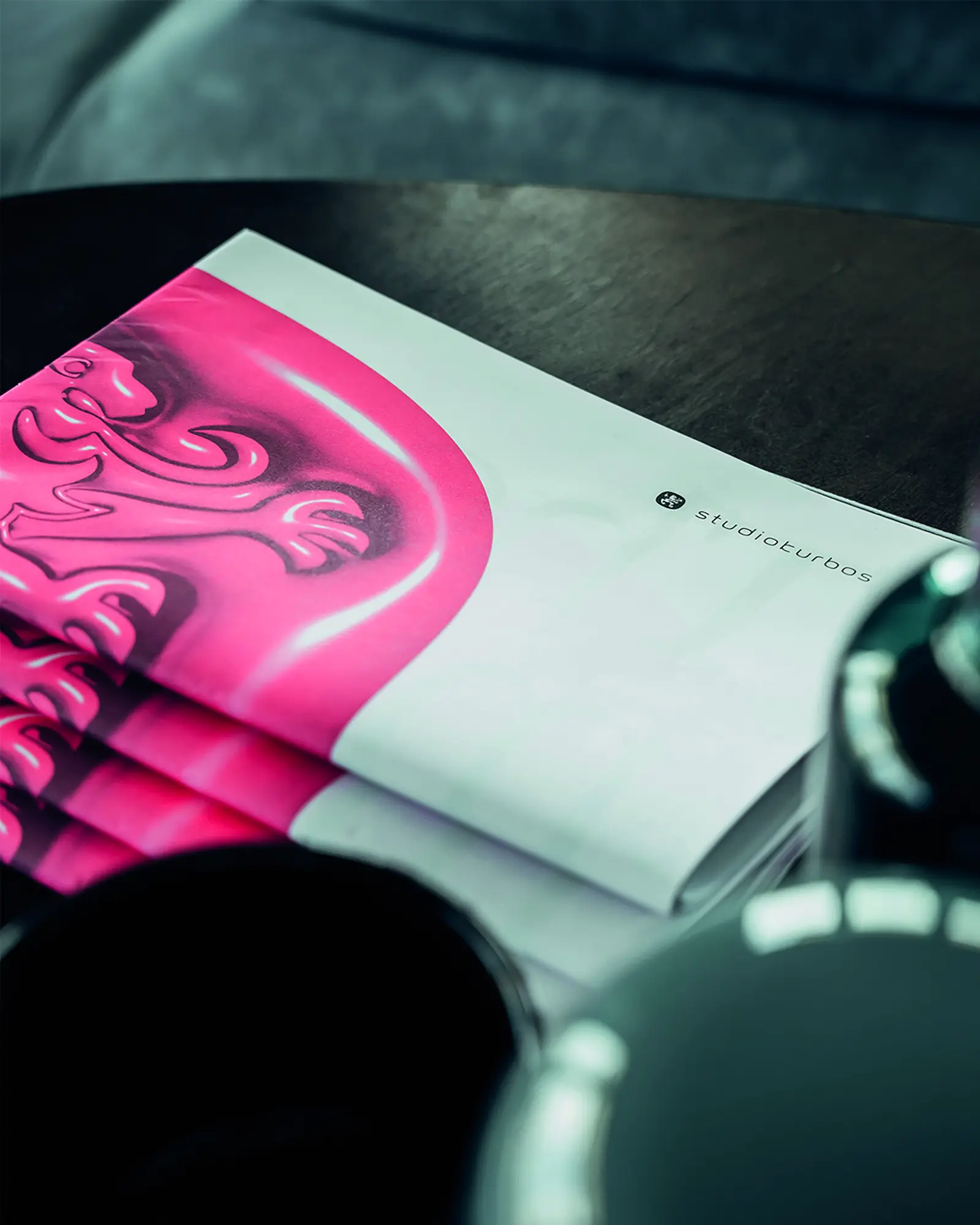
For many years, studiokurbos has published the studiokurbos magazine for clients and partners at different intervals, a large-format print statement: What we do, where we are, where we're headed. Each issue, based on our timeless corporate design created by Hochburg, is unique and combines studiokurbos' visual style and spirit. Our iconic lion emblem looking toward the future and the striking neon pink come together in issue N°6 with our biggest motivator: Cross Culture.
The Jury‘s Statement
The subtle interplay of distinctive color and iconic imagery makes »Cross Culture N° 6« a striking statement. Neon pink and the forward-looking heraldic lion create an identity-defining, charismatic atmosphere. The consistent application of the corporate design gives the magazine a clear and unmistakable signature. Particularly outstanding is the bold handling of thematic diversity and typography, which sets benchmarks for excellence in editorial projects both visually and conceptually.