Vogelschau
Winner
Excellent Communications Design
Packaging
Details
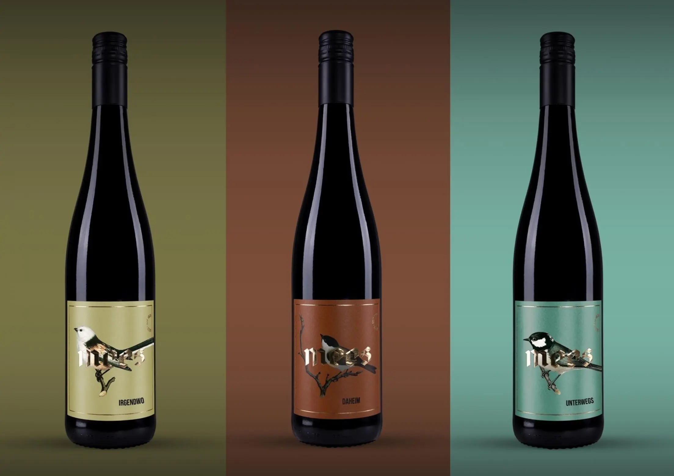
We were allowed to accompany the generation change of the familyrun traditional winery »Mees« from the Nahe with a new wine series. The aim of the new development was to achieve a striking long-distance effect for the trade and to stand out among the other wines. Pictorial brand concepts work wonders. For us, therefore, picking up the distinctive family name and the graphic implementation of the titmouse was obvious. The labels therefore show different hand-drawn titmice from an ornithology book.