ATRESMEDIA | ANTENA3 REBRANDING
Winner
Excellent Communications Design
Audiovisual

Details
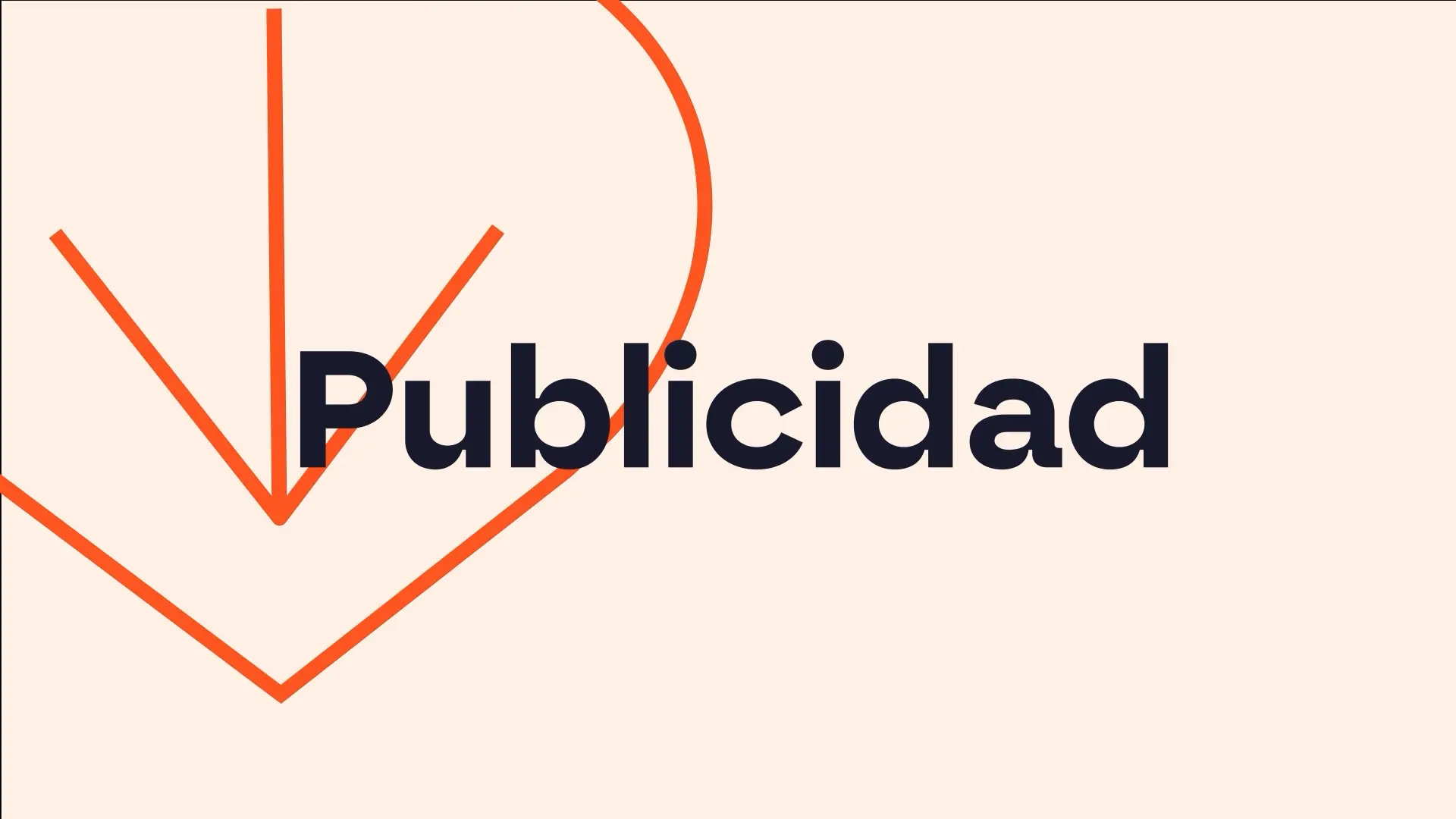
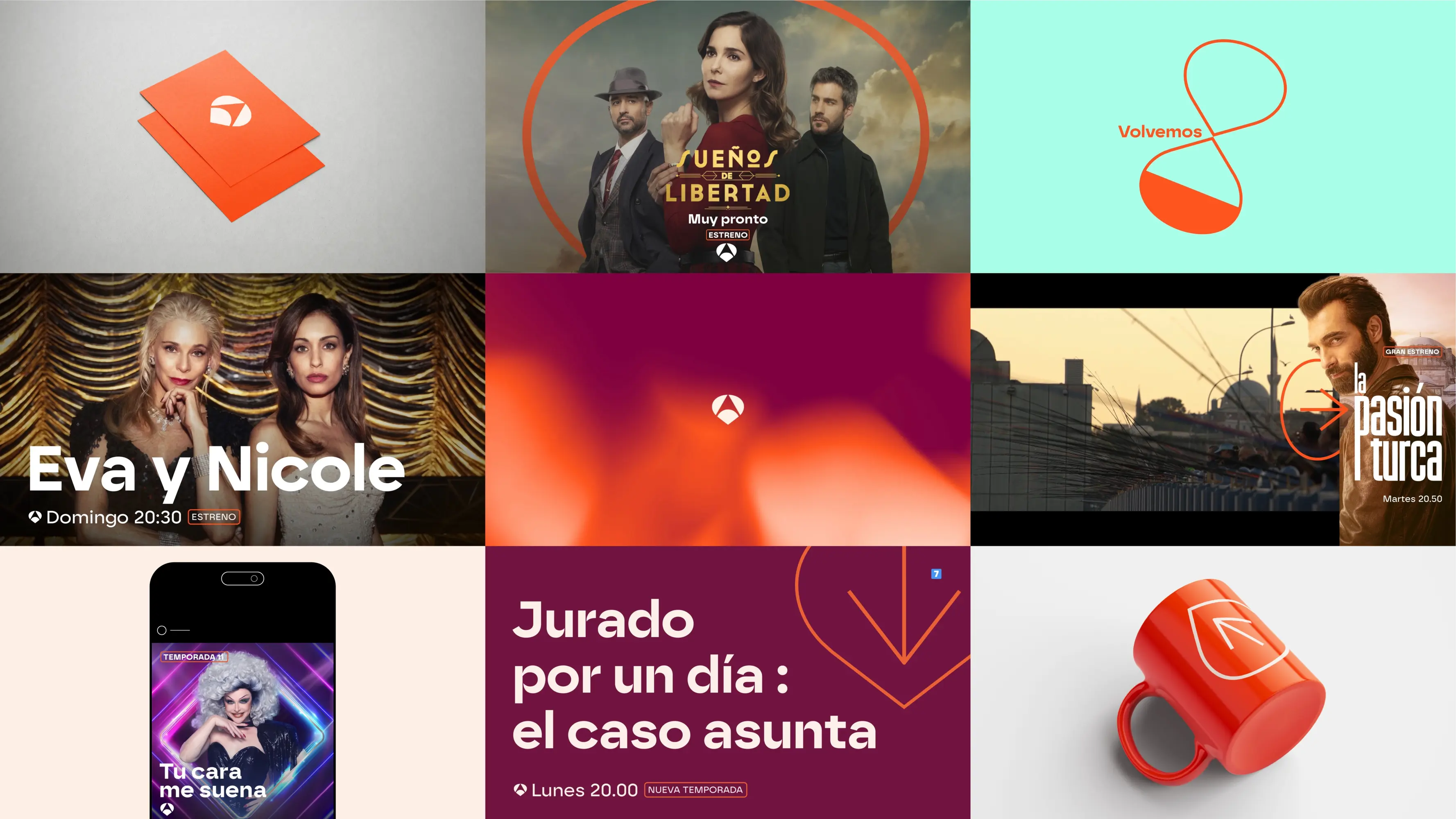
After years of leading Spain’s TV market, Antena3 was ready to embrace a more streamlined yet dynamic identity. Drawing inspiration from elements within their logo, we’ve crafted a visual grammar that reflects the diversity and richness of their content. The shape of la púa (the pick) arose as a key new element. La púa is now the multifunctional and recognizable symbol of the channel, acting as both a guide through commercial breaks and a brand identifier used next to the channel name or as a standalone logo. With a refreshed logo, updated typography, and a vibrant new colour palette, the channel marks a bold new chapter in its iconic journey.
The Jury‘s Statement
The consistent focus on the charismatic »púa« gives »ATRESMEDIA | ANTENA3 REBRANDING« a distinctive visual identity. Striking typography, vibrant colors and an iconic logo merge into an authentic brand world. Particularly impressive: the visual language conveys diversity and depth with ease, making this achievement truly deserving of the highest distinction.