Arrival Training
Winner
Excellent Communications Design
Brand Identity
Details
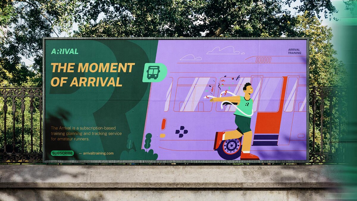
Arrival is an online training planner and tracking service for amateur runners. The logotype visually hints at the duality of the wordplay between "Arrival" and "A Rival”, through the positive-negative trick of the "R" letter. The slanted typography adds dynamism and movement to the design. The unique angle of the logotype is reflected across the visual identity, determining the illustration style, the structure of icons, and the layout arrangements. The graphic element set not only ensures a coherent appearance but also lends a distinctive visual language to the brand.
The Jury‘s Statement
The brand identity for "Arrival", an online training planner and tracker for amateur runners, plays with the similarity between "Arrival" and "Rivale" in a formally and typographically sophisticated way. The dynamic angle in the design is consistently reflected throughout the visual language, giving the brand an unmistakable identity.