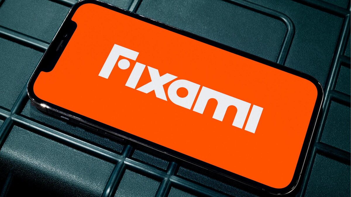
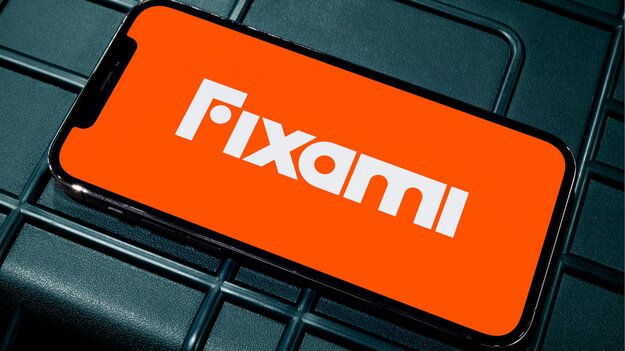
Fixami - An eye for detail
Winner
Excellent Communications Design
Brand Identity
Details
‘Creating better’ is at the core of Fixami’s new and rich brand identity that fully focusses on catering clients online. The Dutch word ‚Timmermansoog‘, the so-called carpenter's eye, is the base of the visual identity. The one who wields the tool, knows what he or she is doing and is owning the workspace. Resulting in a solid wordmark that contains the face and eye of the professional wielding the tools. This way the logo is both strong and friendly. And a layout system that reflects the workshop space: For every task, a flexible setup.
The Jury‘s Statement
The brand identity of »Fixami - An eye for detail« impresses with its clever integration of visual precision and functional design. The concept of the carpenter's eye symbolizes expertise and trust, while the flexible layout system reflects adaptability to various customer needs. This results in an inviting and professional brand presence.