Gebrüder Schulte Marken-Relaunch
Winner
Excellent Communications Design
Brand Identity
Details
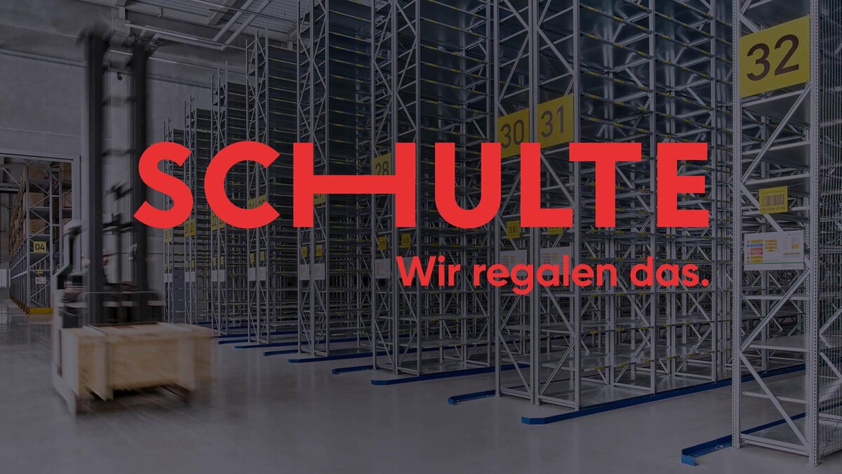
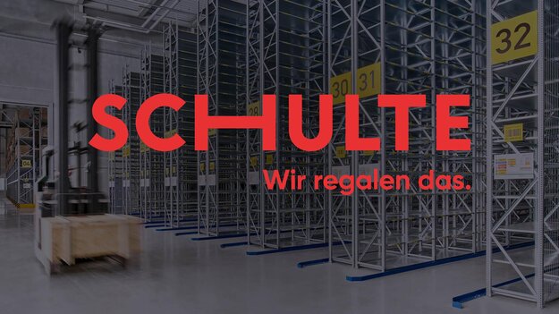
Gebrüder Schulte, a traditional shelving manufacturer from Sauerland, has stood for quality, sophisticated storage concepts for over 100 years. As a sign of innovative strength and courage to change, brand positioning and corporate image were reimagined. The new SCHULTE logo visibly represents freedom and flexibility as brand values. The claim "We shelf it" articulates SCHULTE's new self-confidence as an independent brand message. The new corporate design visualizes the clarity and flexibility of SCHULTE shelving systems through a basic grid of "Spaces" - the free space between the shelving compartments: geometric, modular, and clear.
The Jury‘s Statement
The brand relaunch impressively demonstrates how tradition and modernity can be harmoniously combined. The clear design of the signet and the flexible use of spaces create a contemporary brand image. The confident claim effectively communicates the new identity as a powerful message.