Yongsan Children's Garden Brand Identity
Winner
Excellent Communications Design
Brand Identity
Credits
Company / Customer
Designer
Details
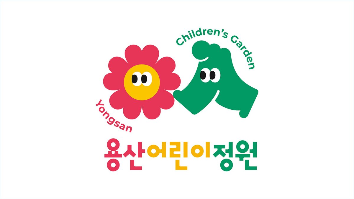
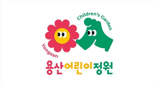
Yongsan Children's Garden is located in Yongsan-gu, Seoul, South Korea. It was a 'forbidden land' where Japanese troops were stationed after 1904, and has been used as a US military base since Korea's liberation, but it was opened to the public in approximately 120 years and transformed into a garden. The new logo is based on the initial Korean letters. The symbol, which is given 'eyes', symbolises a child full of curiosity. By combining the 'flowers' and the 'steps' of children playing in the garden, we expressed that life blossoms beautifully through the garden and that children's futures will blossom.
The Jury‘s Statement
The brand identity of Yongsan Children's Garden seamlessly blends historical depth with childlike curiosity. Inspired by the initial Korean letter, the logo incorporates eyes as a symbol of exploration, combined with floral elements reflecting the blossoming of children. This visual storytelling creates an emotional connection that honors both the past and future of the site.