Becherovka Fruits and Herbs Liqueur
Special Mention
Excellent Communications Design
Brand Identity
Details
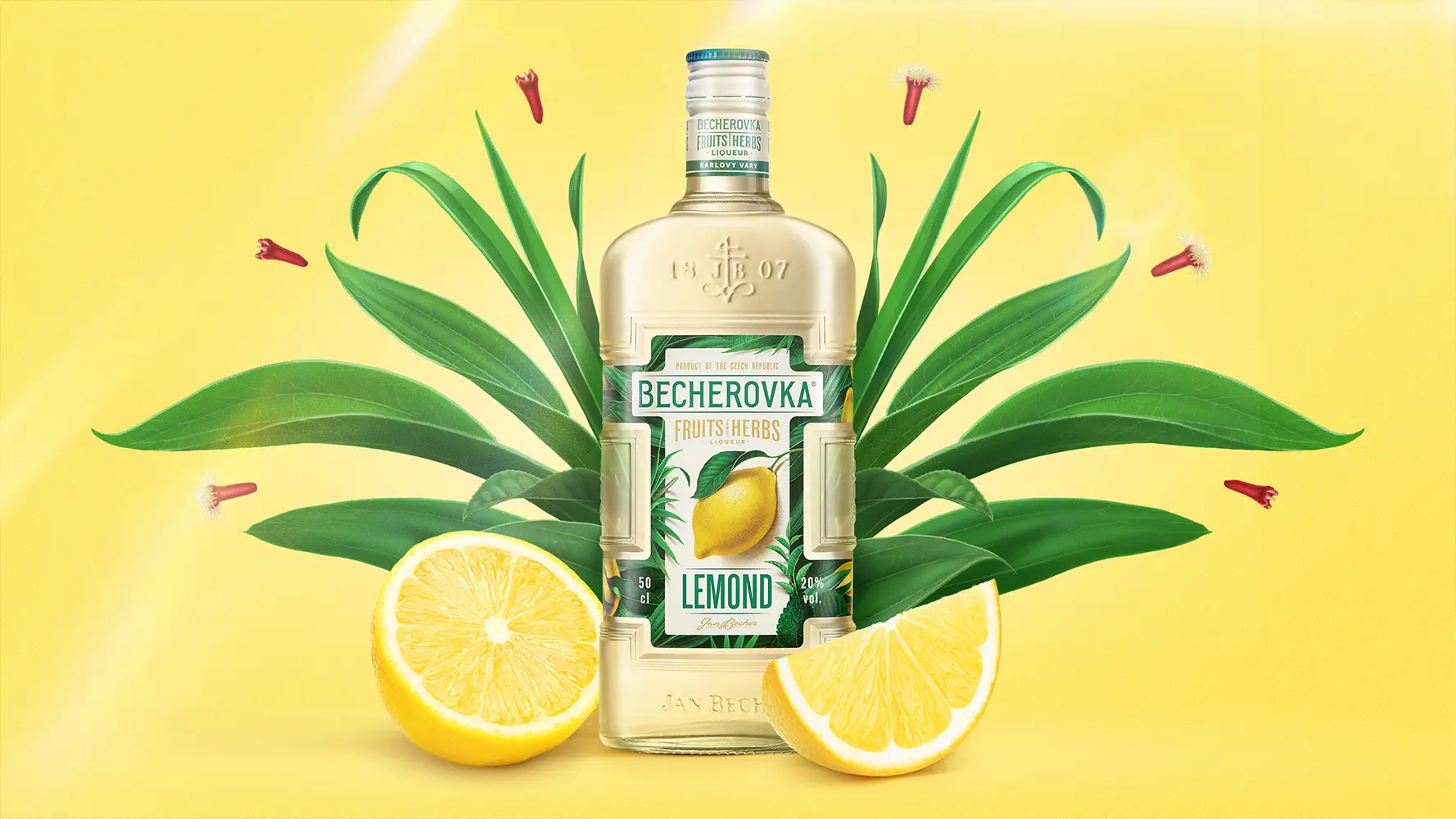
A soft, yet full beige colour was selected as the base. Focus on flavour and juiciness was the reason the zesty lemon became the hero of the label. Yellow brings freshness, and neutral green tones represent the herbal aspect and help create label contrast. The illustration style was a selected tool to express naturalness with a modern look. Fruits and herbs were digitally crafted to help compose a frame-like composition on the label and allow playful and flexible identity.