goetel
Winner
Excellent Communications Design
Brand Identity
Details
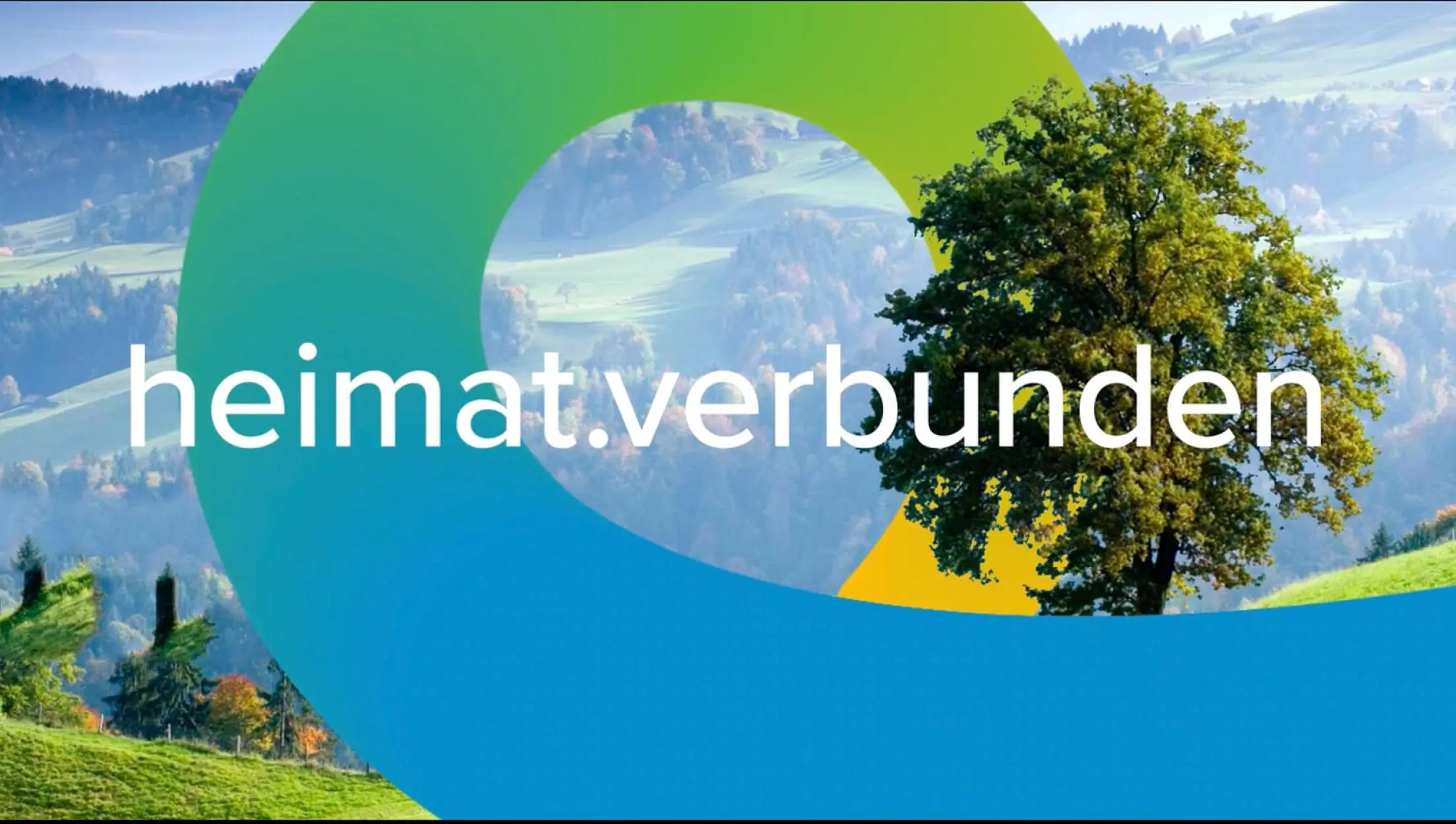
Task: Repositioning of the goetel brand The new claim tells what goetel is and what it does: heimat.verbunden. Connecting the home region and being connected to it. The logo with the concise style of the "oe" shows what goetel does: creating connections. And it shows how goetel is: friendly, open and approachable. The striking "loop" shows what goetel is all about: making fast connections. In the center of it is always the most important thing: the customers or the offer to them.
The Jury‘s Statement
With the catchy claim "heimat.verbunden", the new identity of the fibre-optic operator goetel combines regionality and fast high-tech communication. The appearance succeeded in being emphatically friendly and modern in form, colour and tonality and creates a sympathetically open and approachable closeness.