wecare agentur
Winner
Excellent Communications Design
Brand Identity
Details
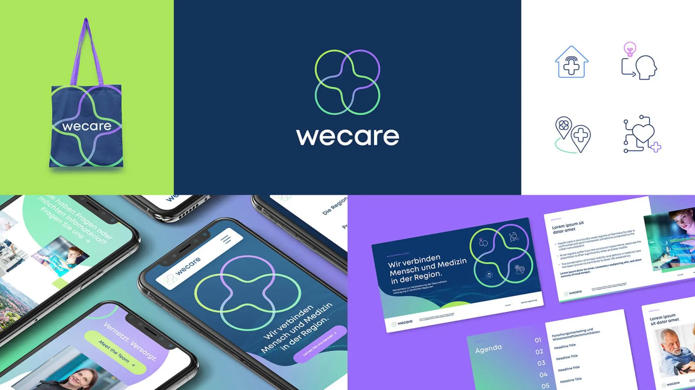
wecare connects health care providers and innovator, patients and relevant actors in the structurally weak regions of Thuringia in order to establish comprehensive health care. The logo shows two overlapping merged pairs of circles and visualizes with its modern gradient colours the connection of network, development, progress and future and through the cross the medical orientation. The geometric font Mont underlines the emotional communication.
The Jury‘s Statement
The newly developed logo comprehensibly unites the four target groups - medical service providers, innovators, patients, relevant stakeholders - in four overlapping circles. The resulting cross also refers to the medical theme. A design that is as ingenious as it is modern and highly recognisable.