Neuer Markenauftritt der Deutschen Post
Special Mention
Excellent Communications Design
Brand Identity
Details
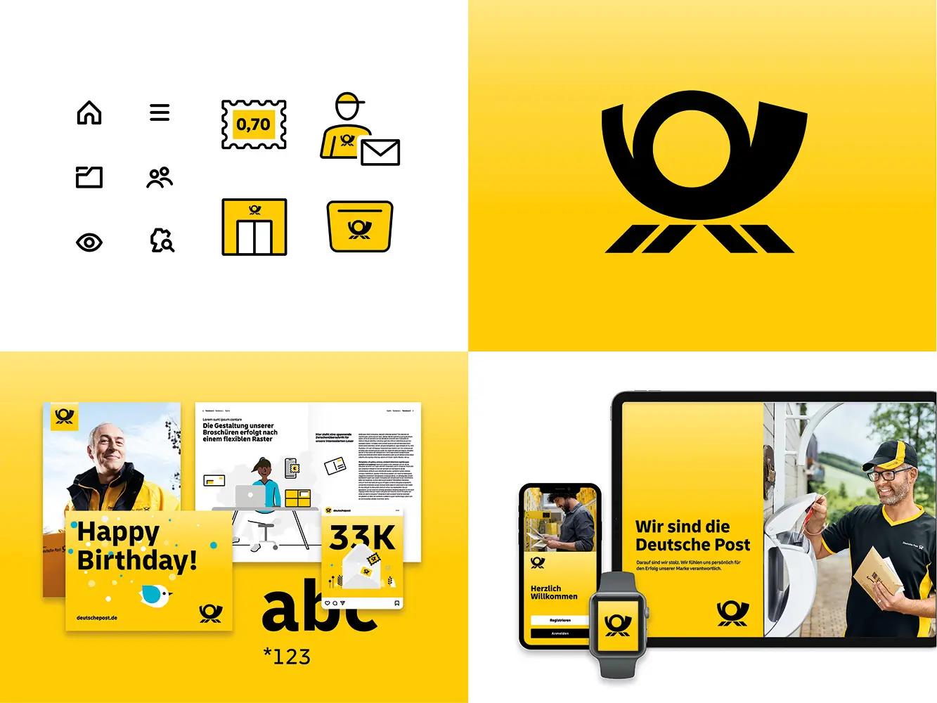
With the CD refresh, Deutsche Post is moving away from the wordmark to focus on the iconic posthorn as a super-sign. The new look is striking, clean and modern. The new approach to typography, a flexible layout principle, memorable extras such as (persona-) illustrations, pictograms or the new additional color mint ensure liveliness. In digital media, the brand is well-positioned with guidelines and toolkits within the areas of UI, motion and social media.