Durstone Branding
Winner
Excellent Communications Design
Corporate Identity
Details
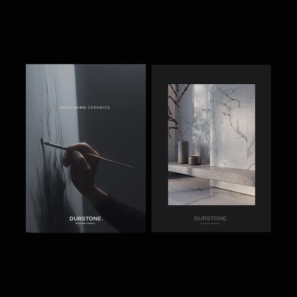
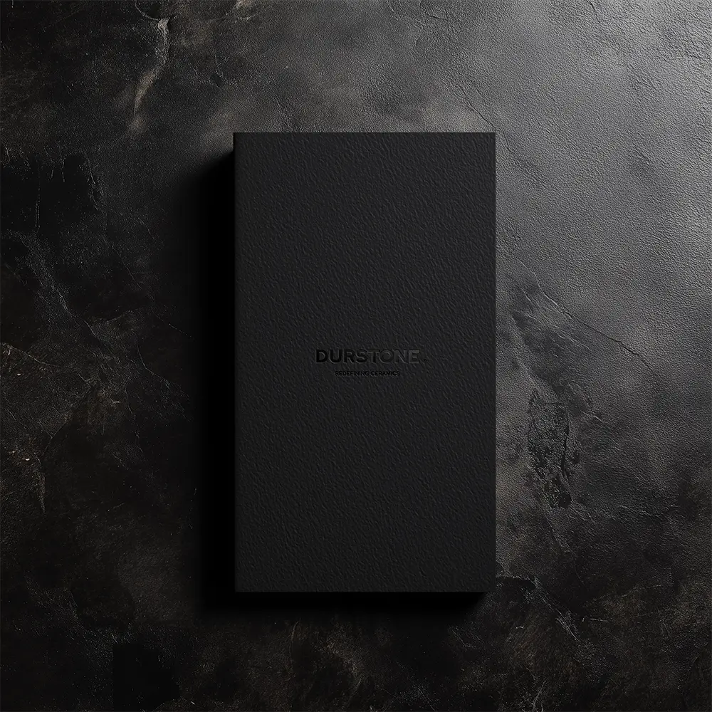
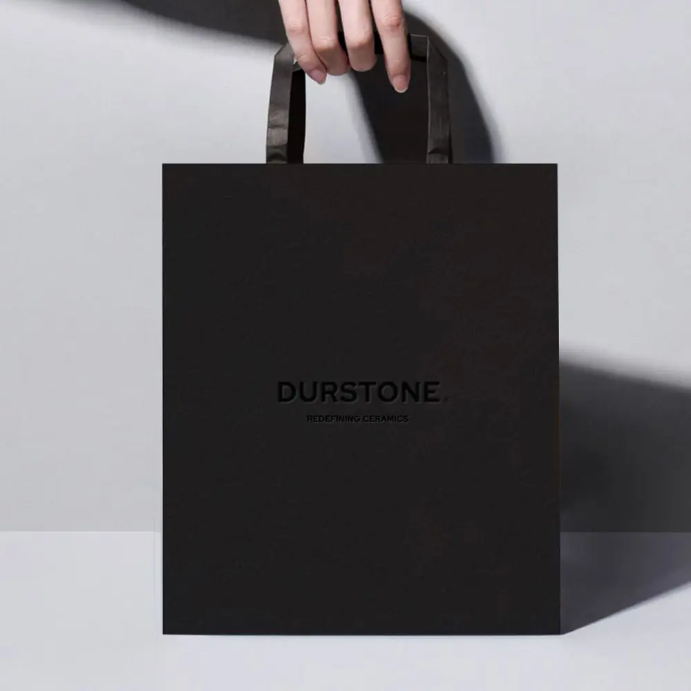
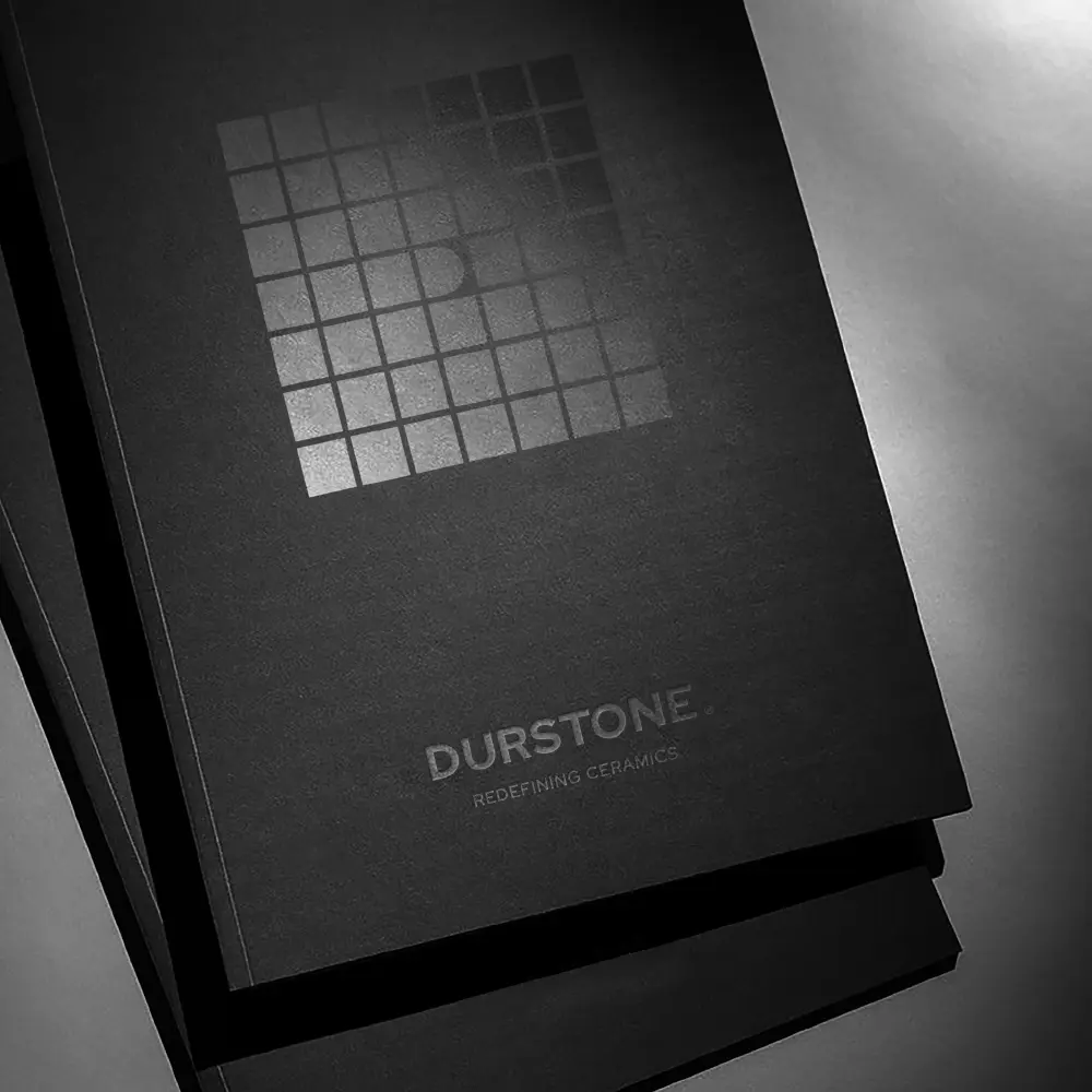
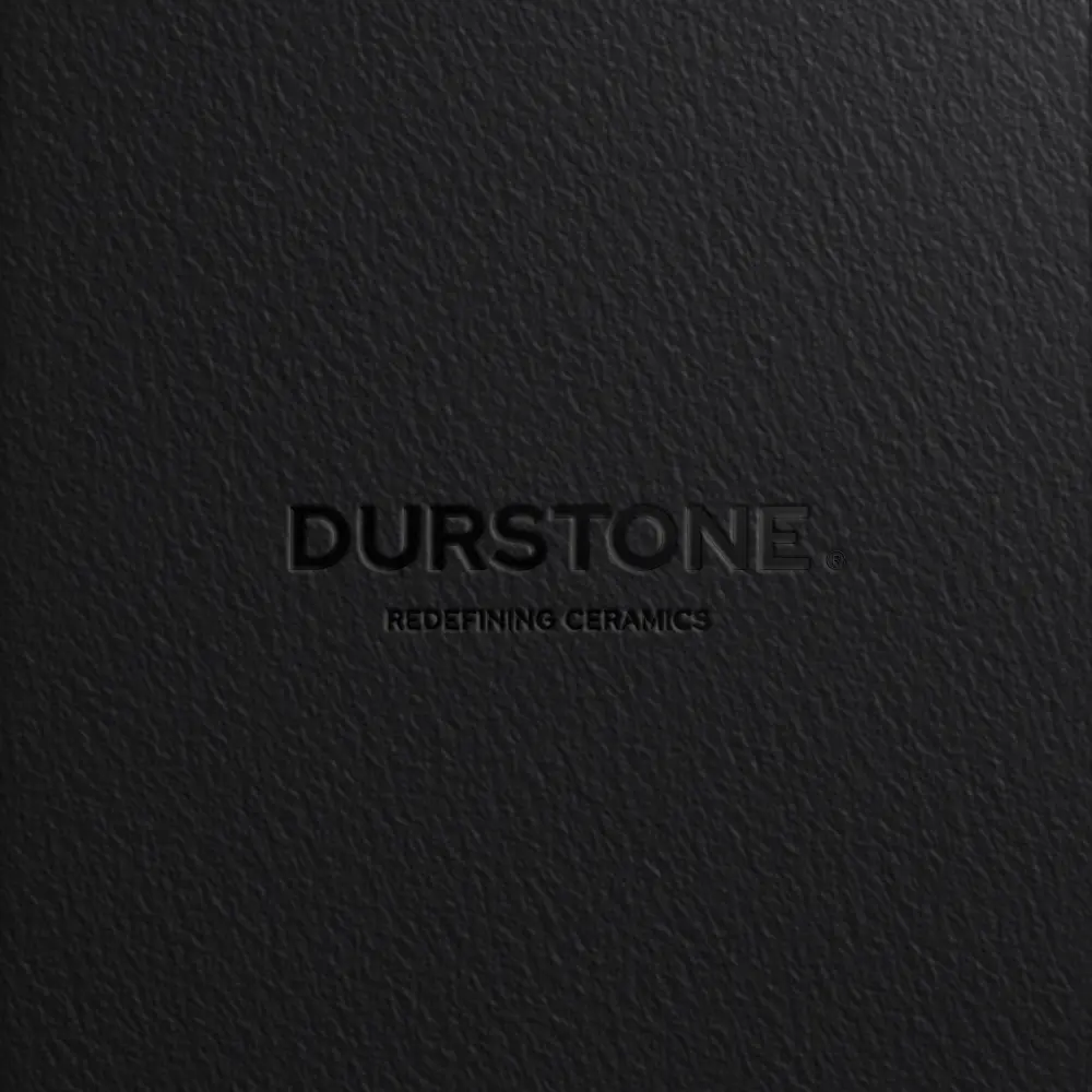
Durstone forges its own path in a repetitive sector, not following trends but redefining them. Born from curiosity, rigor and a drive to explore, it sees ceramics as constant research where design, technique and differentiation meet. At its core stands the “D” of Durstone: Design, Differentiation, Detail, Dynamism. A bold, geometric yet disruptive symbol, it conveys change, evolution and leadership. The new identity respects its graphic heritage while amplifying its essence, using the square as a base grid broken by a striking “D” that disrupts repetition and embodies innovation.
The Jury‘s Statement
The striking, geometric “D” forms the core of an identity that confidently departs from convention. Combining powerful symbolism, clear structure, and a subtle tribute to graphic heritage, Durstone Branding is charismatic and forward-looking. The consistent execution is especially impressive, making differentiation and transformation tangible – a gold-worthy demonstration of contemporary brand leadership.