EK - retail in motion
Special Mention
Excellent Communications Design
Corporate Identity
Details
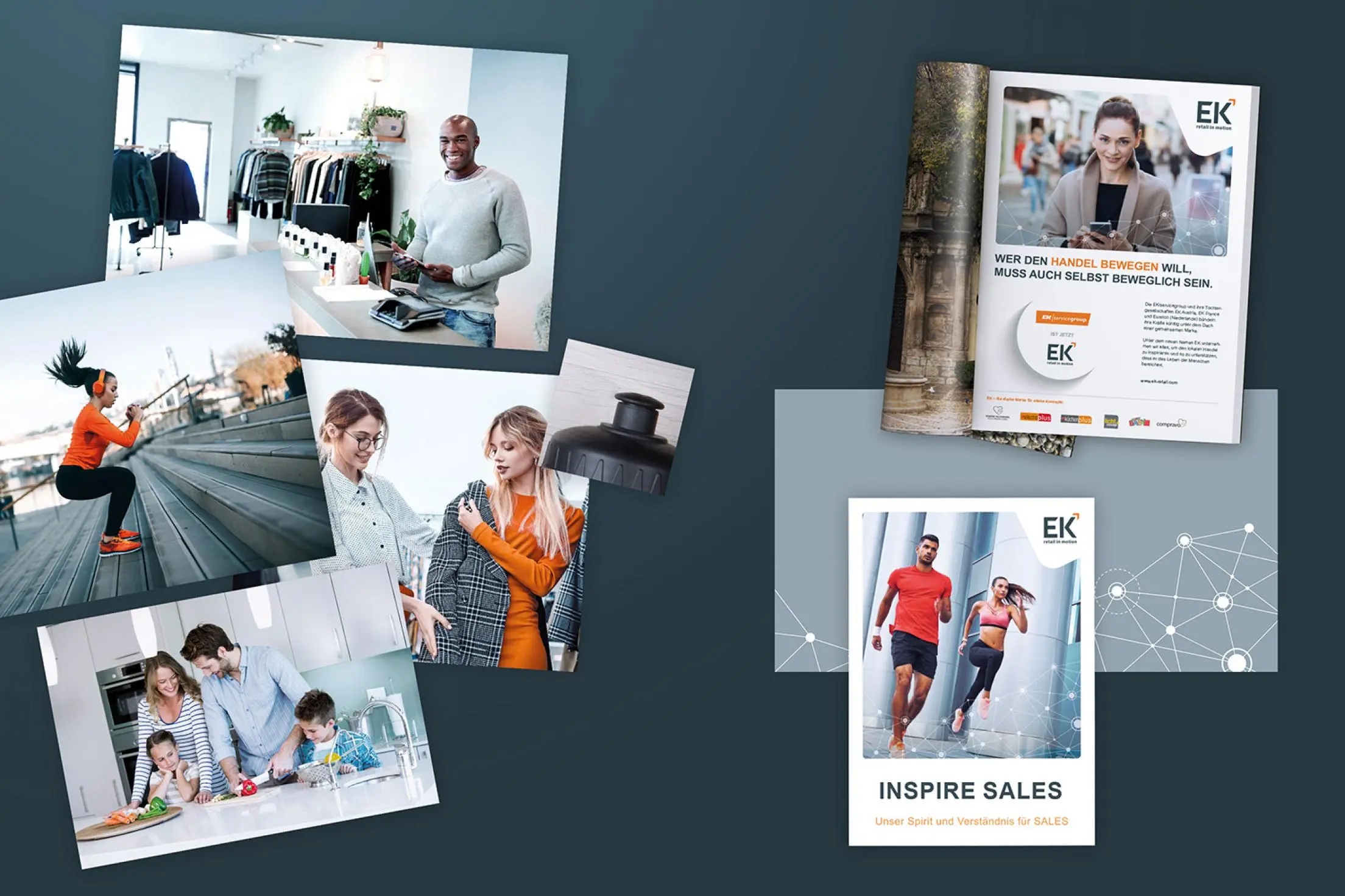
As the multi-sector group EK grew internationally, it was time to rebrand the “One Group” philosophy with a unified name and new image. Based on a brand core analysis, three basic elements were defined: The logo integrates an orange arrowhead, which stands for EK's marching direction upwards – to the top. In addition, the arrow is a symbol of added value and represents the passion and motivation that drives EK. The visual language was changed from a mere product presentation to a focus on customer benefits. In the course of this, the entire color concept has also been refreshed.