Klar, kraftvoll, nahbar: TenneTs Corporate Identity
Winner
Excellent Communications Design
Corporate Identity
Credits
Company / Customer
Details
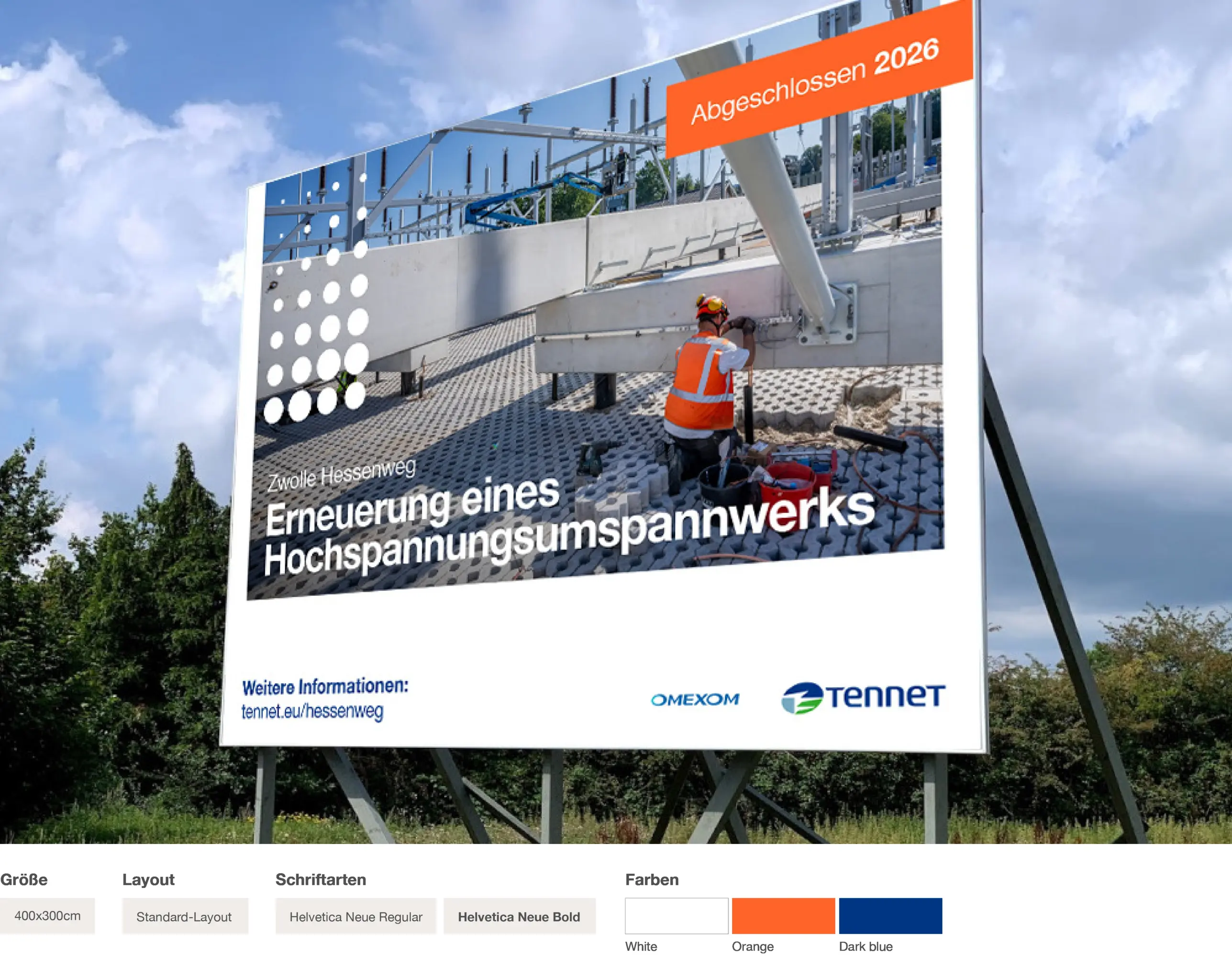
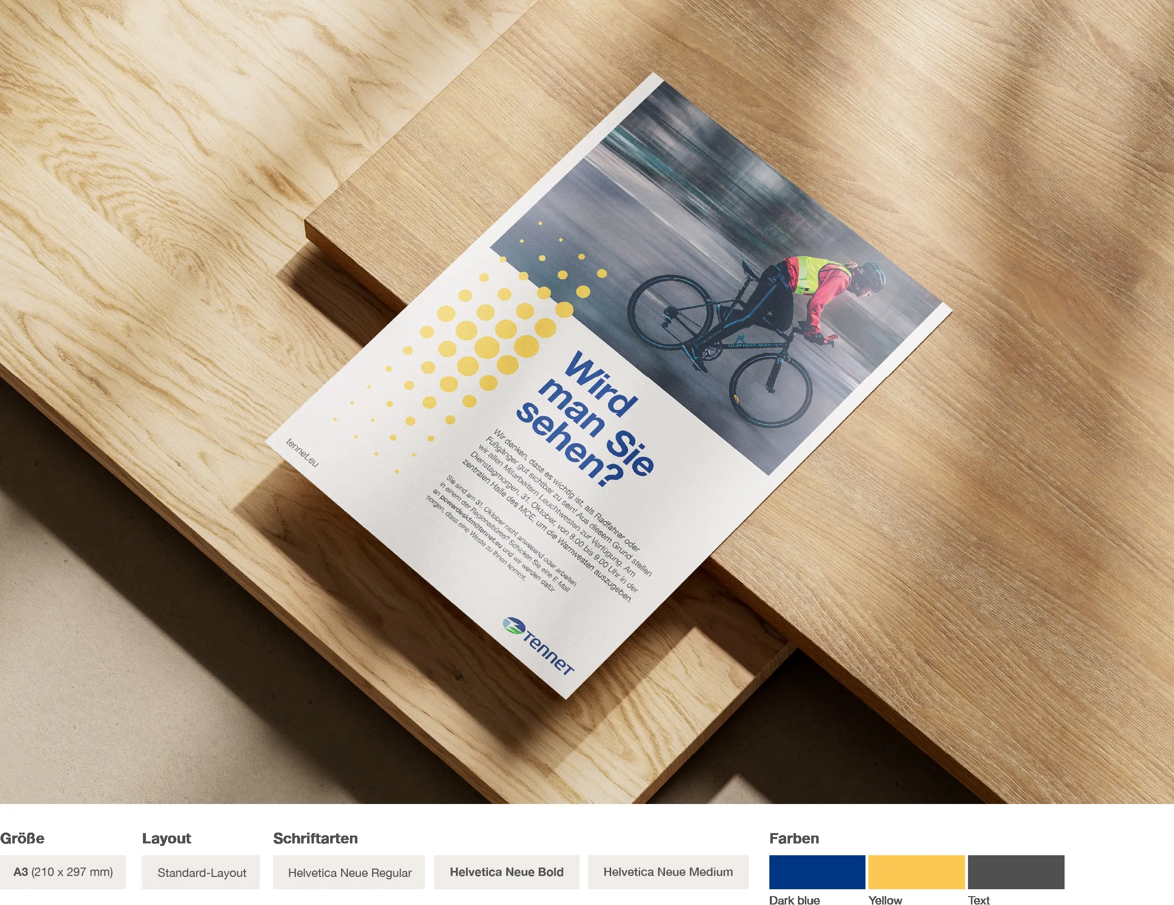
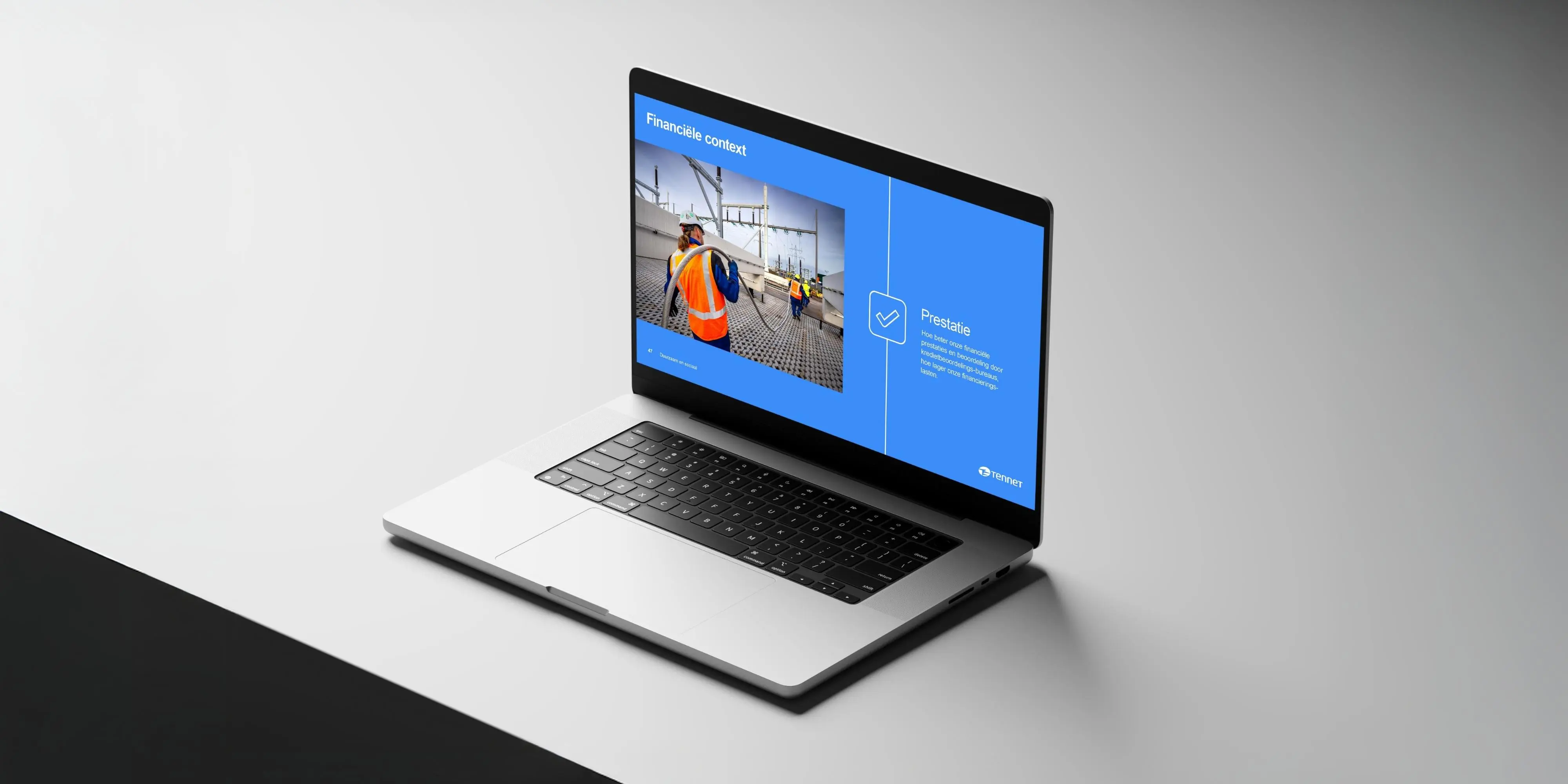
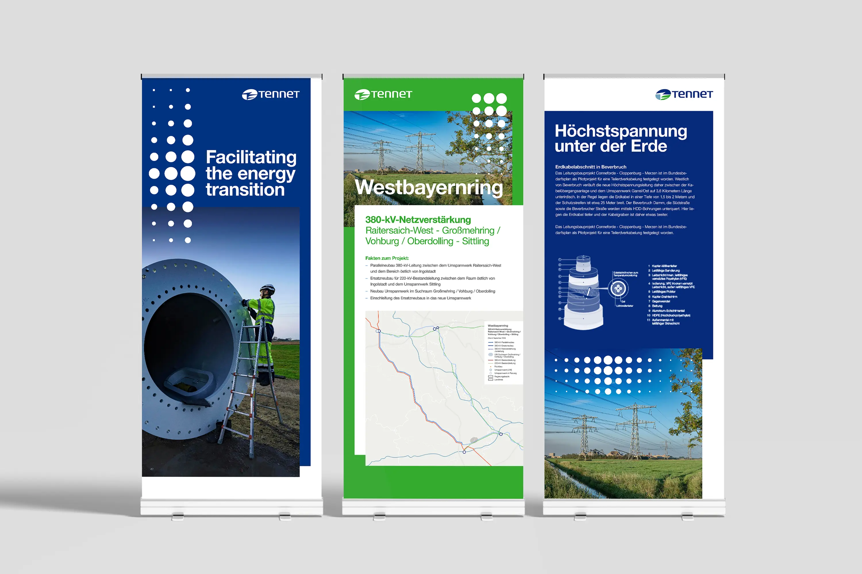
The transmission system operator TenneT Germany, together with its Dutch holding company, has redefined its corporate identity. The challenge: a complex and rigid design that neither reflected the company's dynamism nor its growing customer focus. The new design is clear, powerful, and approachable – featuring modern typography, a fresh colour palette, intuitive layouts, and improved usability. The visual elements – from photography to micro-animations – symbolize energy and connection, creating a consistent brand across all channels. This identity is implemented and maintained through the brand portal.
The Jury‘s Statement
A clearly structured, emotionally charged brand presence makes »Klar, kraftvoll, nahbar: TenneTs Corporate Identity« both distinctive and approachable. The harmonious blend of contemporary typography, concise color palette and dynamic graphic elements gives the company a charismatic, consistent profile. The visual concept sets benchmarks for impactful, identity-forming brand communication and stands out especially for its confident, user-centered implementation.


