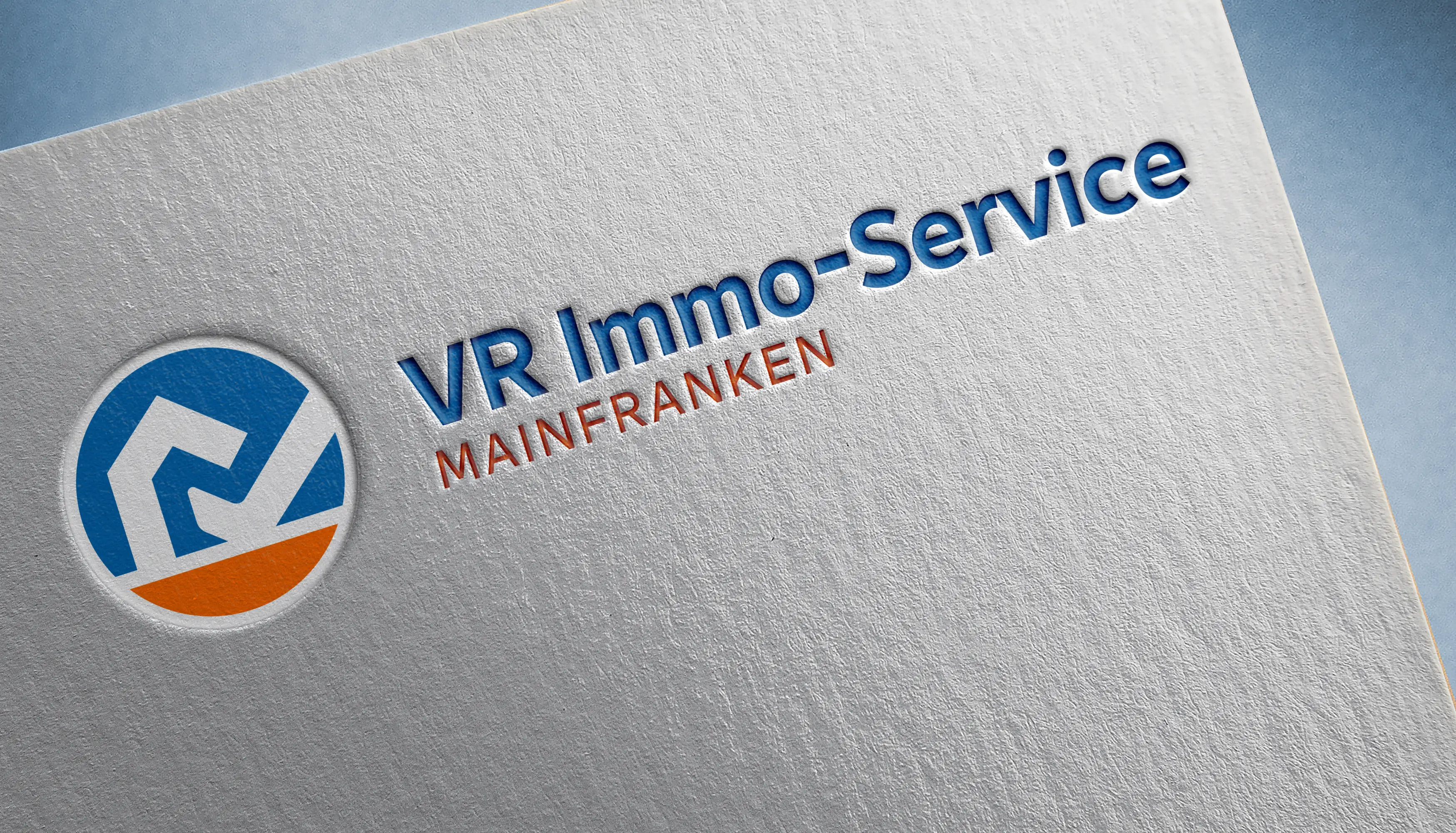
VR Immo-Serivce Mainfranken
Winner
Excellent Communications Design
Corporate Identity
Details
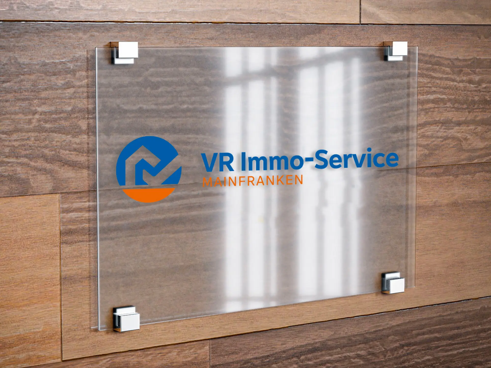
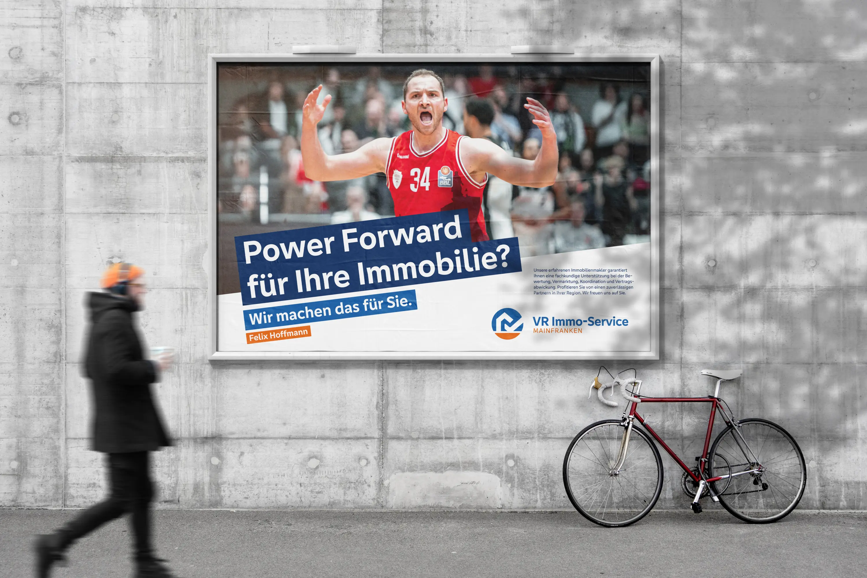
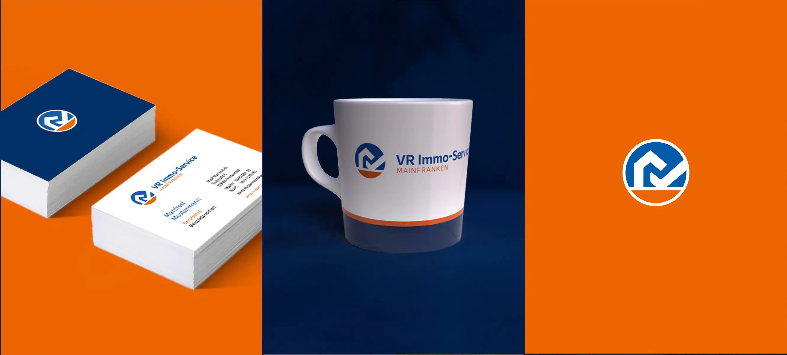
The new corporate design combines the brand strength of VR Bank with the independence of the local real estate company. The logo mark merges a clear symbol of stability and expertise with the distinctive positive check mark, conveying trust, quality, and partnership. Together, these elements form a striking “M” for Mainfranken, creating a strong, regionally rooted brand identity. Designed for intuitive use and secure application, the logo ensures consistency and confidence across all media.
The Jury‘s Statement
A distinctive emblem subtly uniting stability and trust defines the appearance of »VR Immo-Serivce Mainfranken«. The interplay of clear symbolism, regional anchoring, and consistent use of color and form creates a charismatic, coherent brand identity. Particularly impressive is the confident distinction from the bank identity and the lasting reinforcement of emotional connection with the target group.