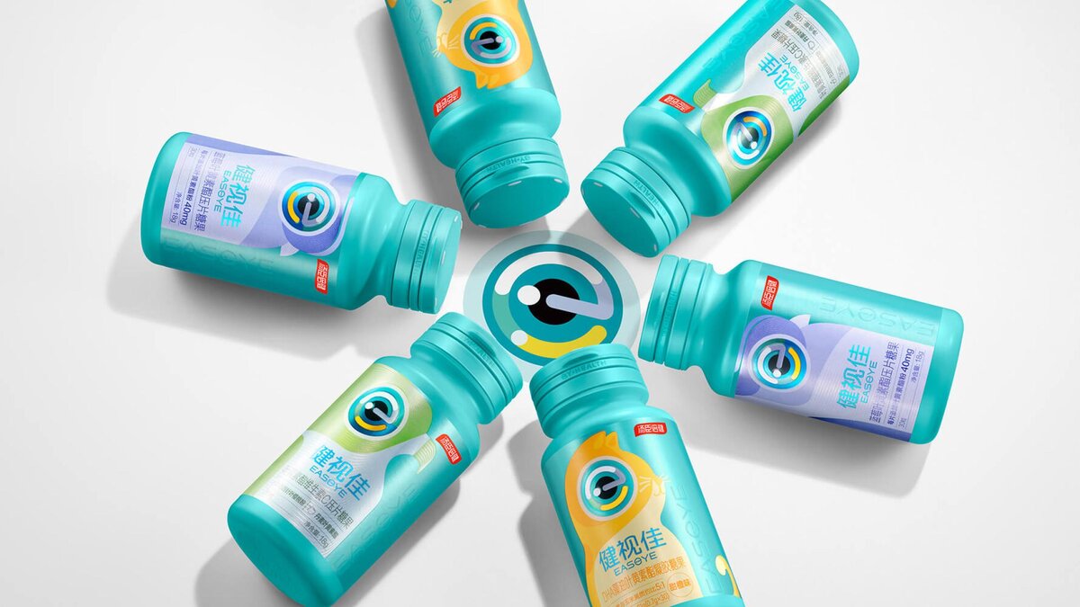
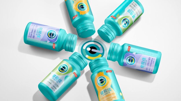
Easeye
Winner
Excellent Communications Design
Packaging
Details
Easeye is a brand focused on eye health and nutrition. We use the letter e of the brand name to create unique graphics for the smart big Eyes brand, and flexibly apply them to all product packaging and different media, so that consumers can better understand the brand. The packaging of health food and ordinary food uses strict eye patterns and animals with excellent eyesight as the core pattern, clearly expressing the product function, and the design style is young and interesting, which is favored by consumers. Packaging using SGS certified environmentally friendly materials, conducive to the sustainable development of the earth.
The Jury‘s Statement
The packaging design for food products creatively uses eye patterns and animal motifs to highlight the focus on eye health. The youthful, engaging style and eco-friendly materials reflect a modern understanding of sustainability. »Easeye« impresses with its clear message and innovative design.