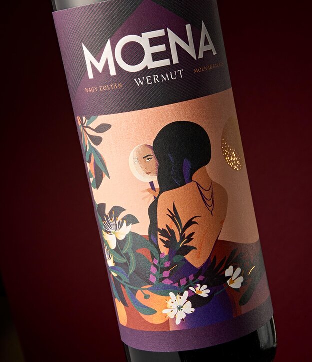
Moena Wermut
Winner
Excellent Communications Design
Packaging
Details
The designers envisioned a label for the drink that reflects its complexity while also evoking the beauty and boldness embodied in the exotic qualities represented by this vermouth. The defining elements of the label include plants that refer to the other botanical ingredients and spices accompanying the red vermouth, while the female figure represents elegance, along with a hint of sensuality and eroticism, with a tamed black panther by her side. The illustrations symbolize the harmonious balance between elegance and courage.
The Jury‘s Statement
The packaging impresses with its successful visual representation that subtly reflects the complex flavors of the beverage. The illustrations featuring plants and a female figure with a panther create a harmonious balance of elegance and boldness. »Moena Wermut« stands out in the field of packaging design.