ÓGIN
Winner
Excellent Communications Design
Packaging

Details
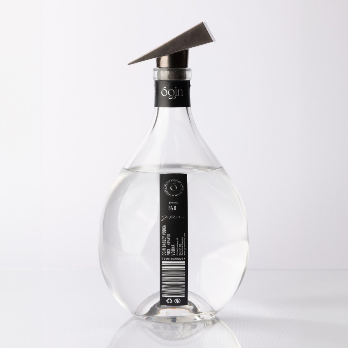
When ÓGIN was founded, our goal was clear: no compromises. Every part of our operation, from spirits to design, is driven by perfection. While many distilleries settle for standard bottles and labels, we aimed to create something unique—a silhouette that embodies our brand. Purity is central to both the taste and design of our products. Our minimalist labels let the clarity of our spirits shine. Even the cork reflects our Ó, taken from our Master Distiller Jón Óskar’s name. Once finished, the bottle can be repurposed as a vase or carafe by removing the thin vinyl label.
The Jury‘s Statement
The bottle impresses with its clear, minimalist design, which emphasises the purity of the high-proof contents. In addition to the special shape, the distinctive cork with the ‘Ó’, which refers to the name of the master distiller, ensures that the bottle is recognisable in the shops. The possibility of subsequent use as a vase or carafe is appealing.