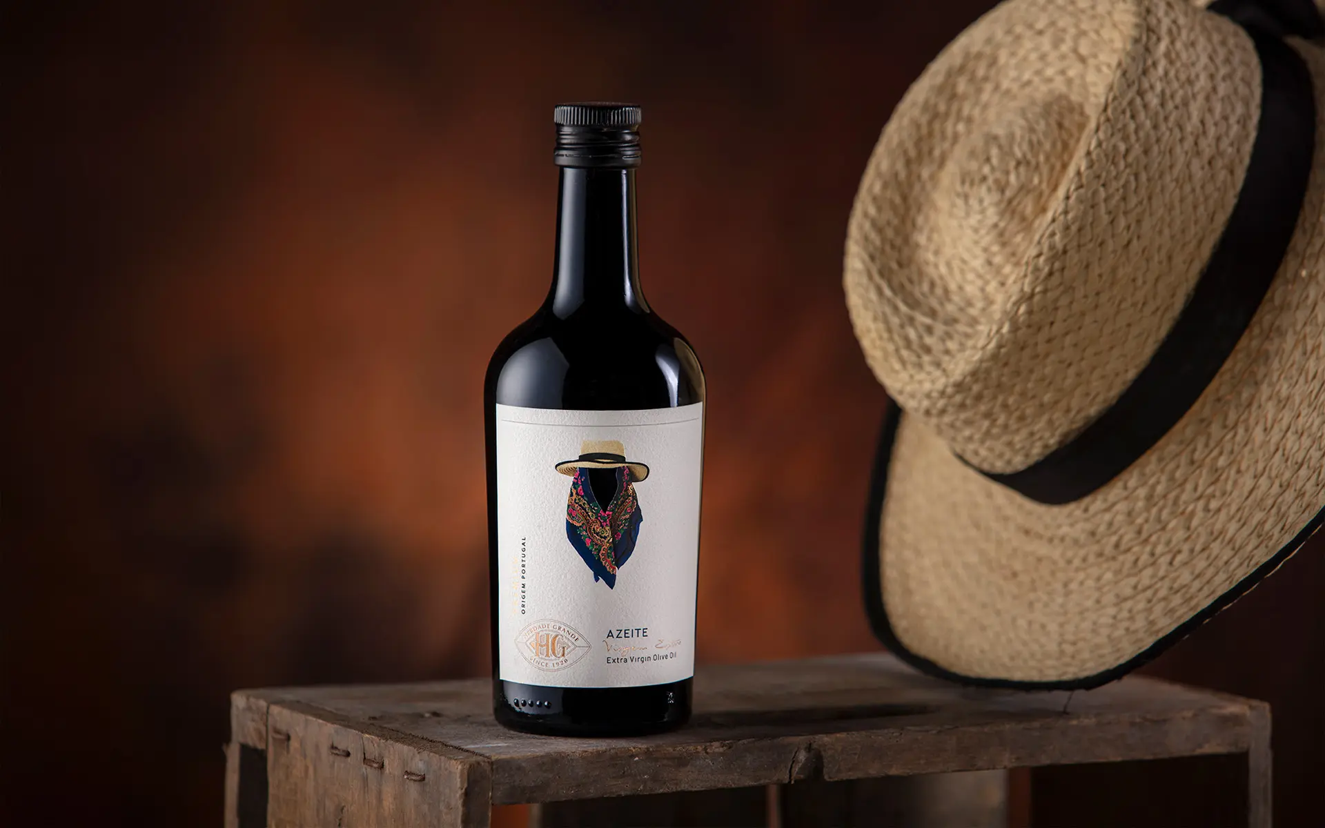
Olive OIl, the Portuguese Gold King
Winner
Excellent Communications Design
Packaging
Details
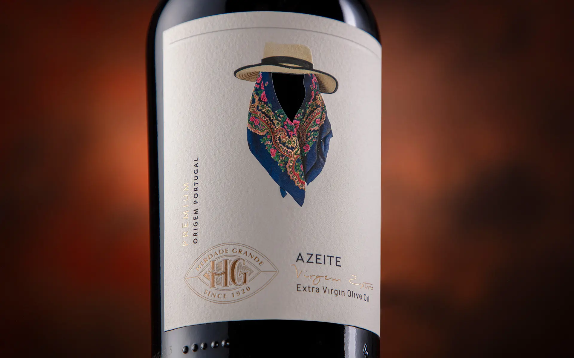
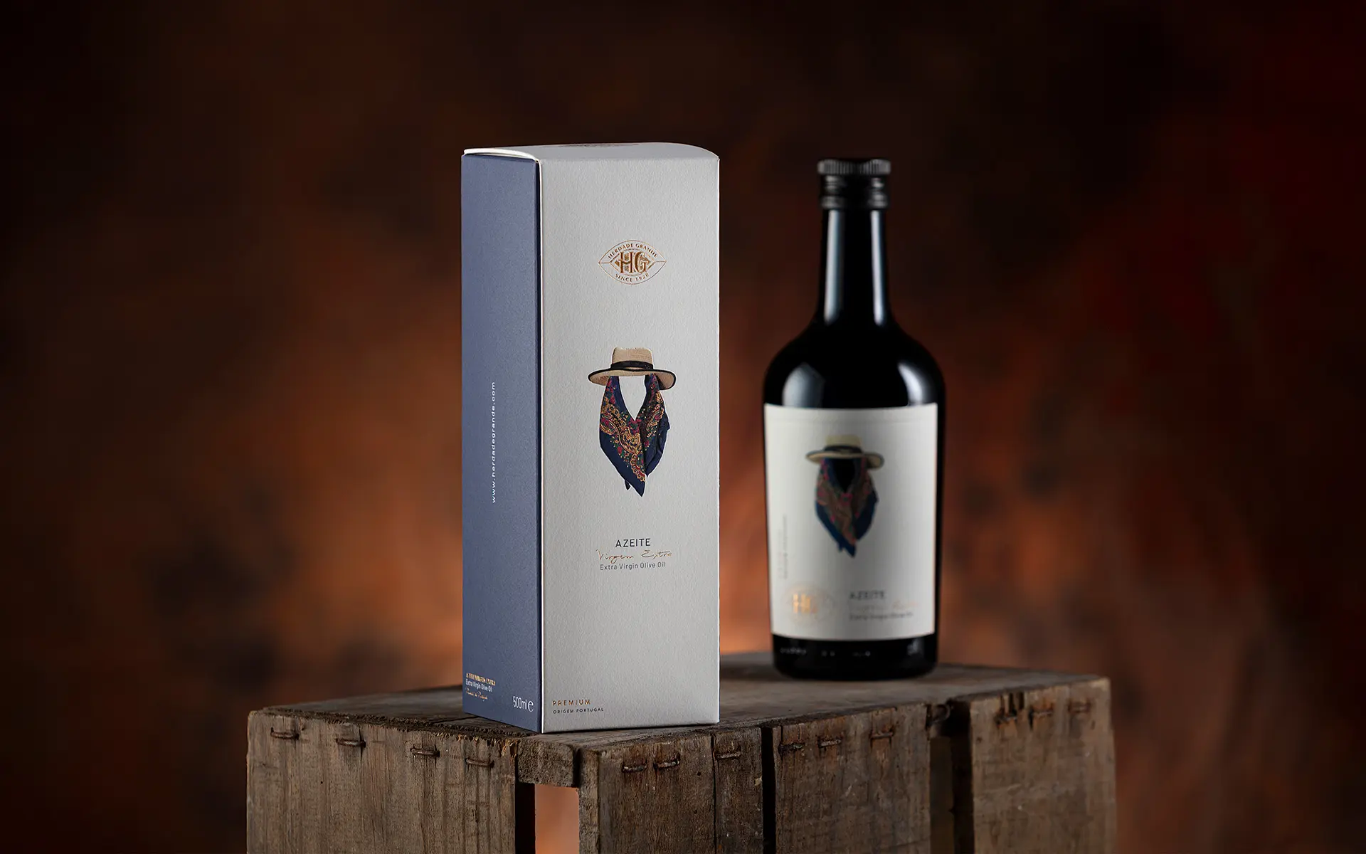
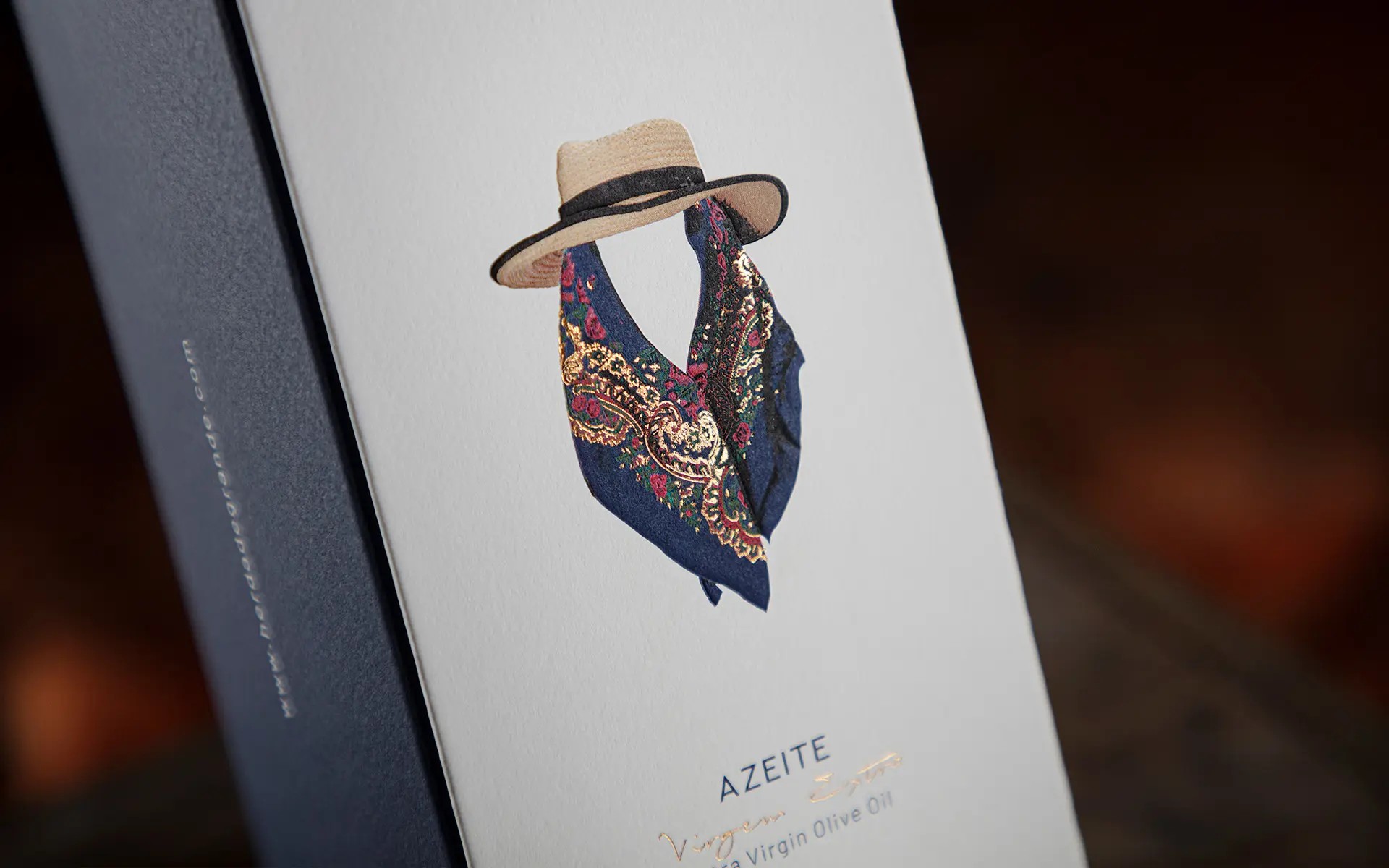
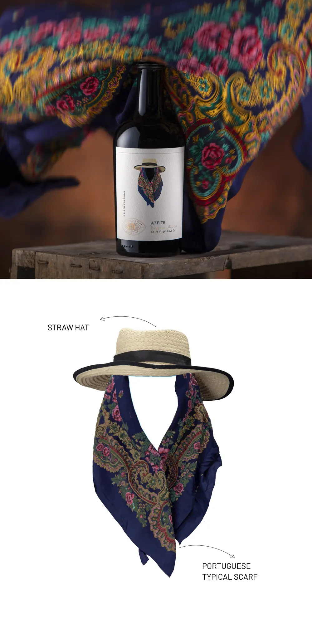
In Alentejo’s plains and olive groves, the harvest season inspired a packaging design rooted in cultural heritage. The image of men and women, workers in the fields, in traditional costumes led to a concept honouring the women of the Lança family, settled there since 1920. Scarves and hats became central motifs, transformed into subtle illustrations blending elegance and minimalism. Gold stamping, embossing, and refined cuts elevate the design, while photography and colours capture identity and tradition. The result bridges culture and innovation, turning packaging into a poetic tribute to Alentejo.
The Jury‘s Statement
The subtle interplay of cultural heritage and contemporary clarity defines »Olive OIl, the Portuguese Gold King«. Harmoniously applied gold embossing, precise cuts, and minimalist illustrations lend the design a timeless elegance. Striking color choices and detailed motifs create a strong identity. This packaging impresses with charismatic presence and exceptional value.