Sprinkle Redesign to Reduce
Winner
Excellent Communications Design
Packaging
Details
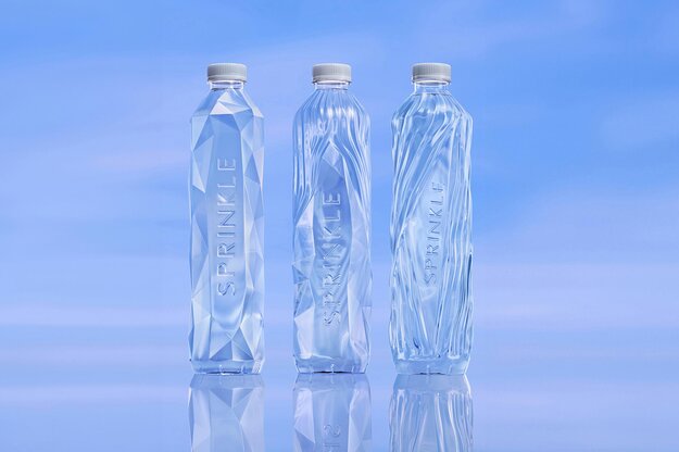
There are many no-label drinking water brands, both local and imported, making it tough for "Sprinkle" to stand out. Instead of just adopting the no-label concept to address environmental issues, we decided to tell a story reflecting our world’s situation. With the "REDESIGN TO REDUCE" concept, we focus on minimalism, depicting the melting of Arctic ice through three bottle designs: A crystal bottle with a full wall of Arctic ice. A bottle with ice melting. A bottle with only the last ice sheet. This design raises awareness about climate change. The clear, no-label bottle is easy to recycle and reminds consumers of global climate change.
The Jury‘s Statement
The packaging impressively demonstrates how minimalism and climate change awareness can be intertwined. Through the creative depiction of melting Arctic ice, a current global issue is conveyed in a visually appealing manner. »Sprinkle Redesign to Reduce« effectively uses design to sharpen perception and communicate a message.