Rebranding Torgler Treuhand AG
Details
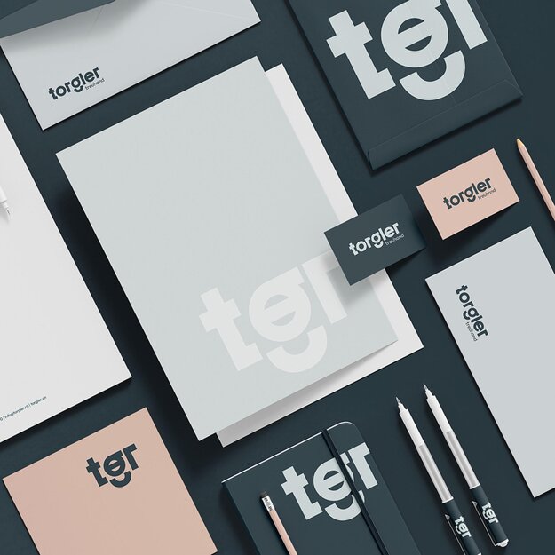
The new logo of Torgler Treuhand AG impresses with clear, precise lines that reflect professionalism and reliability. The specially developed typography combines structural clarity with organic elements that symbolize dynamism. Particularly noteworthy is the characteristic “g”, which accentuates the uniqueness of the design. The main colour Blue Dianne stands for consistency and trust - central values in the fiduciary sector. Supporting colours reinforce these attributes, while “Light Rose” adds a lovely component. The figurative mark is an iconic element that rounds off the communication.