Timo Rieke: What Designers Still Get Wrong About Colour
Colour Is More Than a Design Decision
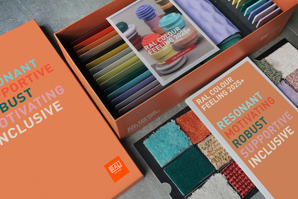
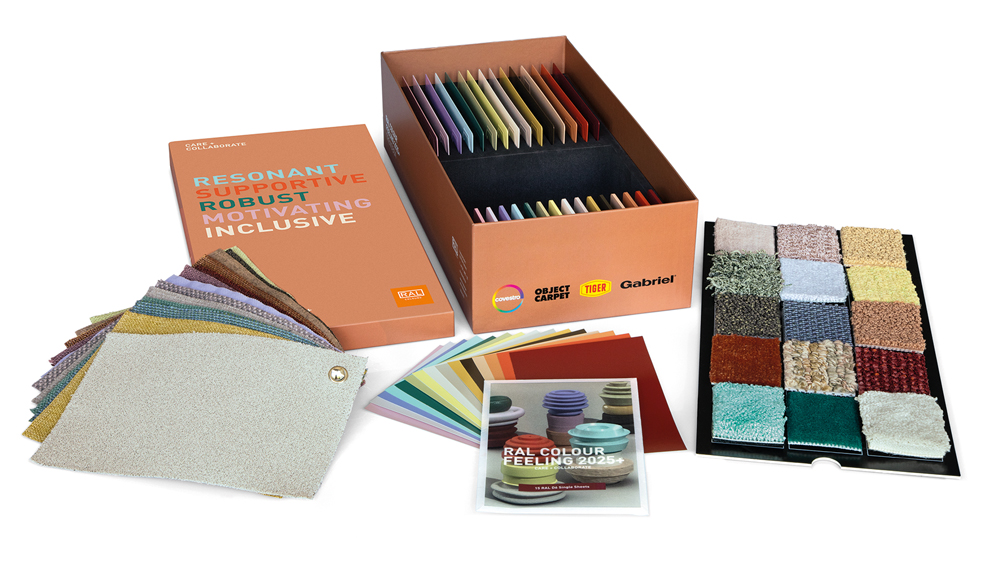
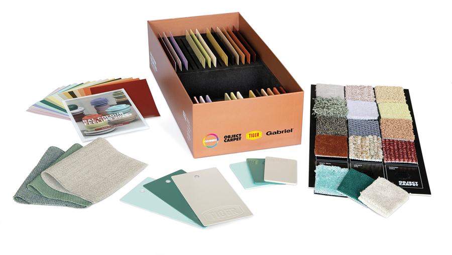
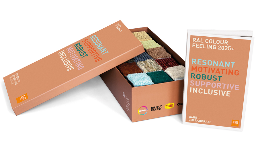
The RAL Trendbox 2025+ received Gold at the German Design Awards because it offers a new perspective on colour. Rather than presenting colours in isolation, it translates the 15 shades of RAL COLOUR FEELING 2025+ across five different materials, from plastics and powder-coated metal to textiles and carpet. The result is an immediate understanding of how dramatically material and surface influence the way colour is perceived.
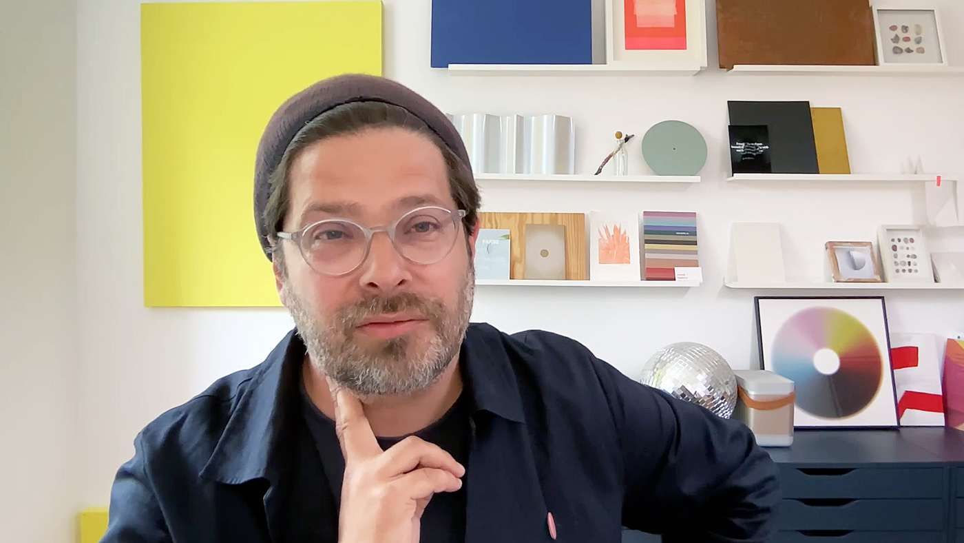
That same perspective shapes the work of Timo Rieke, Professor of Colour Design at the University of Applied Sciences and Arts Hildesheim. As both a colour designer and researcher, he has spent years exploring how colour shapes perception and why it is far more than a decorative design element. „Farbe hat eine Wirkungsmacht.“ Doch genau diese Wirkung werde häufig missverstanden. „Farbe ist natürlich etwas, was für uns konstitutiv ist für unsere Wahrnehmung überhaupt.“
Yet that power is often misunderstood. "Colour is fundamental to the way we perceive the world." To illustrate this, Rieke suggests a simple experiment: switch your Instagram feed to black and white. Suddenly, materials feel different, food loses its freshness, interiors change their atmosphere and it becomes harder to interpret mood and emotion. The point is clear. Colour is not simply a matter of taste. It shapes the way we experience our surroundings. That is why good colour design starts not with a palette, but with an understanding of perception.
Why the Trendbox Is About More Than Colour
The German Design Awards jury particularly praised the Trendbox for its carefully curated colour selection, material diversity and holistic design approach. The same colour behaves differently depending on the material, surface finish and lighting conditions.
For Rieke, that is exactly the point.
"Designers shouldn't assume that colour can rescue a design."
Too often, he observes, colour decisions are made only after the form, material and construction have already been finalised. Colour is then expected to create atmosphere or provide the finishing touch. Great design works the other way around. Colour should be considered from the very beginning, alongside material, function and intended use. Only when these elements are developed together does colour become a meaningful and lasting design decision.
The RAL Trendbox makes this tangible. Rather than presenting abstract colour swatches, it shows colours where they actually matter: on real materials and across different surface finishes.
Moving Beyond Colour Psychology
Another key takeaway from the conversation explains why the Trendbox deliberately avoids simplistic answers. Anyone looking into colour psychology quickly encounters familiar claims: blue creates trust, green is calming, red energises. For Rieke, these ideas are far too simplistic: "They're a starting point at best, not a solution to understanding colour."
Whether a colour feels trustworthy or calming never depends on hue alone. Material, lighting, spatial context, cultural background and intended use all shape how colour is experienced. That is why the Trendbox is not about copying trends. It is a working tool that allows designers to explore, compare and refine colour in context.
A colour fan provides accurate colour values. But how a colour is actually experienced only becomes apparent in a space, on a material and under specific lighting conditions.
"Ultimately, you always have to see how a colour performs in its actual context."
For Rieke, testing is as essential to the design process as sketching or prototyping. Successful colour design is not driven by intuition alone. It is built through observation, iteration and experience. The Trendbox translates this mindset into a practical design tool, demonstrating how the same colour behaves differently on metal, textiles or plastics, and why meaningful colour decisions can only be made in real material contexts.
Colour Tells a Bigger Story Than Trends
Colours reflect far more than personal preference. They reveal technological progress, societal change and cultural values. RAL COLOUR FEELING 2025+, whose scientific development was supported by Timo Rieke, therefore approaches colour trends not as short-lived fashions but as indicators of broader developments.
Its curated palette responds to today's social and cultural shifts while helping designers create lasting, meaningful relationships between people, materials and their environment. The Trendbox brings these insights into the physical world. It demonstrates that future-oriented design begins not with individual colours, but with the interaction between colour, material and surface.
By awarding Gold, the German Design Awards jury recognised far more than an exceptional material box. It honoured a research-driven design approach that positions colour as an integral part of a holistic design process. The same philosophy defines Timo Rieke's work. "The best products are those that consider material and surface from the very beginning."
The RAL Trendbox 2025+ makes that philosophy tangible. It demonstrates that colour is not a decorative finishing touch but a strategic design tool connecting perception, material and design. It was precisely this holistic understanding of colour that convinced the international jury and earned the project Gold at the German Design Award.
At What Stage Does Colour Become Part of Your Design Process?
The German Design Award recognises projects that take a holistic approach to design and open up new perspectives on material, function and user experience. The RAL Trendbox 2025+ is a strong example of how research, material expertise and design can come together to create tools that transform the way we design.
If your project offers new answers to today's design challenges, we look forward to your submission for the German Design Awards 2027.
Present your work to an international jury and become part of a global network celebrating design excellence.