BIB Fair Banking – Markenrelaunch mit Klarheit und Verantwortung
Winner
Excellent Communications Design
Brand Identity
Details
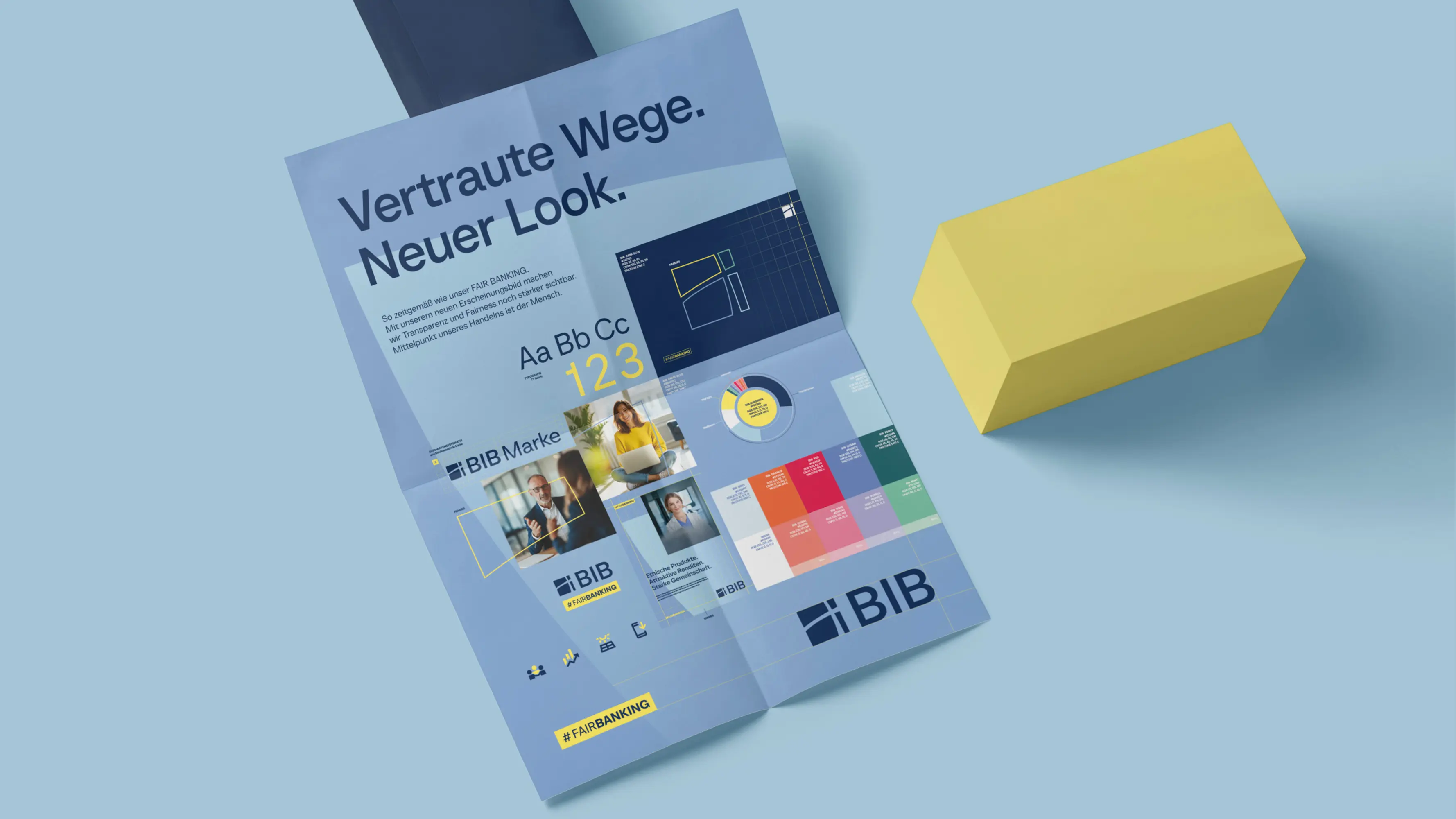
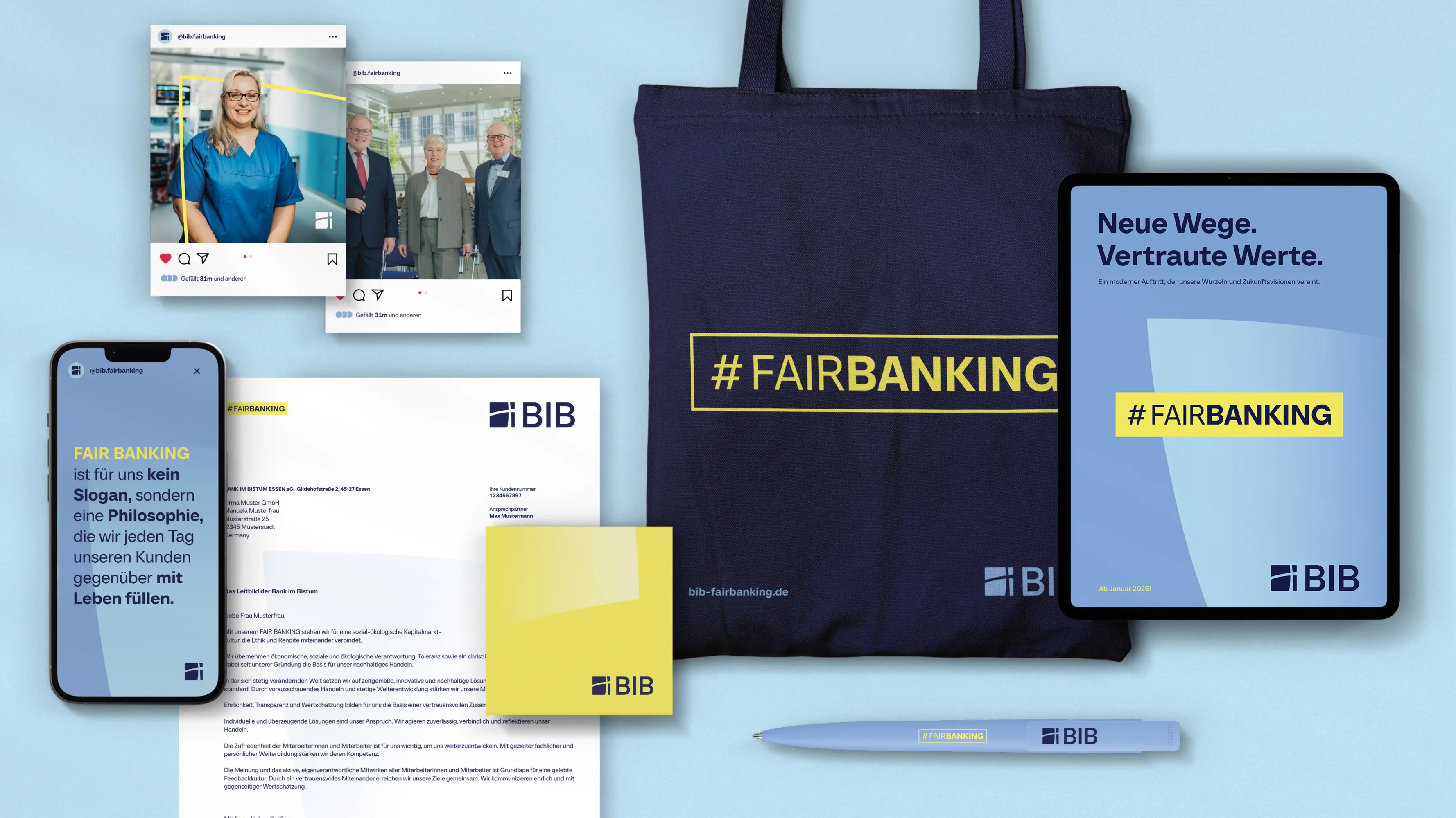
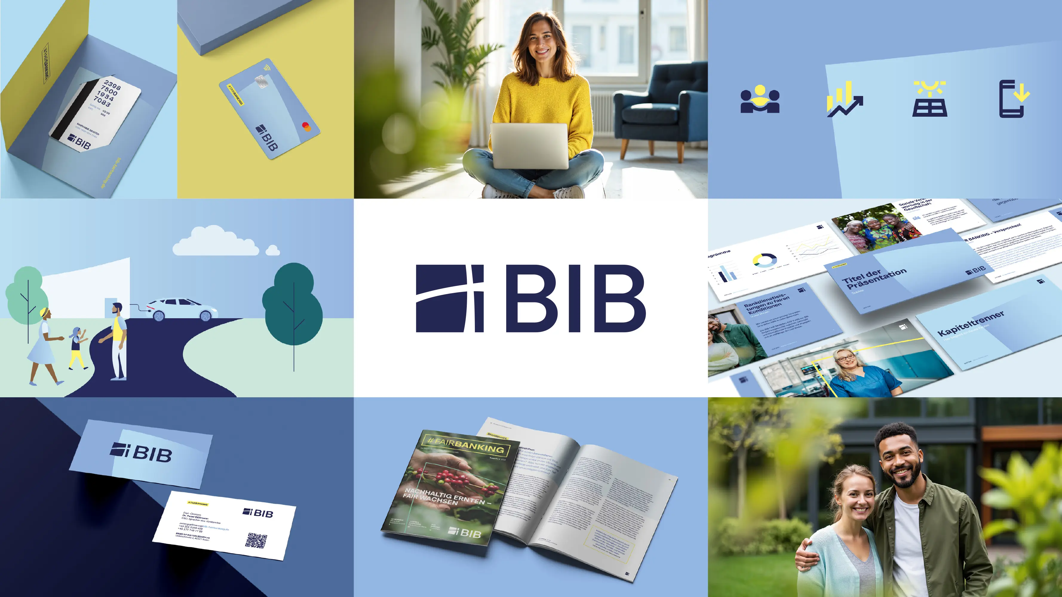
The Bank im Bistum Essen (BIB) represents Fair Banking – a value-driven financial approach with a clear focus on social responsibility and sustainability. 31M developed a new corporate design that fully translates these values into the visual identity. The relaunch modernized the logo, colour scheme, and typography while introducing the BIB Shines as a new design element. The Shines symbolize openness, clarity, and transparency, ensuring strong recognition across all media. A reduced, modern design and a consistent design system make Fair Banking instantly tangible.
The Jury‘s Statement
The captivating clarity of the »BIB Fair Banking – Markenrelaunch mit Klarheit und Verantwortung« identity impresses with a consistently developed visual system. Distinctive design elements such as the BIB Shines, a harmonious color palette and a modular illustration toolkit ensure strong recognizability. The implementation is both strategic and aesthetically pioneering, setting an impressive benchmark in the field of sustainable brand management.