DAZHANG Brand Identity
Winner
Excellent Communications Design
Brand Identity
Credits
Company / Customer
Designer
Details
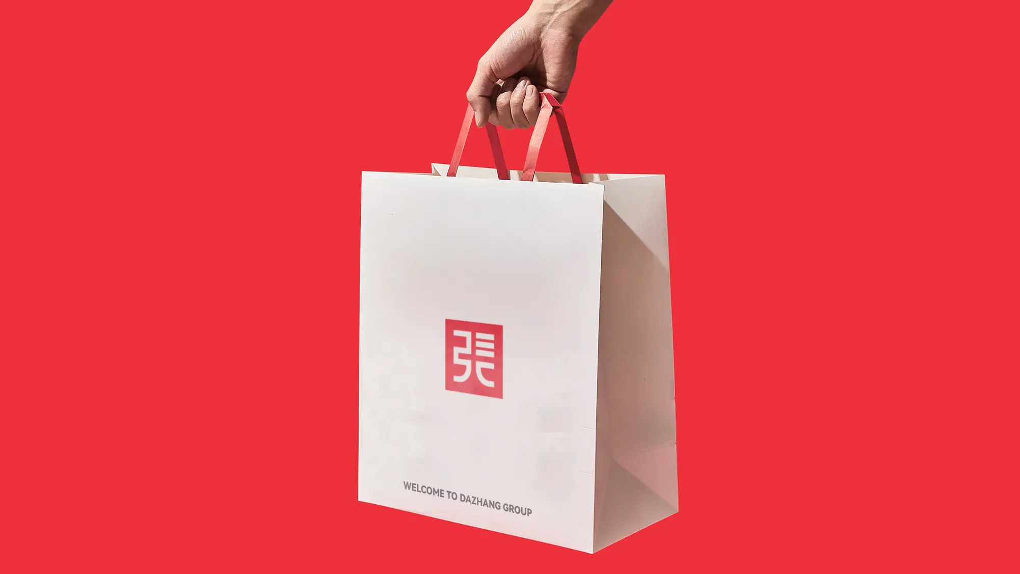
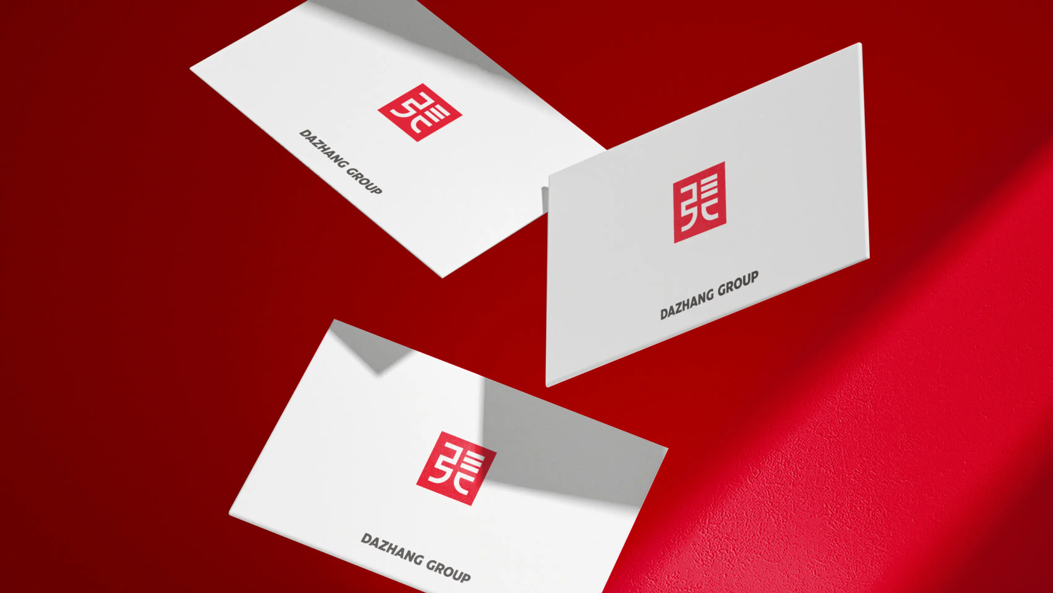
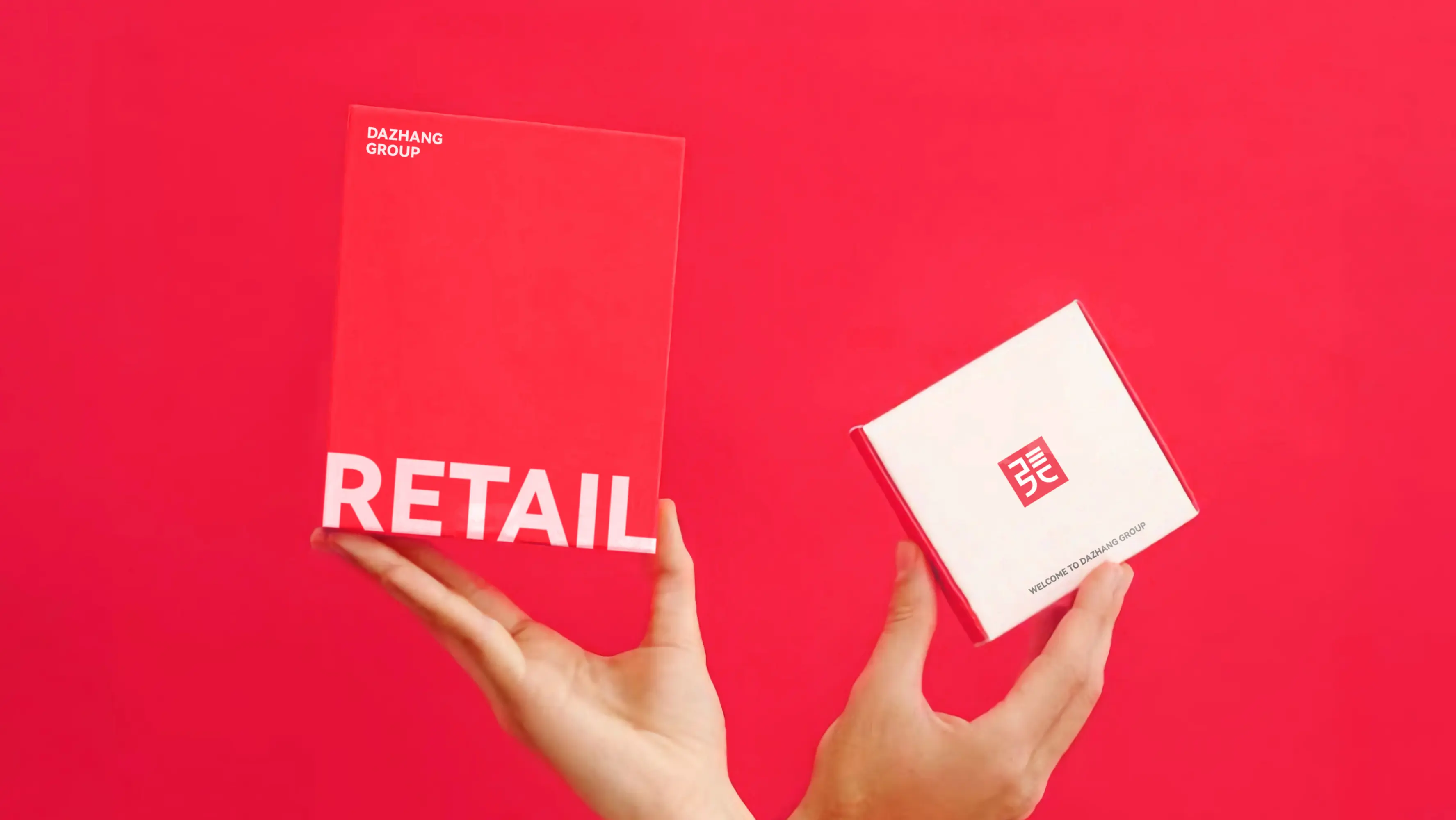
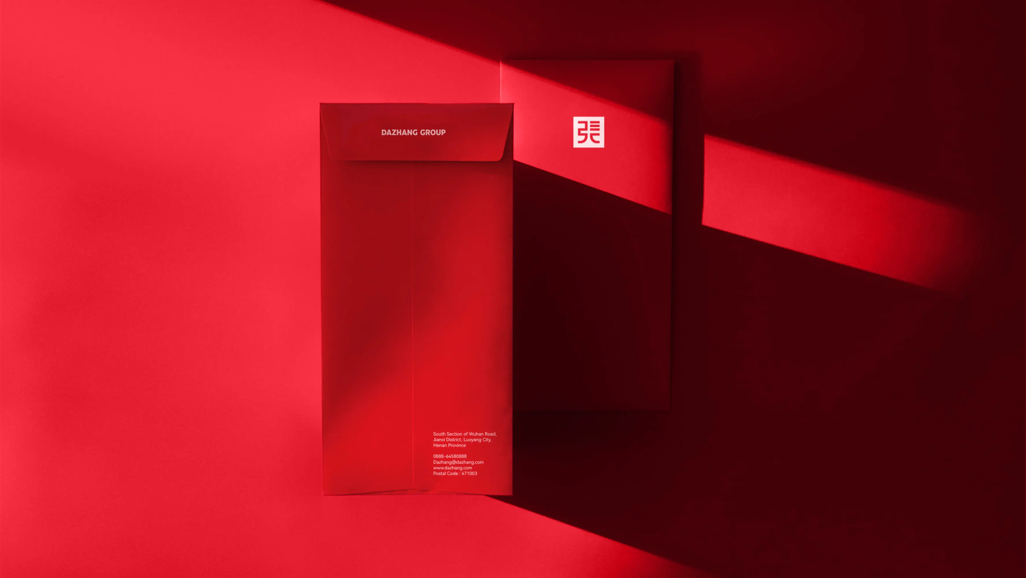
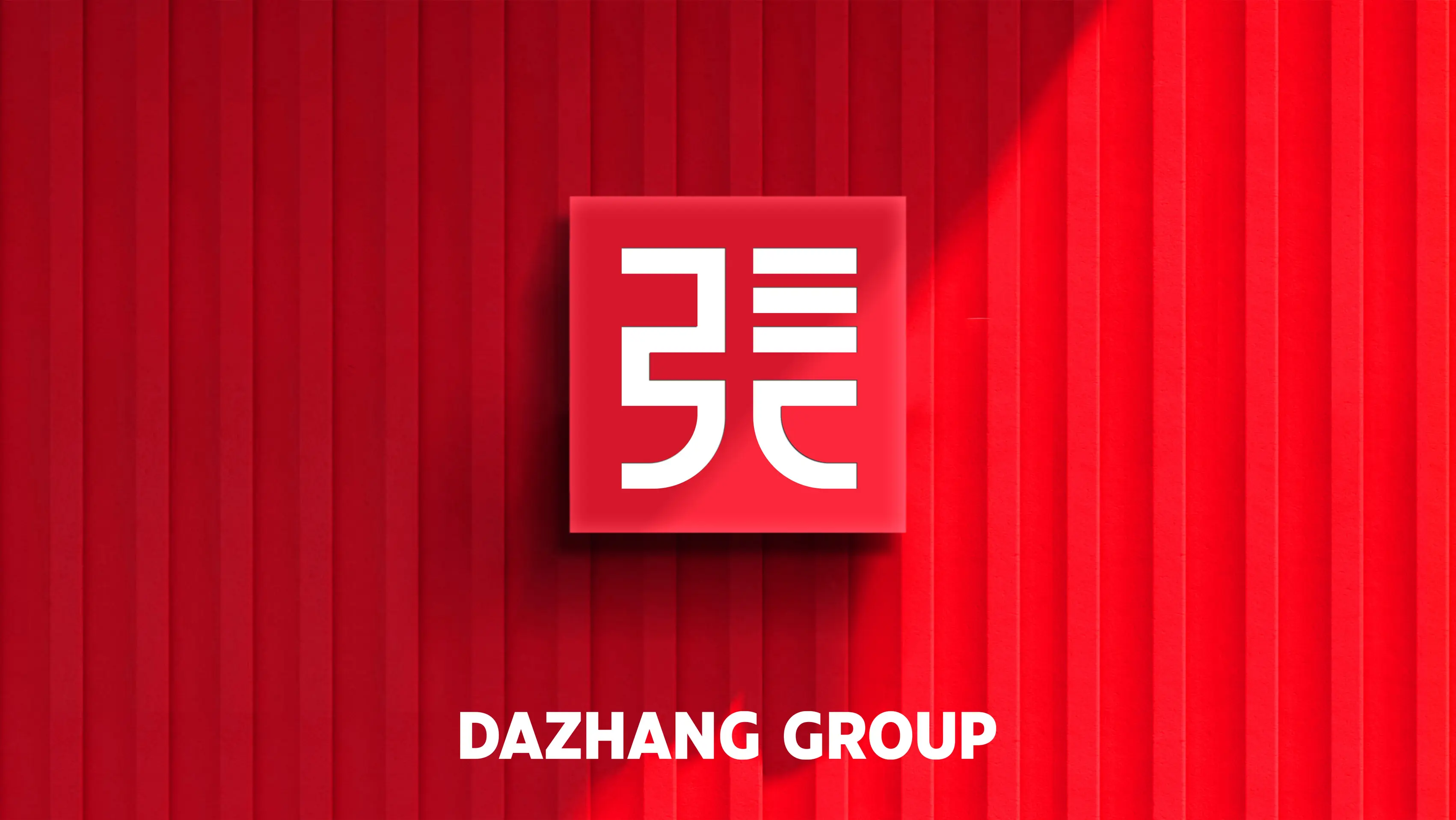
Dazhang, a leading retail enterprise in Luoyang, has launched a brand upgrade to meet new-era demands. The redesigned logo retains key graphic traits while enhancing symbolism and recognition. Using positive–negative form, it echoes the structure of “張” with the character “大” revealed in its negative space, expressing inclusiveness and diversity. Inspired by the Chinese seal, it conveys tradition, credibility, and permanence, blending cultural depth with modern warmth—reflecting Dazhang’s commitment to quality, integrity, and building a lasting brand.
The Jury‘s Statement
The powerful interplay of positive and negative space gives »DAZHANG Brand Identity« remarkable depth and makes the symbol distinctive. The fusion of tradition and contemporary aesthetics is subtly yet strikingly conveyed through the integration of Chinese seal art. This identity-defining solution impresses with its clarity, emotional resonance and strategic consistency at the highest level, fulfilling an exceptionally high standard of brand leadership in an outstanding way.