Decode Brand Identity
Winner
Excellent Communications Design
Brand Identity
Details
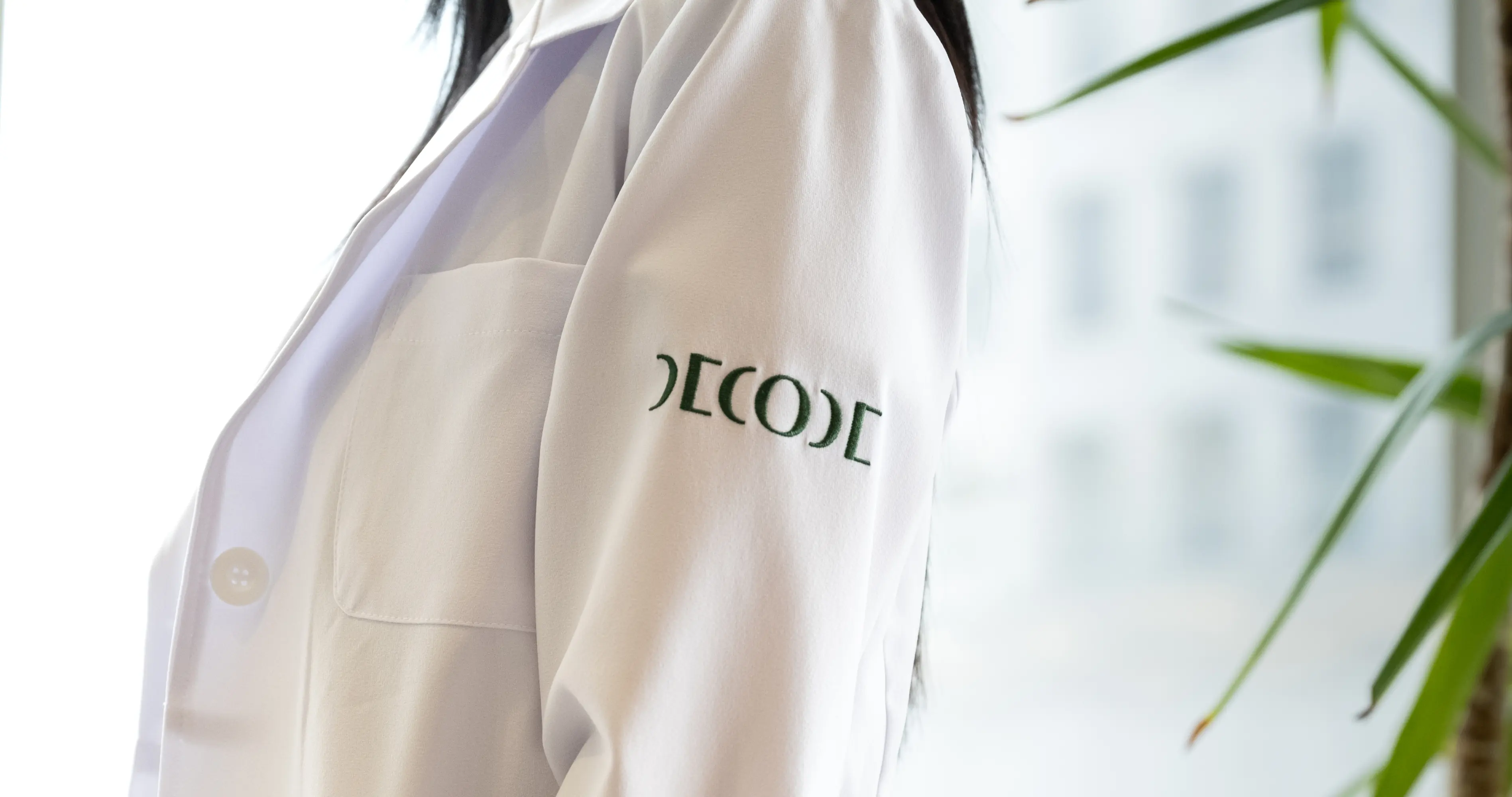
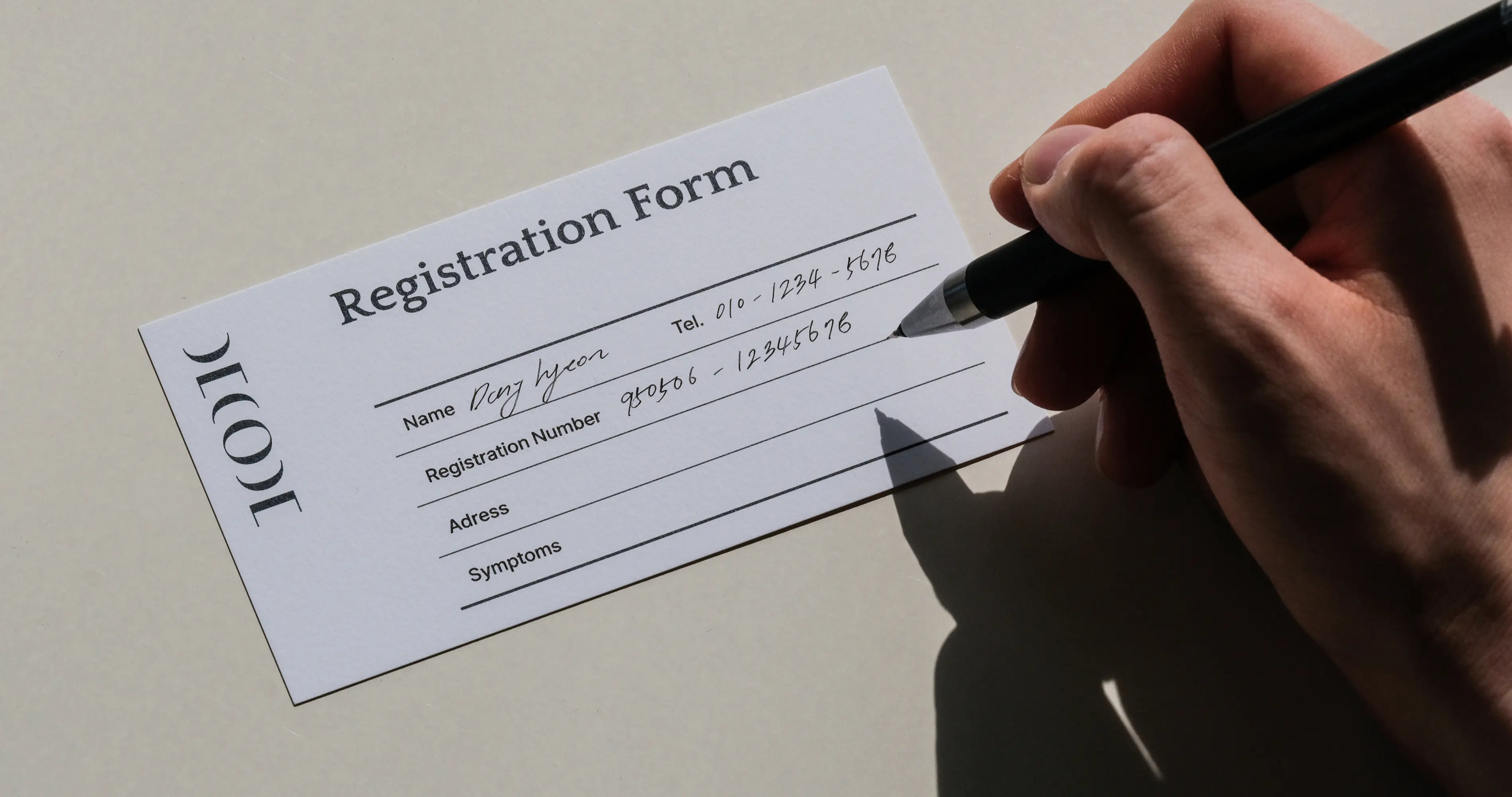
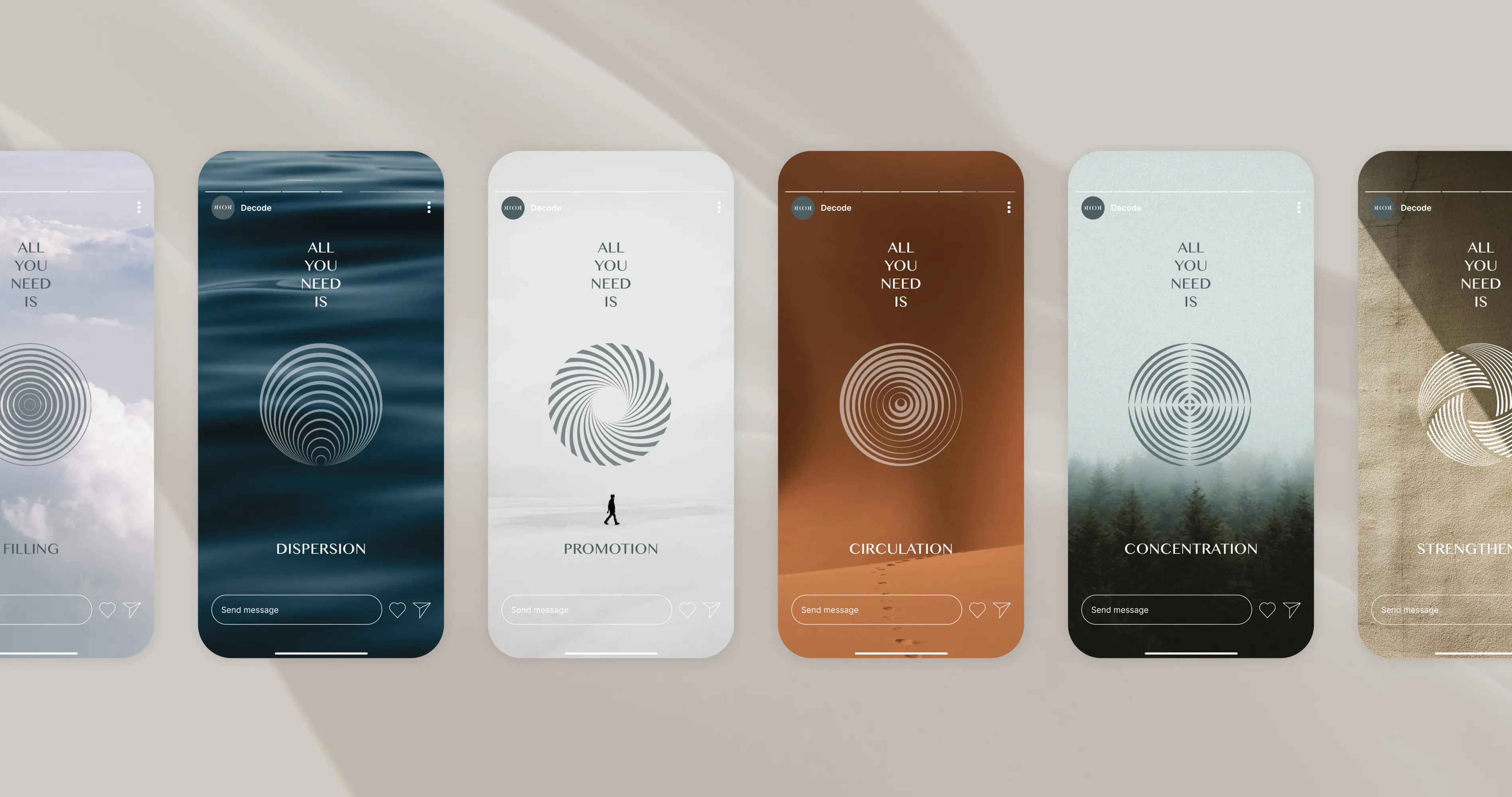
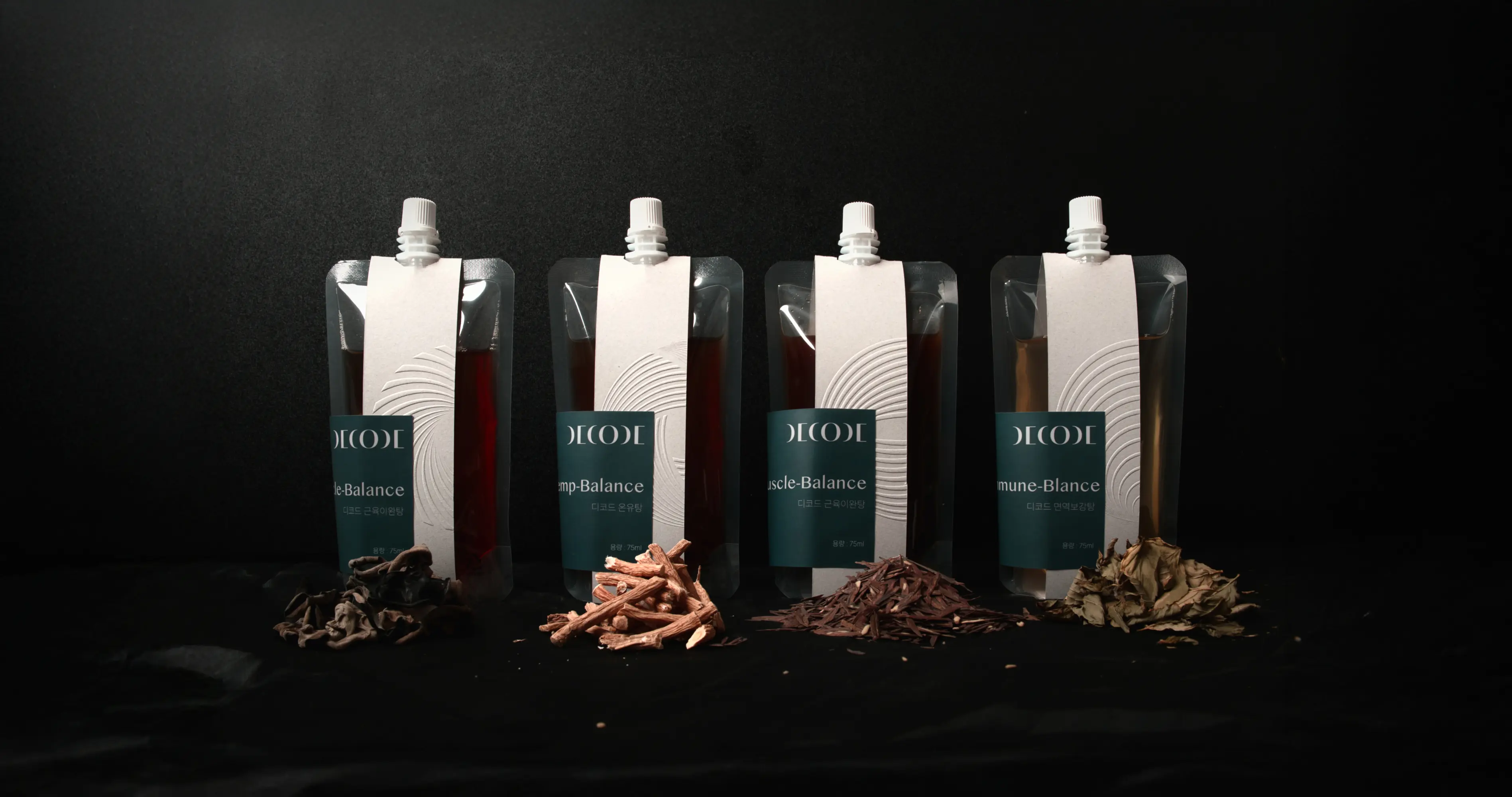
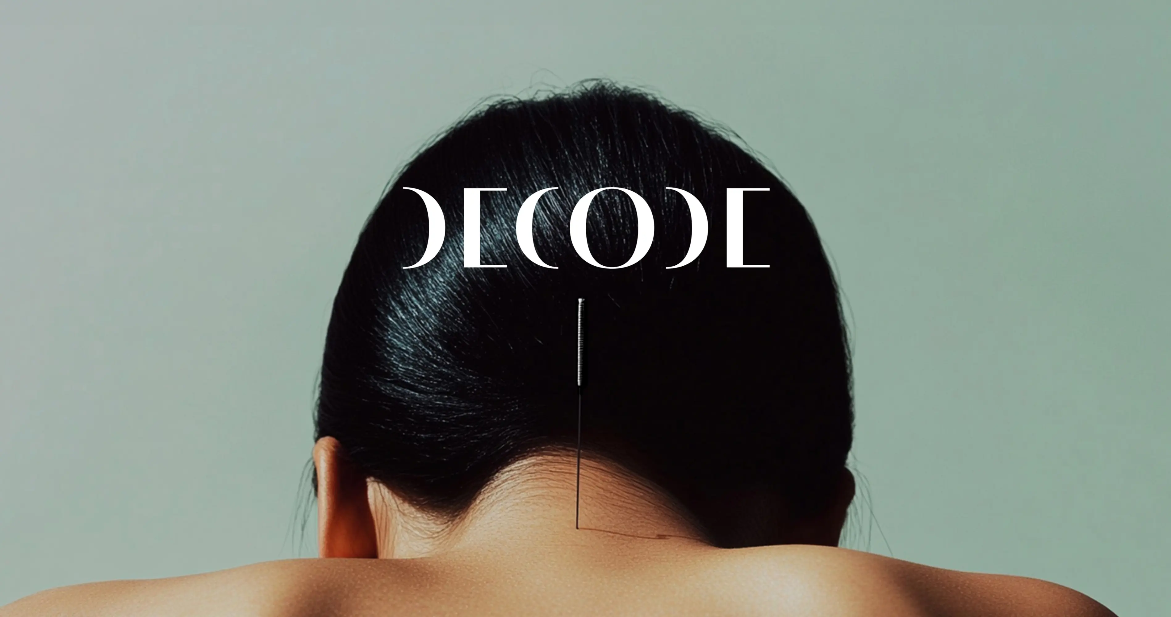
DECODE Korean Medicine Clinic was created to make traditional medicine more approachable. Its visual identity centres on the value of understanding the body’s natural balance. The logo renders “Decode” as a readable cipher with serif elements, embodying the act of decoding itself. It lets users sense understanding at first glance and reinforces recognition. A graphic motif turns the flow of Qi—vital energy in Korean medicine—into icons showing treatment intent, helping patients better understand their remedies. With stable proportions and a calm tone, the system ensures clarity across media, bridging tradition and modern care.
The Jury‘s Statement
A clearly structured visual system that effortlessly translates complex content defines the work »Decode Brand Identity«. The powerful combination of tradition and contemporary aesthetics is especially convincing: harmoniously designed pictograms and a finely balanced logo provide guidance and emotional resonance. The result is an identity-building brand world that, through its consistent clarity and relevance, stands as a prime example of excellent brand design.


