Evage
Winner
Excellent Communications Design
Brand Identity
Credits
Company / Customer
Details
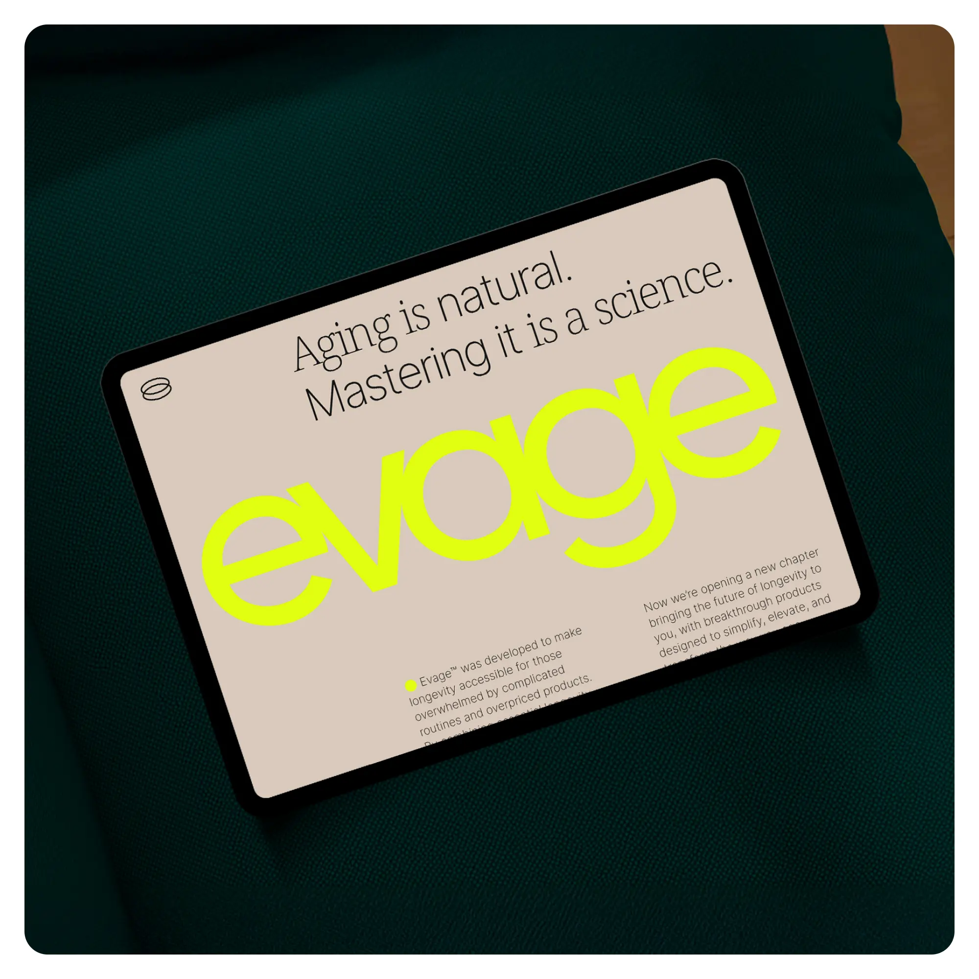
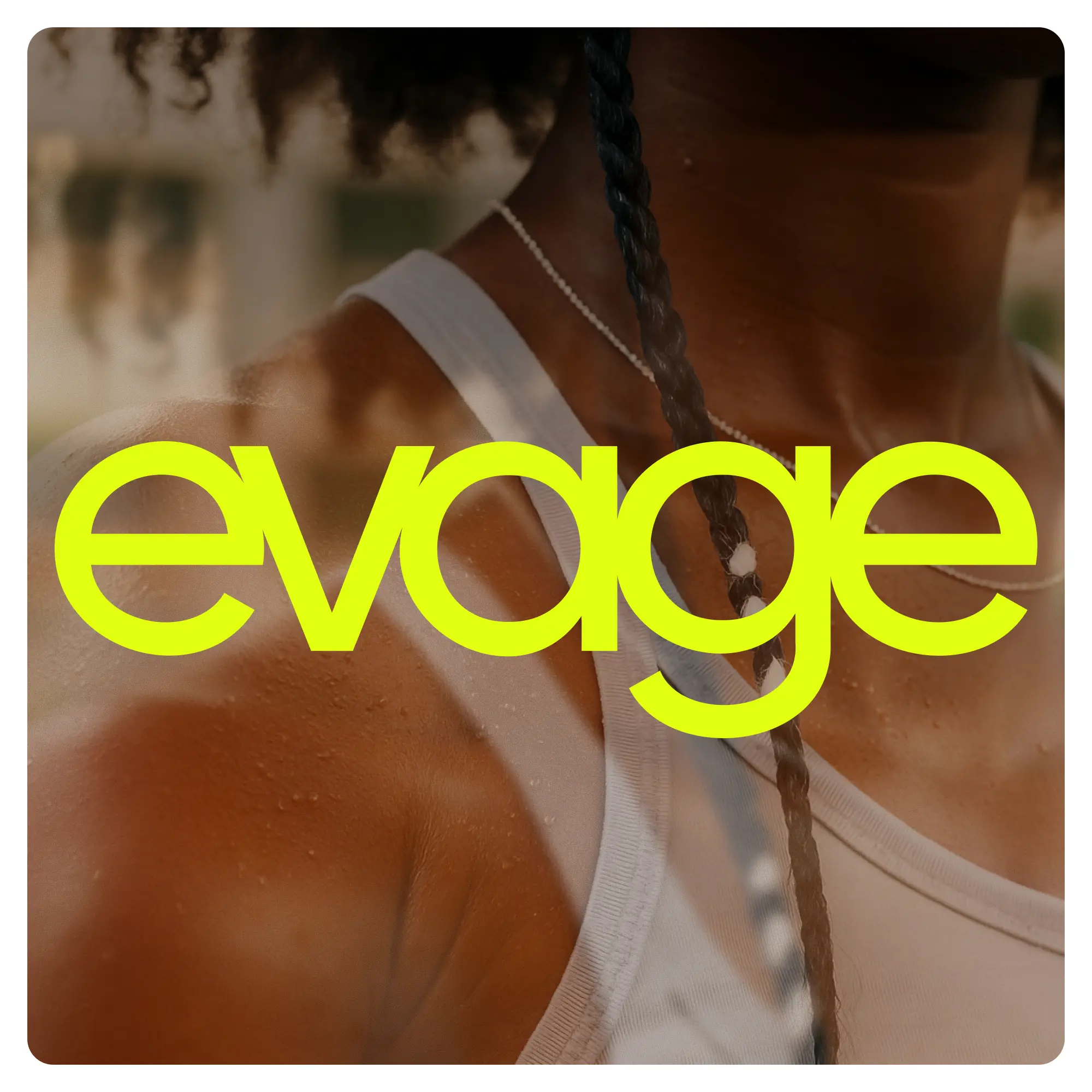
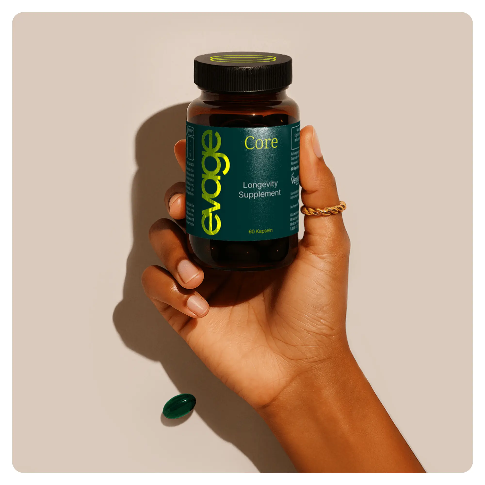
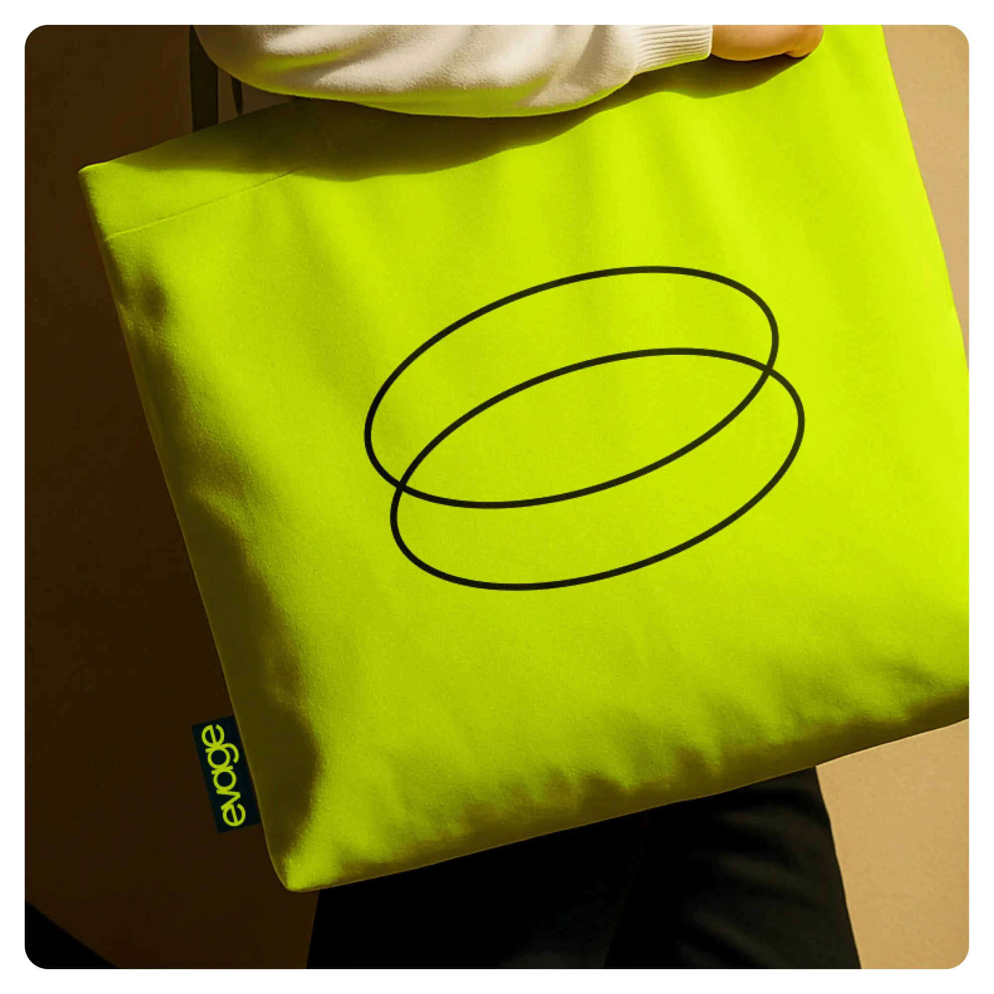
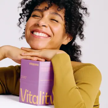
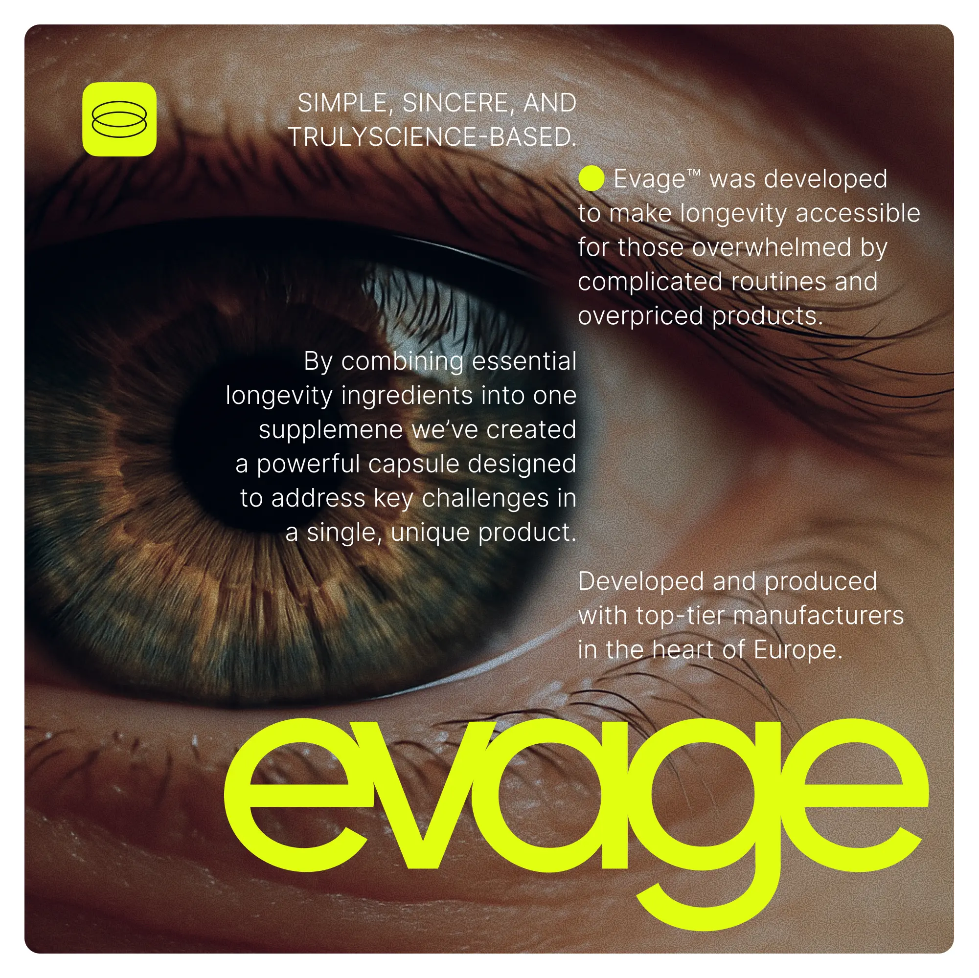
In the overcrowded longevity market, dominated by complex routines and interchangeable brands, we created Evage: a radically innovative branding system for a science-based supplement brand that conveys positivity, trust, and accessibility. The name (derived from “The Evolution of Aging”) resonates with the ultra-simple logo. A bold colour palette breaks with established schemes through striking accents like Lifeglow Yellow and versatile natural tones, powerfully combined with distinctive typography and a warm, immersive mood world. In this way, Evage unites design, knowledge, and community into a strong brand identity for healthy ageing.
The Jury‘s Statement
Powerful clarity defines the appearance of »Evage«: The combination of striking, memorable logo, bold color palette, and precise typography creates an identity that is both aesthetically and emotionally compelling. Particularly impressive is the subtle balance between scientific expertise and inviting accessibility. This charismatic brand world sets a benchmark for impactful communication about healthy aging and clearly distinguishes itself at Gold level through its consistent execution.